
The Good, the Bad, and the Ugly Startup Landing Page Examples
Startup companies have enough to worry about without fussing over landing page perfection and form building best practices. So I wasn't surprised when I set out to find some early stage startups that got it right, and found most got it very, very wrong.
Landing Page Examples From Startups
First, let me clarify how I am defining a landing page for this post. Technically, it can be any page a visitor lands on; in marketing they are primarily pages that have a distinct goal: to send you further down the funnel (as in an e-commerce page) or to get you to register/sign up (say, for a newsletter). In these cases I focused on landing pages that attempted to get you to register or sign up for something.
With that said, the startups on this list that have managed to impress me, a self-admitted landing page snob, still may have a few minor tweaks that I would recommend (again, LP snob), but even those that missed the mark deserves some kudos simply because they actually have a landing page. More often than not, any sort of sign-up is non-existent. But at least they are on the right track. Now, if I could just talk to their marketing director...
4 Great Landing Pages from Early Stage Start-Ups
1. Survmetrics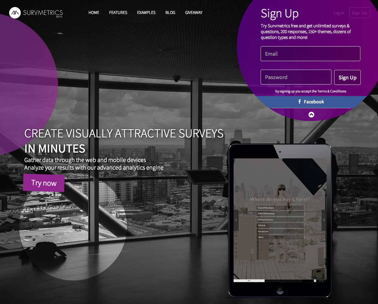

Survmetrics creates surveys that are not just pretty, but actually improve the response rate; according to the company's Co-Founder Ramon Escobar, at least.
What I love about Survmetrics is first, there are 2 opportunities to sign up.
After you scroll to the bottom of the (short) home page, there is a simple and straightforward registration form. At the top of every page also lives a Sign Up button, which, when pressed, displays a pop up form with the same information.
What's great about these landing pages:
1. They tell you exactly what you are getting.
"Try Survmetrics now for free get unlimited surveys, unlimited questions, 200 responses per month, over 150 themes, dozens of question types and more coming every day! Just sign up here and start using Survmetrics."
No confusion, no questions.
2. They've got it down to 2 fields and only ask for the required information.
I registered myself, and was happy to see it really was that simple. I put in my email and password, and was immediately taken to a page to start building forms. Doesn't get much easier than that.
3. It's simple and uncluttered.
The form doesn't have to compete with anything else on the page to get your attention. And the pop-up registration is particularly eye-catching.
4. They also offer the "Enterprise" option for those that want more.
They don't require you to select which one you want first, and then guide you to a registration page.
If you have multiple registration options, and the majority of your users select a particular one, start them with that information, and just make the others available in a different manner or at a later time.
Adding options up front is confusing, and hinders the sign up process. Keep it simple, people will always ask for more if they want it.
2. 23Snaps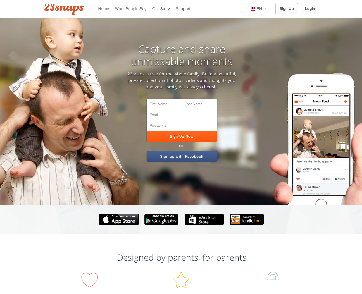

As stated on their homepage and right above the form, "23snaps is free for the whole family. Build a beautiful, private collection of photos, videos and thoughts you and your family will always cherish."
The Good
1. They provided that short description.
You always need to tell people what they are signing up for. I do think it could be more explicit though.
Am I signing up for a collection of photos? Is this like Shutterfly? Do you own my photos?
I would like to see more specificity, like Survmetrics provides. They tell you exactly what you are getting. From the outset, I am not 100% clear on what I am signing up for, but I do like that they have a bit of info.
2. It's right on the top of the homepage, a great location that can't be missed.
3. They allow you to register with Facebook, which is a plus.
Having other available options reduced any hindrance to providing their information.
4. It's uncluttered and the form is able to shine on the pleasant picture background.
5. They only ask for the required information.
And their form clearly indicates "first name" versus "last name," rather than just "name."
6. Again, we see the 2 options for signing up.
The form on the homepage, and the "Sign Up" button at the top of the page which leads to a separate landing page.
Nobody said it was perfect...
1. No clear privacy policy.
People want to know what will be done with their personal photos. Make sure they understand that from the outset.
2. Get rid of the top menu and footer!
You don't want anything on the page that can redirect people away from the form. (This can't be avoided on homepage forms, of course, but their separate "sign up now" page still has the menu available.)
If they got rid of the top menu, they would also be able to move the page up and get the whole form on one page without scrolling. Remove the footer too and you've got a clean, one-page landing page.
3. Board a Boat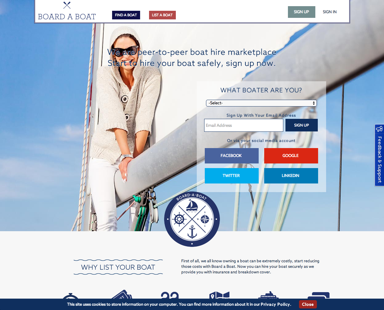

Board a boat is a boat rental service that is focused on "Connecting people who want to go boating with owners."
Wait, boating... with owners? As in, the owners will take me boating? That seems a bit awkward. Perhaps they should revisit that tag line.
Gotta love it:
1. They give a myriad of sign up options
The most of any form I encountered. This is the primary reason why I selected them for the "good" list.
They allow you to do one-step registration via Facebook, Twitter, Google, and Linkedin.
2. Simple and straightforward.
They keep the background clean and the form uncluttered.
They don't ask for any unnecessary info, just select your boater type and put in your email, and you're good to go.
And everything is above the fold. Perfect.
Gotta get rid of it:
Now, the cons of this landing page are not large in number, but are large in magnitude.
1. If they just stopped after the form, they would be close to perfect, but they don't.
The page scrolls on to try and sell you on their service, after you've already clicked on the "sign up" button.
Stop. Just stop. If a visitor has gone to your sign up page, they most likely have already seen the information they need to sign up. If they haven't, I'm sure they know where to find it.
2, Get rid of the huge footer.
It just offers more opportunities for them to click elsewhere.
Oh, and as a side note, the text over the woman's face hurts my eyes. Just make it a pretty blue seascape scene and call it a day.
4. Tambero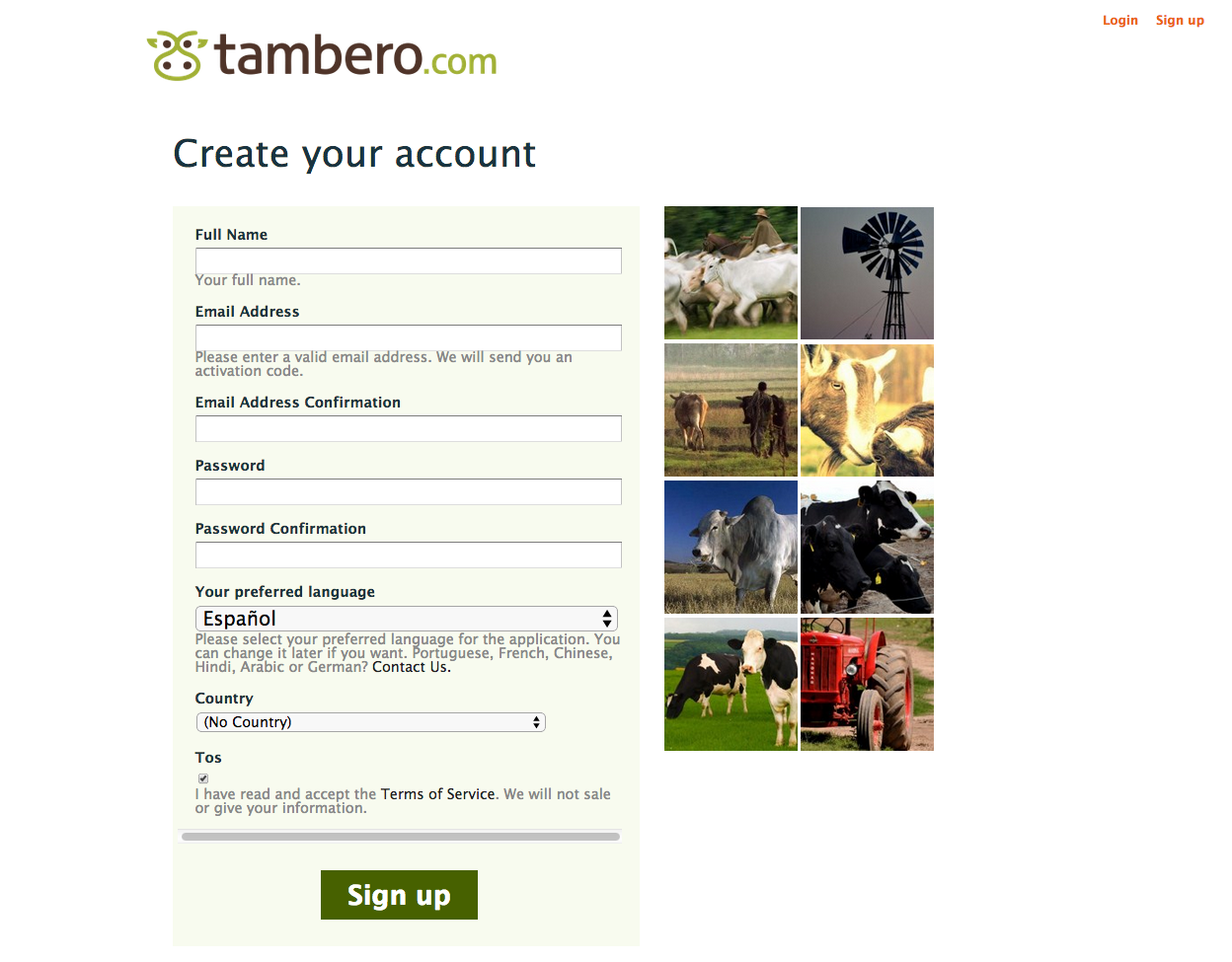

This company offers a cloud based software for cattle management. They get a few important things right, and I mean, hey, it's cattle software - I'm impressed they even have a website.
What I like:
1. No menus! Yay!
They got rid of their top menu bar so you won't be wooed away by a flashy button. And no footer either, except for the privacy policy, which is another plus in my book.
2. They only have one name field
But they put "Full Name" so you know what their expectations are for that field. I also appreciate that they ask for your phone number, and have a little description below letting you know they will send you the activation code, so no guessing what they will use your email address for.
3. The page is simple
And it includes a few cow images but nothing that draws you away from the form.
What I don't like:
1. Why ask for the country?
You can get that automatically via a hidden field that auto-populates from my IP address.
They already have a couple extra fields due to the email and password confirmation (I'd probably get rid of the email confirm myself), so any other spots in which you can cut down on your requests is good.
2. Unfinished Options
The whole "preferred language" section that only offers 2 languages and then tells you to email them for the others... it can all just go.
Have a language selection right at the beginning and guide them to the contact page or a form depending on the selection. Or don't ask at all and just have it all in the language of your primary demographic, with a caveat at the bottom of the page.
There's a few ways to go about this, and this could be the best one, but it's certainly something I would A/B test.
Not-So-Great Landing Pages...
5. Tolq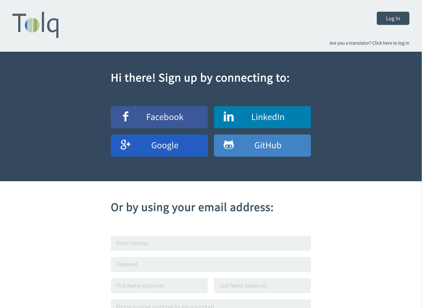

Tolq does website translation. Their entire website is straightforward and they do have a couple of buttons, on the menu and throughout the page, to take you to their sign up form.
Here's the issue. While having other sign up options (Facebook, Twitter, etc.) are good, a lot of people don't want to tie their personal accounts to a registration, especially a website in which it's not clear how that online identity might be used.
Upon going to the page, you are immediately encouraged to sign up using Facebook, LinkedIn, Google or Github. If you don't want to sign up with an account, or don't have one (hey, there's still people out there without Facebook!), then you may turn away, not realizing there is an email form below the fold.
Again, I like these options, but when you first get to the page they are all you see. These options should be small buttons below the actual form, not stationed as what appears to be the only method of registration.
Even more importantly, the page has no value proposition. Their focus is on feature and function, not benefit and value. Landing pages need to showcase the brand's unique value proposition in clear, concise language.
6. Shipstr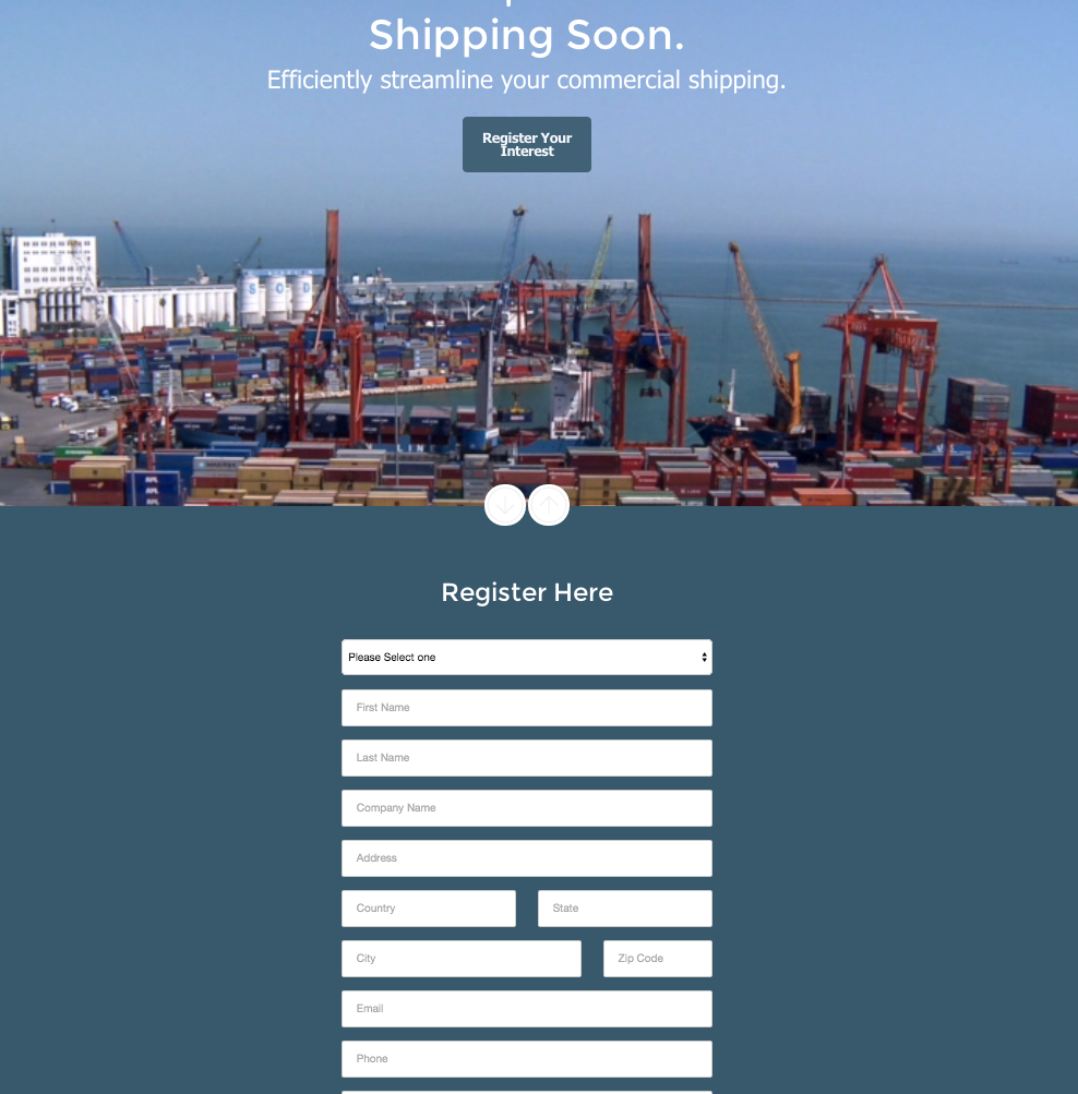

I can't really tell you what Shipstr does but it has something to do with commercial shipping. And I understand it says "coming soon," but all of the organizations on this list are start-ups, and no one gets it quite this wrong. Either way, their landing page makes me have to take a deep breath.
You really need all this information?
They ask for everything down to your country (which they could get automatically) and they in no way make it clear whether all of it is required or just some, leaving you to assume you must give it all just to get...
Why am I giving you all this information? What am I supposed to have "interest" in exactly?
If you've been paying attention, you know by now how important it is to actually tell people what they are getting in exchange for their personal information. And in this case, it's very personal, and they ask for a lot of it.
It's plain and basic, and little too plain and basic if you ask me, and nothing about it inspires me to hand over everything down to my phone number.
Conclusion
Overall, I was actually fairly impressed with the landing page standards for these early stage start-ups. It's not easy for the biggest and best companies to get it right, but at least none of them had a "reset" button.
About Lean Labs
The only outsourced growth team with a track record of 10X growth for SaaS & Tech co's. 🚀
Explore Topics

Discover the Hidden Strategies We Use to 10X Our Clients Growth in 36 Months!
The Growth Playbook is a FREE guide to planning, budgeting and accelerating your company’s growth.