
Startup Website Design: Timeless Tips From The Fastest Growing Companies
Many of the fastest growing startups are already using a buyer journey website to drive performance and growth:
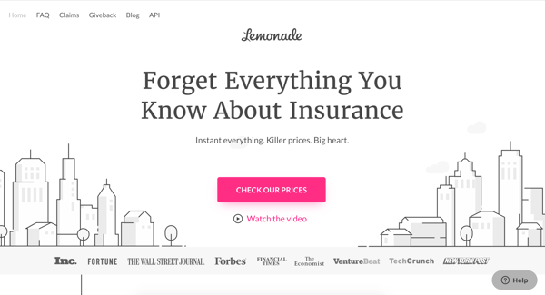
Lemonade
Lemonade is a startup striving to take the complexity (and paperwork) out of insurance. Founded in 2015 by Daniel Schreiber and Shai Wininger, the company uses chatbots and artificial intelligence to create customized insurance packages for customers.
There are a lot of things they get right on their site. To start, there's the clear messaging on their homepage targeted towards new visitors.
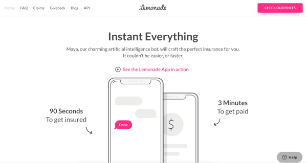
Lemonade uses modules to organize their website content, making it easy for visitors to understand who they are and what they value. They also use a strong UVP (unique value proposition), simple language, and specific detail to help the customer understand all of the intricacies of how Lemonade works.
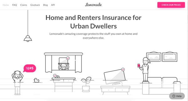
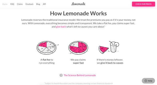
All of the homepage content serves a specific purpose, creating a cohesive narrative from start-to-finish. There's even upfront pricing to help leads self-qualify.
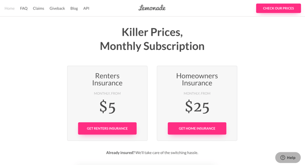
Throughout their homepage, Lemonade does an exceptional job at answering the two questions every new visitor has: how does Lemonade work and how much will it cost me?
The minimal, yet effective copy and flow of this homepage are what makes it an A+.
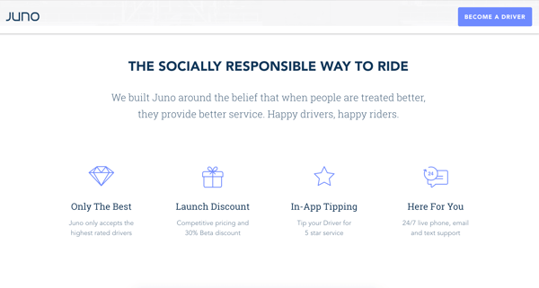
Juno
Uber and Lyft may have been a great side-hustle in the beginning, but drivers are growing tired of low wages and long hours. Juno, a new ride-share company, recognizes this and wants to attract the high-quality drivers that other ride-sharing companies neglect.
Founded by Talmon Marco in 2016, the company attracts potential drivers by giving them a more substantial cut of their ride revenue. They attract riders by promising happier drivers (that probably do not insist on being tipped.)
With this advantage, they differentiate themselves as the more compassionate, caring brand from the very beginning.
The first element is in their H1, which says "Juno treats drivers better..."
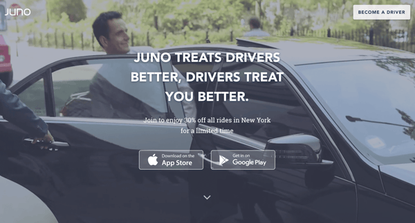
It's a powerful way to appeal to the more socially conscious rider, which may object to the poor treatment and pay of drivers at other companies. For Juno customers, it's not just about getting a cheap ride. It's about doing something good for the driver and having a pleasant trip.
Waggel
During the awareness and interest stages, you have to stand out to get the attention of your ideal customer. Because there are always other products and services trying to get into their wallet. For pet lovers, it's treats, toys, pet visits, brushes, and if you love your pet a little more than anyone else, birthday parties.
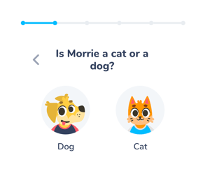
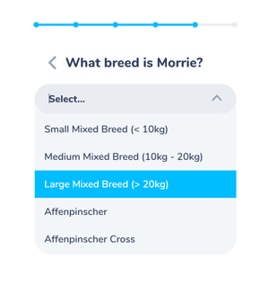
Another thing that you could spend money on is pet insurance. And while you may not think you need pet insurance, UK startup Waggel makes a pretty strong case for it. The company, founded by Andrew Leal and Ross Fretten in 2018, helps make pet insurance accessible with something they call “fully digital” pet insurance.
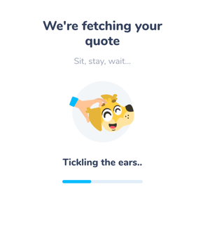
Their website content and illustrations explain to new visitors what they get from pet insurance, and what goes into determining the cost. One of it's best features is an engaging, interactive form.
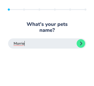
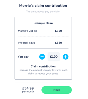
The form makes it easy to see the math behind your quote. There's an overview of your monthly payment and where all of the money goes, making the cost seem more reasonable.
Bright Health
Healthcare is a delicate topic. Around 44 million Americans do not have health insurance, due to cost, preexisting illnesses, and more. But Bright Health, a startup founded in 2016 by Bob Sheehy, Kyle Rolfing, and Tom Valdivia, wants to help with that.
They want to deliver "stress-free" healthcare to their customers by offering a flexible individual, family, and Medicare Advantage plans. There's more than one ideal customer here, so Bright Health needs to appeal to a few different types of people.
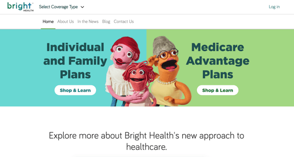
That's why they use a split call-to-action at the top of their homepage to direct visitors toward the right plan. The split CTA is a great way to appeal to more than one kind of persona, getting them on track with the proper path from the very beginning.
(And all of their imagery site-wide is of puppets, which is fun.)
You want to provide these clear paths, especially when you have different primary products and services. Otherwise, your visitor will have no idea where to go or find what they're looking for on your site.
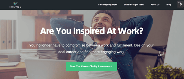
HireVibe
Similar to Bright Health, HireVibe caters to two different personas. Founded by Tariq Al Muhtasib in 2018, HireVibe is a leadership coaching, personal branding, and talent agency all rolled up in one. They strive to match candidates with inspired work, as well as companies with energetic, enthusiastic job seekers.
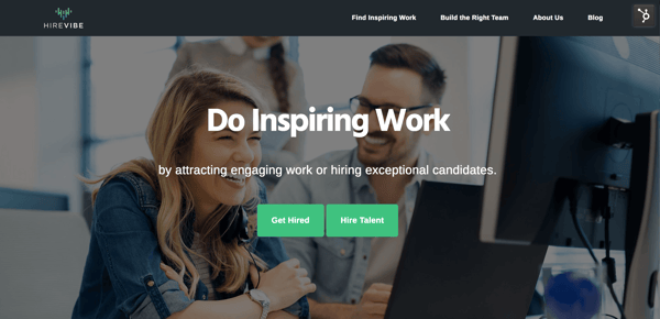
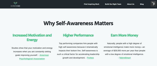
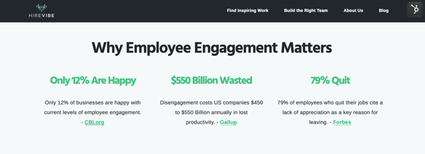
HireVibe speaks to both personas on their site with sleek modules and engaging statistics. At the top of the homepage page, there's the same split call-to-action, as well as two calls-to-action at the bottom.
The site branches out from there.
The job seeker goes to a "Get Inspired" page and the company goes to a "Hiring Talent" website page.
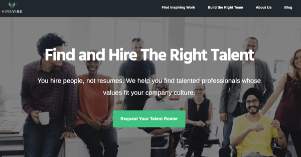
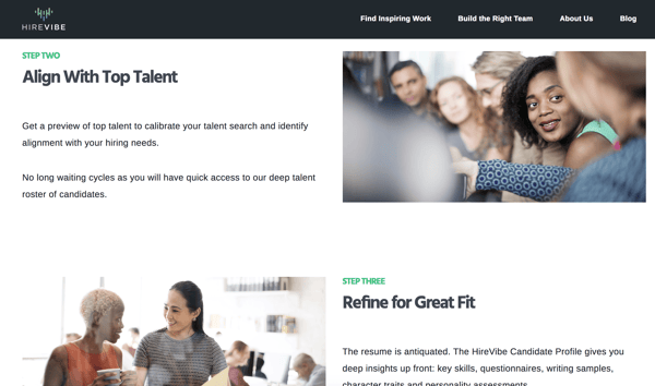
On each of those pages is a further direction. For companies, you can walk through the steps to get a roster.
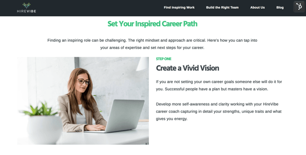
If you're a potential job seeker, you can take their career clarity assessment.
You can copy this tactic and provide your primary service offerings at the top of your homepage as well, and help that inform the flow of your site. Overall, building these paths can reduce your bounce rate, eliminate confusion and improve the overall UX.
Legacy
Legacy is a startup for men who want to test their vitality and ability to father children, even before deciding to have any children. Founded in January 2018 by Khaled Kteily and named Startup Battlefield at Disrupt Berlin 2018, Legacy provides fertility kits, encouraging men to rethink family planning.
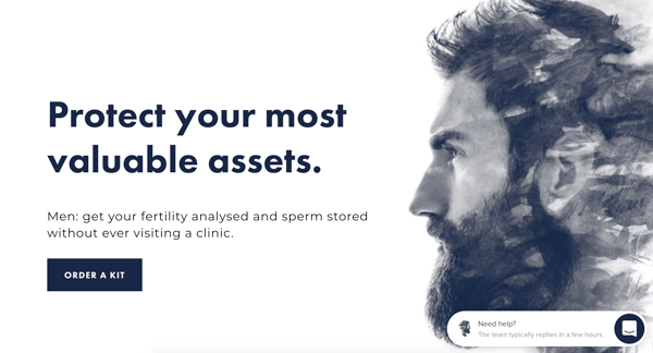
Fertility can be an awkward conversation to have. Legacy succinctly breaks it down into easy steps on their products and process website pages.
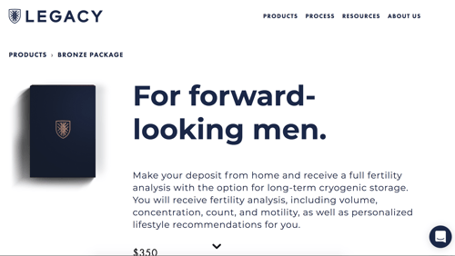
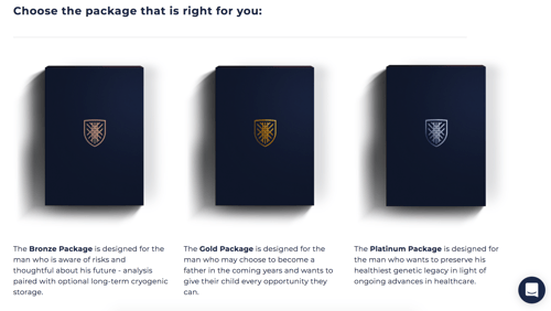
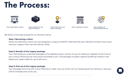
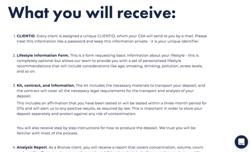
Legacy's site provides essential context and is completely transparent about the process. Rather than burdening customers with details, Legacy sticks to essential content, such as how they send in a kit, details about storage, what each kit includes, and the various pricing tiers for their boxes.
N26
I'll admit, as a professional in her 30s, the idea of starting a new bank account or switching banks does not appeal to me. It seems like it would be a huge hassle. However, a lot of my online banking experience (as of now) is frustrating.
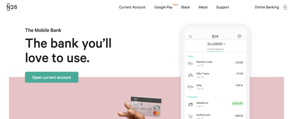
N26 , a German-based mobile bank, hopes to attract clients like me with an easy-to-use app and more modern, useful banking features. Founded by Valentin Stalf and Maximilian Tayenthal in 2013, N26 wants to be "the bank you'll love to use."
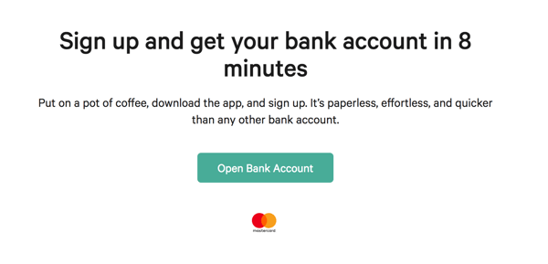
N26 uses the exact frustrations that the modern banker has with online banking to create website content that confronts each feeling or fear with a solution.
For instance, on their homepage, they don't just direct you to open an account. They tell you how long it will take to create and access your account, addressing any concern that it will take too long.
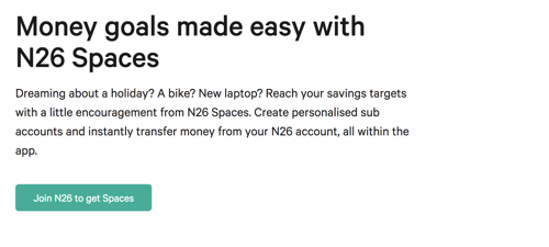
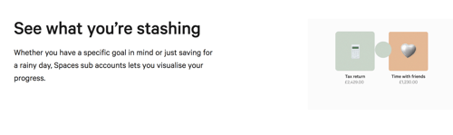
They also use the wants and desires of their average customer, such as being able to save up for costly expenses, to position their stashing feature. Instead of opening a separate savings account, N26 tells you, you can simply create sub-folders to store money away within your primary N26 bank account.
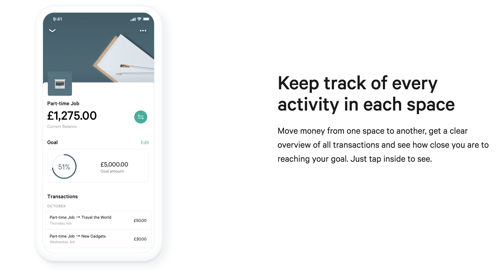
N26 also makes it very easy to read their website content with a modern, modular design. While the concept of an online bank can seem complicated, the N26 website makes it look simple and even beneficial.
The Water Scrooge
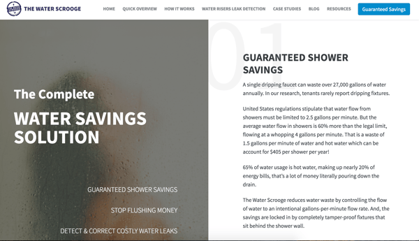
The Water Scrooge is a device that regulates shower flow, making it possible to conserve more water. Founded by David Schwartz in 2009, The Water Scrooge can help you save 35% or more on usage.
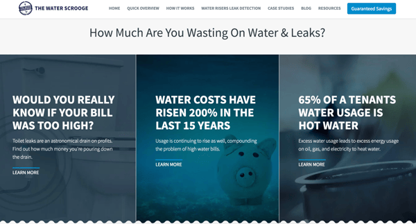
The Water Scrooge homepage delivers a lot of content that answers basic questions about water usage like, "why is my water bill too high?" or "why are my tenants using so much water?"
The Water Scrooge also makes it easy to see how much money you could save using their product with their savings calculator.
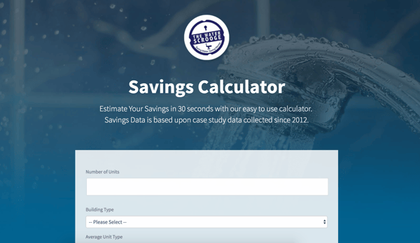
On this savings calculator form, TWS collects critical data about potential leads, such as the numbers of units the landlord has, the building type, the average unit type, and more.
All of this information is fed into the website and comes up in their CRM, giving them a lot of context about who their customer is, and what kind of solutions could work well for them.
It also helps TWS see whether or not the lead is a strong match.
At that point, the website is basically a sales lead vending machine.
SUPPORTING THE buyer journey
With excellent website content, an intuitive flow, and pages and material to support every stage of the buyer journey, you can create a high-converting website for your startup. However, if you really want to kick your efforts into high gear and get the best possible ROI from your site, you need to invest in a COS like HubSpot.
With HubSpot, you can use features like smart content, progressive profiling, lead scoring, and a completely integrated CRM to put your website to work. With our savings guide, you can learn how to get the most out of HubSpot right away and save up to 60% off in your first year.

About Lean Labs
The only outsourced growth team with a track record of 10X growth for SaaS & Tech co's. 🚀
Explore Topics

Discover the Hidden Strategies We Use to 10X Our Clients Growth in 36 Months!
The Growth Playbook is a FREE guide to planning, budgeting and accelerating your company’s growth.