-
What is Website Menu Design?
-
Why Does Effective Website Navigation Menu Design Matter?
-
11 Examples of Stunning Website Menu Design
-
1. SQUARESPACE
-
2. LONG STORY SHORT DESIGN
-
3. EDWIN EUROPE
-
4. MOSTLY SERIOUS
-
5. SAM GODDARD
-
6. PIPE
-
7. SercoPointWeb
-
8. Stripe
-
9. William LaChance
-
10. I Love Dust
-
11. Calvin Pausania
-
6 Website Menu Navigation Best Practices
-
1. Web Navigation Must Be Intuitive
-
2. Website Menus Should Be Deep, Not Wide
-
3. Website Menu Items Should Be Clearly Labeled
-
4. Website Menu Items Should Follow a Buyer’s Journey
-
5. Website Menu Items Must Limit Header Navigation
-
6. Website Navigation Should Be User-Centric
-
Making the Best Website Menu Design

11 Creative Website Menu Design Examples You Need to Copy
Are you more likely to walk through a well-lit, beautiful archway that shows the well-kept room beyond it, or an opaque, rusty door that leaves you wondering whether you’re heading into a cozy shop or a sketchy back alley? It’s an easy question to answer.
Your website menu is the entryway to your website. It’s easy to ignore it in favor of other website elements, but think of it this way: It doesn’t matter how beautiful the room behind that rusted, unappealing door is—Your customer can’t see what’s behind it at a glance. As a result, most people aren’t going to want to walk through.
Modern consumers are notoriously impatient and will only give your website a few micro-moments before they bounce to a competitor. A confusing navigation structure will frustrate your potential customers quickly - and no one wants that!
Neil Patel reports that website navigation has a bigger impact on usability and user experience than almost any other factor in your website design. The more usable and welcoming your website is, the more likely a visitor is to stay. And the only visitors who convert are the ones who stick around..
This post will cover the basics of website menu design. We’ll show you some stunning examples of website menu designs you can use for inspiration, then cover the six best practices of website navigation menu design.

Before we get into our examples of stunning website menu designs, let’s first answer a foundational question: What is website menu design? Your website menu comprises a series of links that allow a visitor to easily traverse your website.
The design of your website navigation menu consists of the links you choose to include in your navigation, the way you present them, and the way in which those links are organized and structured in the menu.
Ideally, your website menu will give your site visitors a window into the rest of your website content, allowing them to navigate to the pages they’re looking for (and the pages they’re most likely to convert on) with ease.
Website navigation menu design is the difference between a bounce and a conversion.
Consider the last time you went to a website without converting on any offers. What was the reason you bounced back to the Google results page, selecting another link in place of the page you’d originally visited? For most people, it’s because they weren’t able to find what they were looking for on the first site.
One of the top reasons for a high bounce rate on a website is a poor user experience. As we mentioned previously: Website visitors aren’t known for their patience. If your site can’t answer their question quickly and easily, they will leave your site in favor of a site that can.
Let’s take a look at some examples of website menu designs that work. We’ll discuss why they’re effective and what you can apply from these designs to your own website navigation menu.
1. SQUARESPACE
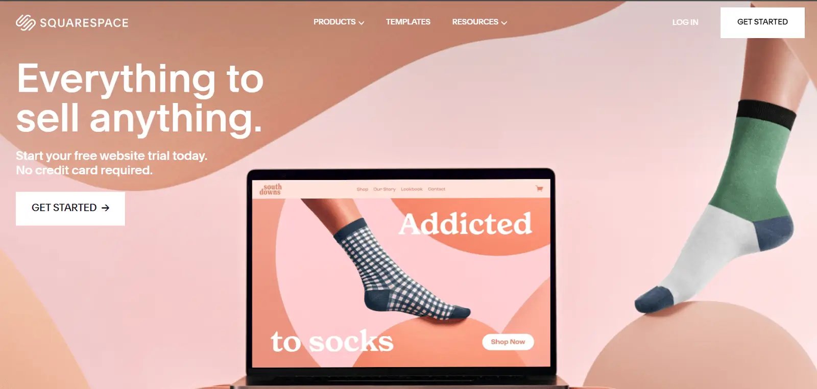 Squarespace offers a clean, simple menu bar at the top of the screen. By scrolling over this menu, you gain access to more specific information related to the menu option over which you’ve covered:
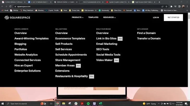 Why it Works: Squarespace’s menu design is effective because if offers first-time visitors the ability to access a lot of information without crowding the initial navigation bar with an overwhelming number of options. If your brand has a complex product or serves a wide variety of customers with different purposes, this dual menu style might be something to consider for your brand.
2. LONG STORY SHORT DESIGN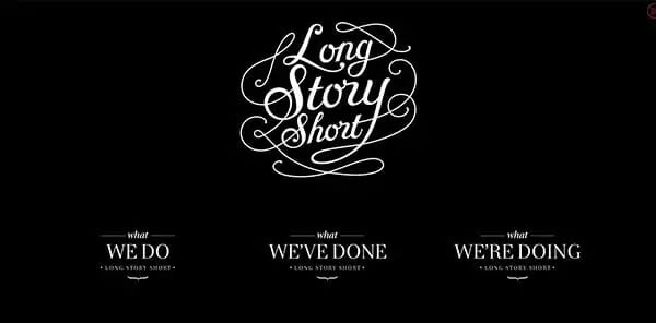
By far the most atypical website menu in this list, Long Short Story manages to break many conventions of user-friendly menu design and still have an incredibly easy-to-navigate website. Each option clicks through to a page that offers additional information and menu options, giving the visitor many options for navigation, again, without crowding the initial page.
Why it works: The simple, three-item menu at the bottom of the page works because the brand's site is so visual-heavy. The page is in constant motion, starting with a loading graphic that appears to scrawl the brand name across the page. Contact information is available upon scrolling, and the ability to sort and search is featured on internal site pages, giving a visitor a multitude of navigational choices without overwhelming them.
3. EDWIN EUROPE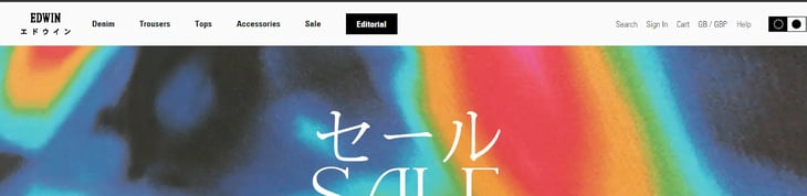
The denim brand's website features a top-of-screen navigation bar, which is convenient for the user as it allows them to view all the major offerings of your website immediately upon arriving to your site. In the case of Edwin Europe, the menu items produce additional drop-down menus with more specific options.
Why it works: This unobtrusive menu works well for Edwin Europe because, like many clothing brands, this site dedicates much of its home page real estate to images of their products. If your site sells a visual product like clothing, artwork, or anything else where the shopper shops with their eyes first, you may want to explore this option.

4. MOSTLY SERIOUS
Mostly Serious uses a sidebar menu, accessible with the classic “hamburger” icon on the righthand side of the screen. Selecting this menu dims the rest of the screen, bringing up a simple menu with additional links.
Why it works: This style works for Mostly Serious because it gives them the space to tell the story of what their business can do for customers without the interruption of navigation—essentially, letting them introduce themsleves before the visitor dives deeper into the site. Additionally, sidebar menus are an excellent choice for mobile-optimized websites because they scale well and are easy-to-use on any device, from full-sized desktop computers to smartphones.
5. SAM GODDARD 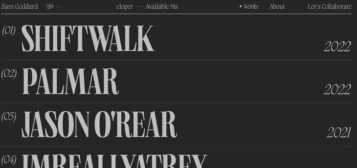
Sam Goddard’s page is an interesting example because, effectively, the entire page is a menu. Truthfully, the navigation menu holds only three options: “Works,” “About,” and “Let’s Collaborate.” However, the home page defaults to the “Works” page, automatically bringing up a full list of the works available to select.
Why it works: This site menu works because the customer base coming to this website is looking to vet this developer’s work to see if they might want to collaborate. Instead of beating around the bush, this website puts the proof and examples of work front and center, allowing a website visitor to browse their greatest success stories with ease.
6. PIPE

Pipe takes a fairly traditional approach to menu navigation. Their menu bar is sleek and clean, offering their top links and highlighting their offer to “Get Started” by circling it in white. This option makes it stand out on the otherwise black page.
Why it works: This works so remarkably well because the simple, straightforward menu serves initially hidden menu serves to enhance the site's ultra-clean first impression. If your website visitors are looking for a no-nonsense website with clean design and no spice, this may be an option for you.
7. SercoPointWeb

SercoPointWeb’s site, at first blush, appears not to have a menu at all. Instead, there is simply a modern take on the hamburger icon in the upper right-hand corner. When selected, the menu folds over the entirety of the page, offering a two-column menu.
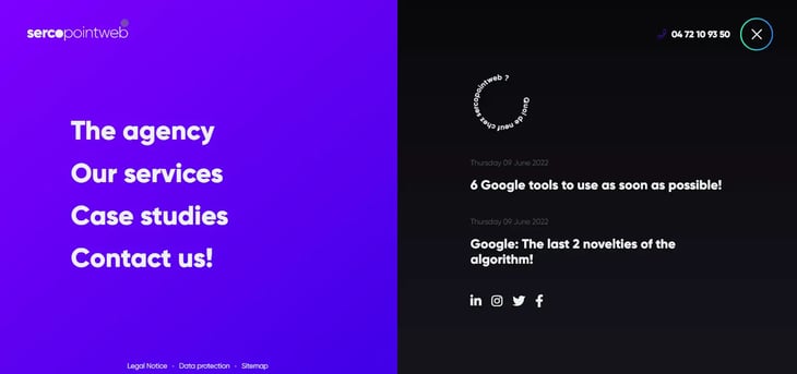
Why it works: This design works because it allows the initial page to be clean and simple, while still giving the visitor access to their most important links. Their classic menu sits on the left hand side of the new menu page, whereare their most recent blog posts populate on the right. If you’re looking to drive more traffic to your blog or another type of content source, this may be a good option for you.
8. Stripe
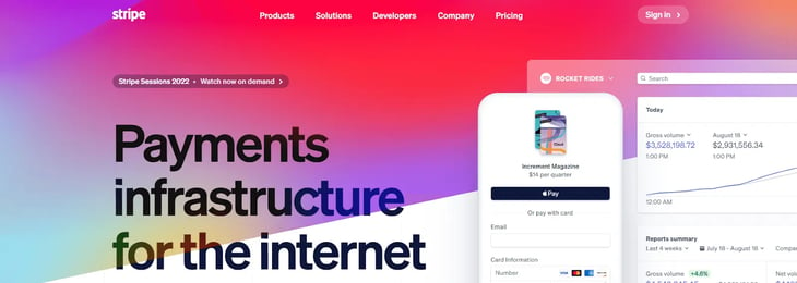
Stripe’s menu, at first, appears to be a simple, standard navigation bar. However, the bar expands when hovered over, revealing an extensive number of options for the visitor to click. This allows Stripe to offer easy navigation to a wide variety of options without crowding the home page.
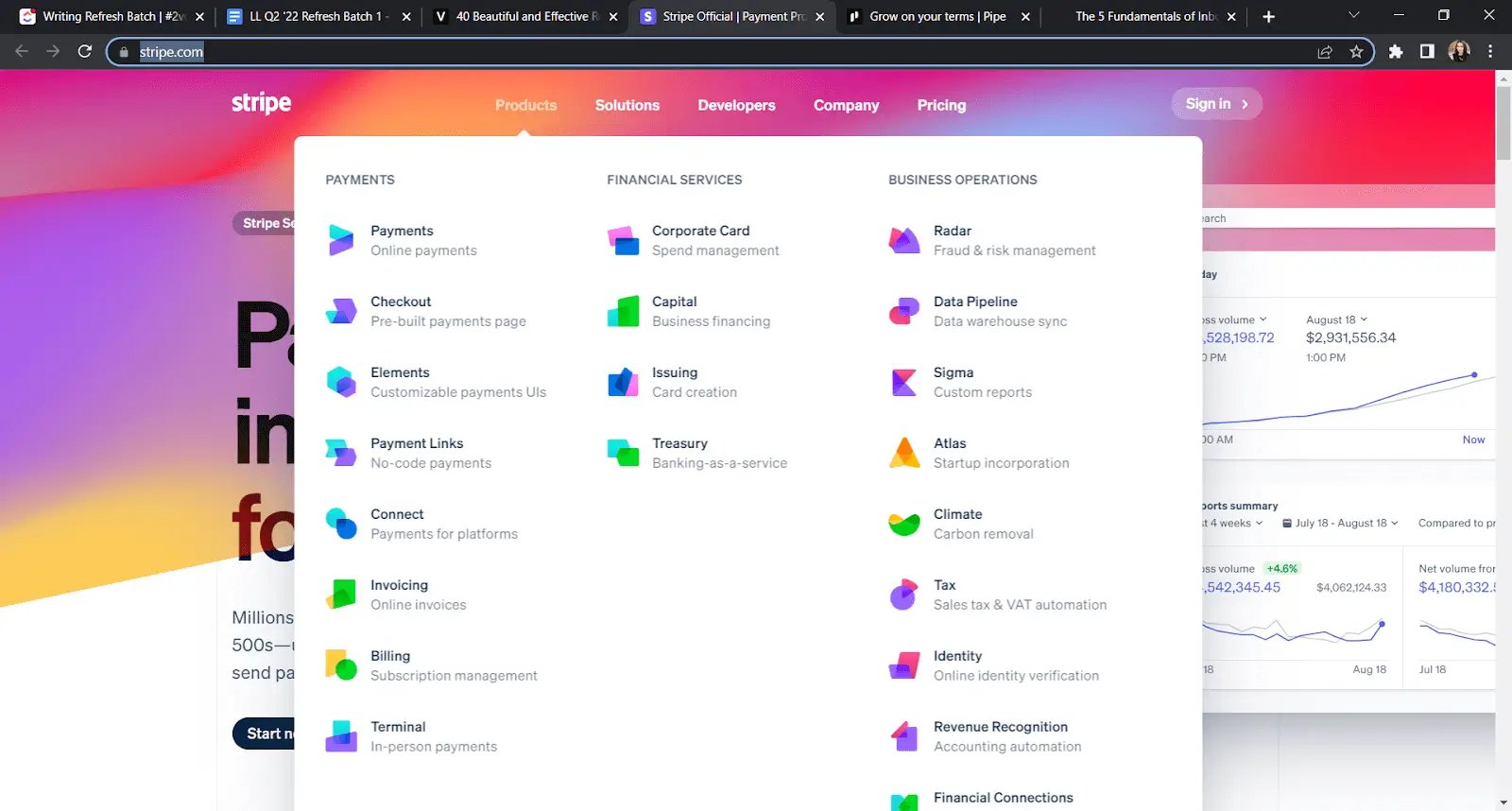
Why it works: If you offer a complicated product or service, offer a wide variety of different products or services, or target a diverse market with different purposes for coming to your site, this option may be a great menu to test out on your own website.
9. William LaChance
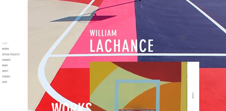
William LaChance’s website navigation menu is unique in that the menu is the homepage. At first, it appears to be a simple sidebar menu—and a visitor can use it to navigate as such—but the menu also integrates with the design of the entire home page, using imagery to highlight the various menu options as you scroll.
Why it works: This design works because it keeps the menu simple and easily clickable for visitors while still giving the site the chance to highlight each option more fully as a visitor scrolls down the page. If your product or service is more visual in nature, this may be a great option for you to use to highlight some great images while still serving the purpose of a clean, navigable menu.
10. I Love Dust

Some may find the I Love Dust homepage to be overwhelming and a bit chaotic with its ever-changing videos taking center stage, but for their target customer this is exactly the type of site they’re looking for. The menu for I Love Dust allows that video to shine, spreading the options for navigation out into the four corners of the screen.
Why it works: This design works because it allows the menu to stay simple while the video in the center of the screen steals the show. If you’re looking to fill your homepage with imagery, videos, or gifs, you don’t intend to have a homepage that needs a lot of scrolling, and you want to try something a little different, this may be a good option to test out.
11. Calvin Pausania
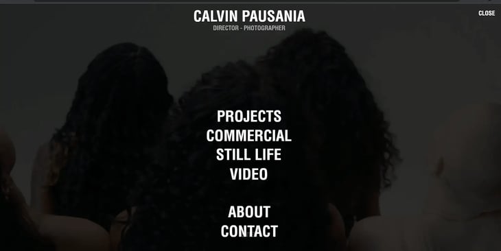 This photographer and director uses his menu to do double-duty. The full-page menu allows the visitor to easily click to the page they’re looking for while the greyed-out background features an ever-changing cycle of the artist’s work and portfolio.
Why it works: Here, the imagery is still showcased, but the menu takes the front seat. If you want to share images of your product or other important branding material, but you still want the navigation to shine, this may be a good option for you.

6 Website Menu Navigation Best Practices
Above all else, a good website navigation structure is easy-to-use. This factor carries an immense amount of weight in how your brand is perceived by first-time website visitors.
Your navigation can confuse and frustrate, or it can build trust.
Usability experts estimate that some 50% of sales are lost because potential customers can't find the information they need. Here are some characteristics the world's most effective website menus have in common:
1. Web Navigation Must Be Intuitive
Consumers form first impressions of a website in just 0.2 seconds. The average prospect spends just 6.48 seconds interacting with a navigation bar. If your website navigation isn't simple enough that visitors can immediately tell where to find their desired information, your menu design is probably to blame.
The golden rule of web design for usability is "Don't Make Me Think," which is also the title of an excellent book on user experience. Your consumers don't have the patience to brain-power their way through hacking your menu structure. Using it should come naturally.
2. Website Menus Should Be Deep, Not Wide
Unless your website consists of six pages, you can't cram every option into your primary navigation menu. Instead, design a "deep" menu, where each option represents categories. Each category can lead to an easy-to-use sub-menu of relevant options. To be clear, sub-menus aren't your only option, and website developers have creative freedom when it comes to presenting sub-categories of information. However, keeping your primary menu from appearing crowded is critical.
There is no hard-and-fast rule when it comes to a maximum number of options that can appear in your main website navigation. Conventional usability wisdom dictated between five and nine items. However, this rule can vary according to brand. Keeping your menu simple, and opting for a "deep" presentation of information with sub-menus instead of a wide, hard-to-use navigation bar matters.
3. Website Menu Items Should Be Clearly Labeled
We've had clients who were opposed to using the word "blog" in their website navigation structures because that word has a negative connotation in their industry. We maintained that calling the blog section "articles" or "resources" would have a negative impact on user experience because it's less clear. Turns out, our A/B test data indicated it did. Always opt for simplicity and clarity.
The value of creativity in naming website menu items is pretty limited. Often, opting for anything less than the most obvious choice or most common primary menu items will frustrate site visitors. If someone is seeking your brand's contact information and it's buried in a sub-menu or named something really odd like "where to find our treehouse," you could lose the opportunity to win leads and sales.
4. Website Menu Items Should Follow a Buyer’s Journey
Your website navigation bar is more than just a list of links: It’s a treasure map that leads visitors (we hope) toward booking a call or making a purchase. As a result, your website navigation menu should serve that purpose. Instead of including options that simply lead a visitor to your “about” page or your “pricing” page, you should start your navigational journey by indicating to your customer that you understand their struggles.
Consider structuring your menu to provide options for cold visitors who are just learning about the challenges they’re facing, warm visitors who understand their problem and are looking for a solution, and hot visitors who are trying to evaluate whether or not you are the right solution for their problem.
With this setup, your home page navigation has a menu option—and a journey—for every visitor, regardless of where they are in their process.
You have a lot to say with your website. The point of your website is to guide your visitors through the journey we discussed above and, ultimately, to a call or sale. As a result, you may be tempted to offer visitors everything under the sun, right from your homepage.
This is a mistake that will overwhelm visitors and cause them to bounce.
Instead, you want to limit your header navigation to the essentials, trusting the flow of the rest of your site to guide visitors where they need to go.
Lastly, as much as your website’s goal is to ultimately lead a visitor to convert, you have to remember that you can’t do that by building the website and its navigation around your needs.
Instead, build your website navigation menu around your user’s needs. What questions are they coming to your site looking to answer? If you can provide that value quickly and easily, they’re more likely to stay on your site and convert down the line.
Clear and intuitive website navigation guards against frustrated first-time website visitors who bounce off your site to visit your competitor. A well-designed menu is a sales asset that can seamlessly guide your prospects throughout their research process.
If you're unsure how your menu stacks up, take a moment to review it carefully. Better yet, run some usability tests with individuals who've never seen your website before. If there's a hint of frustration, consider redesigning with these guidelines and examples in mind.
However, your website menu is only one piece of the puzzle. You’ll only be able to effectively build your navigation menu if you have a deep understanding of the target customer, a compelling buyer’s journey for them to follow, and irresistible offers along the way to keep them engaged.
To learn more about how you can level up your website—and your brand–check out our free Growth Playbook.

About Lean Labs
The only outsourced growth team with a track record of 10X growth for SaaS & Tech co's. 🚀
Explore Topics

Discover the Hidden Strategies We Use to 10X Our Clients Growth in 36 Months!
The Growth Playbook is a FREE guide to planning, budgeting and accelerating your company’s growth.