-
The Common Thread of the Best Lead Generation Websites
-
The One Thing: Buyer Journey
-
What Is a Buyer Journey?
-
The Common Thread
-
Choose Your Own Adventure
-
Brands That Built a Great Buyer Journey
-
Example 1: Wealthfront
-
Example 2: Slack
-
Example 3: StoryBrand
-
Example 4: Neil Patel
-
The Cost of a Customer-Centric Buyer Journey
The Best Lead Generation Websites All Have This One Thing in Common (Examples)
Want to know who’s website stinks?
It’s this guy's!

It doesn't really surprise me. You never hear Gary talk about websites. They aren’t very important to him.
That’s obvious when you reach their website.
What’s wrong with it?
It’s devoid of education, and the only way to become a lead is to fill out the bottom-of-the-funnel form, which is the same on every page.
When you look at the menu, there’s a catchy, natural flow of options: who, what, how, let’s connect. But, when you look at their homepage, they do that flow out of order. When you click “how,” they take you to a portfolio of client videos… which isn’t expected.
It's terrible.
I think they know it. The website is not meant to be much of an asset at all. It seems like it’s just there to catch whatever BOFU leads navigate there.
So, how does Gary Vee get away with it?
The Common Thread of the Best Lead Generation Websites
Gary Vaynerchuck is a celebrity.
He’s speaking at conferences everywhere. He’s got a huge following on YouTube and social media. His marketing is himself.
I’m not dissing that. It obviously works!
Gary Vee is owning a very competitive field by playing a different game than everyone else. His entire marketing, lead nurturing, and funnel, take place through his content. And, he achieves so much volume, the leads come to them ready to buy.
He even admits it in a lot of his content, saying that a lot of VaynerMedia customers come wanting access to Gary, which they don’t all get, obviously.
Now, here’s the truth: you’re not Gary Vee.
And, more than likely, if you’re reading this post, you don’t have the name recognition, the influencer status, nor the gargantuan following that he has, either.
Your website is critical to your success. It has to be a relationship-builder with visitors who are not visiting with the intent to buy.
Most of your website visitors are in search of a very particular thing. And this thing is what a lot of companies forget about when designing their website. Which is why they don’t get the results they want.
If I had to, I would wager that if you audited your own website, you would find you lack this one thing, too.
The One Thing: Buyer Journey
A common marketing mistake of B2B organizations is that they view their website as an interactive brochure. That it’s their opportunity to talk about themselves, or “get their message out.”
This mistake manifests first through their sitemap. The pages they choose to build are chosen based on their importance to the brochure. In many cases, this is detected through an unhealthy obsession with the “about us” page.
Seriously, brands get very narcissistic when they build their website. And, they make a fundamentally flawed assumption that their website is about them. And, this assumption is the reason they miss a huge opportunity to gain market share and attract leads with enough momentum to become not just customers, but fans.
I dare you to look at your website through your customer’s eyes. Can you honestly say that your website is more about your customer than your brand?
If you answered yes, you’re either deceiving yourself or you’re in a very small minority.
What Is a Buyer Journey?
The technicalities of this probably change from one marketer to another. From a very high level, we all agree, it’s the natural steps a customer takes from stranger, to awareness, to consideration, to decision, to customer.
You could describe it as a funnel or flywheel. But, then again, those terms can be applied to the journey, or they can be applied to your marketing assets… it gets fuzzy.
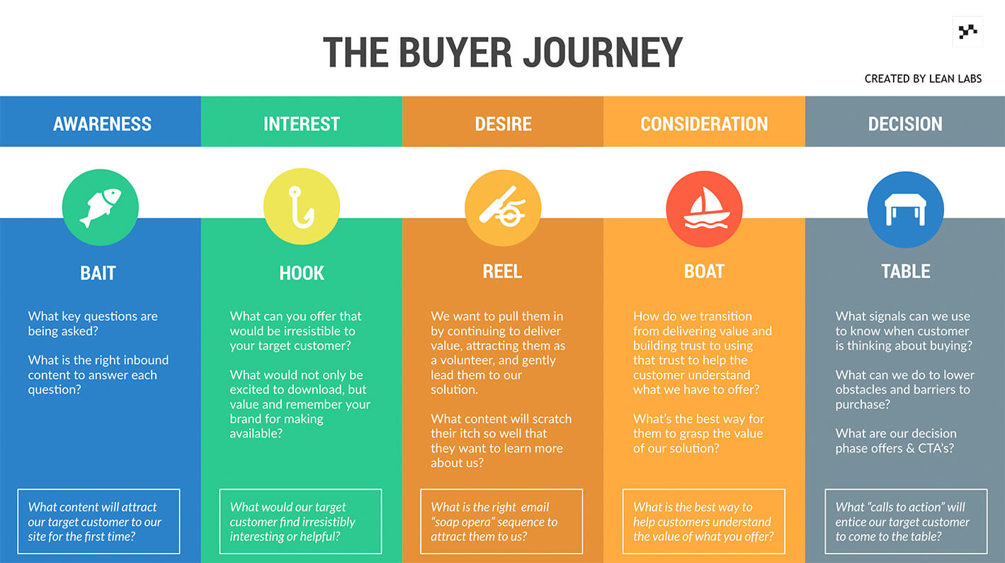
So, rather than trying to give you an ecumenical answer that no one will disagree with, I’m going to give you my answer. This is what we at Lean Labs think the essential buyer journey is; and it comes in five steps.
Step 1: The Awareness Stage (The Bait)
What needs to happen to introduce your brand to a prospect that doesn’t know you exist? Or, at the very least, aren’t really considering you as a solution, yet.
Step 2: The Interest Stage (The Hook)
What needs to happen once you’ve earned your prospects initial attention? It might only be for a few seconds, so it needs to be really good. Something that piques their interest is key.
Step 3: The Desire Stage (The Reel)
What needs to happen to get the customer to want what you offer?
Step 4: The Consideration Stage (The Boat)
What needs to happen to get the customer to fully understand the value of your offer, and whether or not it’s the best fit for their needs? (Yes, the best buyer journey will inform the bad fits that they are bad fits… you may lose a sale, but you keep your brand integrity and you build trust equity.)
Step 5: The Decision Stage (The Market)
What needs to happen to help the prospect understand the value of buying now, as opposed to spending more time weighing their options. If the previous stages were all done well, the prospect understands the value and the fit. The last hurdle is to help them make the decision now.
The Common Thread
Notice, none of these steps include understanding your brand, your message, or who your CEO is. They are all 100% about the customer.
When you get the buyer journey right, you stop broadcasting your solution. You stop leading with your solution, and instead, lead your prospect to your solution.
That’s not a subtle difference, but it does make a dramatic difference on website performance.
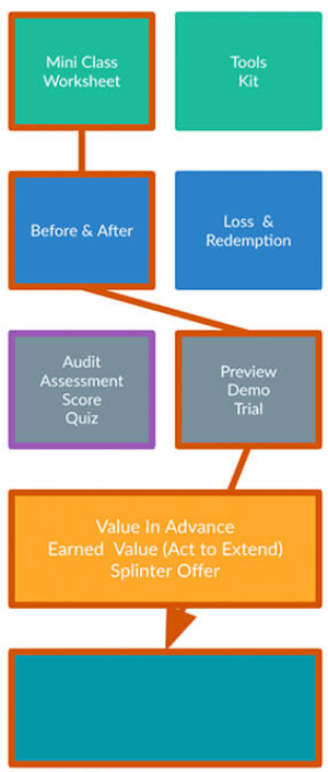
Let’s look at the buyer journey from a different angle, an inverted one.
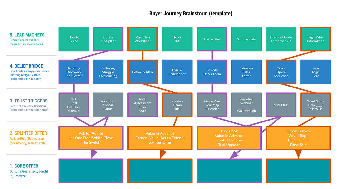
This view helps us to brainstorm how those five stages can be implemented into our sitemap, lead magnets, nurturing… really, this a holistic view of our marketing strategy from the introduction to the close.
Which brings me to one of the most important elements of a high-conversion website: **the total lack of dead ends. **
Even if this brainstorming slide grows infinity wide, every single new block should have a natural flow down to the purchasing decision. In fact, you could add a whole new level under the purchasing decision if you wanted to move your customers into being brand evangelists.
Choose Your Own Adventure
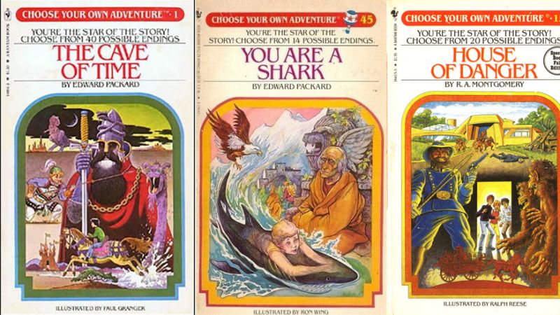
You know those books that let you make choices at the end of each chapter? Did the character do this or that? Then, depending on which choice you make, you turn to a specific page to see what happens next. And this continues until the story is over.
That’s literally what your website should do.
Think of your homepage as chapter 1. You may want your pricing page, or your demo, or whatever to be chapter 2. But, unless you’re Gary Vee, it ain't happenin’ as a general rule. Instead, your website visitors will make a choice as to which page they visit next.
If you look at the data, you can find what the majority prefer as chapter 2 and promote it in priority on the homepage.
 Now, when 80% go to chapter 2, that page needs to offer the logical next step, or chapter 3. Again, 15% might decide to go to a different page, but if you offer the* logical* next step at the end of chapter 2, the majority are going to follow that flow.
What about the 20% that skip chapter 2, and navigate straight to chapter 5?
Don’t worry about them. Let them choose their own adventure.
Your job isn't to drive their journey, it’s to facilitate it. Therefore, if someone leaves chapter 1 (homepage) and goes to chapter 5, your job is to make sure you offer chapter 6 as the logical next step on that page.
Regardless of which page a person lands on, your job is to offer the logical next step.
Here’s the key, though: the next step has to be logical to the customer, not your brand.
Some brands think the logical next step to everything is “contact us!” (cough, cough, Gary Vee). But, unless you have serious trust capital already, it ain't gonna work.
Brands That Built a Great Buyer Journey
So, we’ve seen the bad in Gary V’s website. Let’s look at some brands that are doing things right!
See if you can pick the common thread out in all these examples.
Example 1: Wealthfront
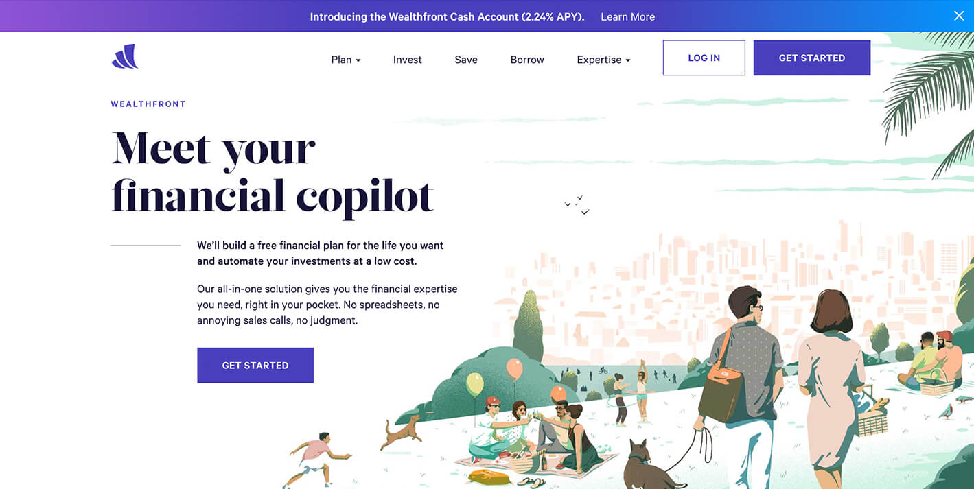
Their homepage is brilliant.
The header isn’t shy about asking you to take action. They assume that, since you’re visiting their page, you are ready to start working on the financial problem at hand. So, the CTA is very BOFU, but the message is brilliant.
They know their customers don’t want to spend their time managing their financial plan. So, the UVP headline is about getting a copilot. In other words, go to sleep, we’ll make sure the plane doesn’t crash.
The sub-headline talks about getting a free financial plan, which is risk removal. And, it promises them the life they want. No particulars, no definitions, it’s the prospects right to have the dream they want.
Notice the last line, this is the trust-builder: No spreadsheets, no annoying sales calls, no judgement.
Where does that come from?
They’ve done their research. Their target customers hate spreadsheets. They hate sales calls. Who doesn’t?
And, they don’t want someone telling them what they should do with their own money.
That’s the big one, it’s the momentum-builder, which is the reason it’s the last thing they read before they get the first call to action.
What about the majority of website visitors who aren’t sold?
This is where Wealthfront’s website is brilliant, in my opinion.
They start appealing to the wants of their target personas, and they address the concerns and fears as well.
See this section:
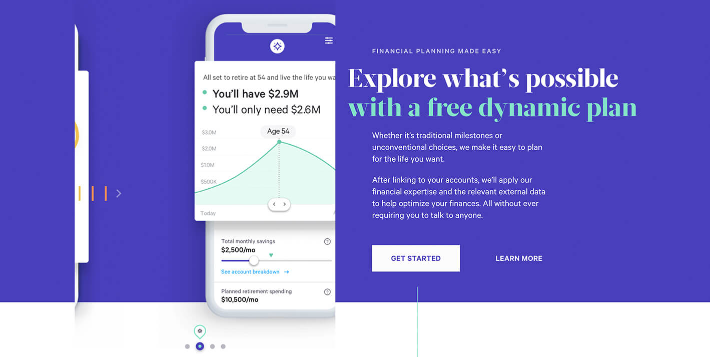
Notice the message: It’s the experience you want.
- It’s easy.
- It’s valuable, and free.
- Do what you want.
- We’ll help you.
- You don’t have to talk to anyone!
Then, there are always two choices (choose your own adventure): Get Started, or Learn More.
Next Section:
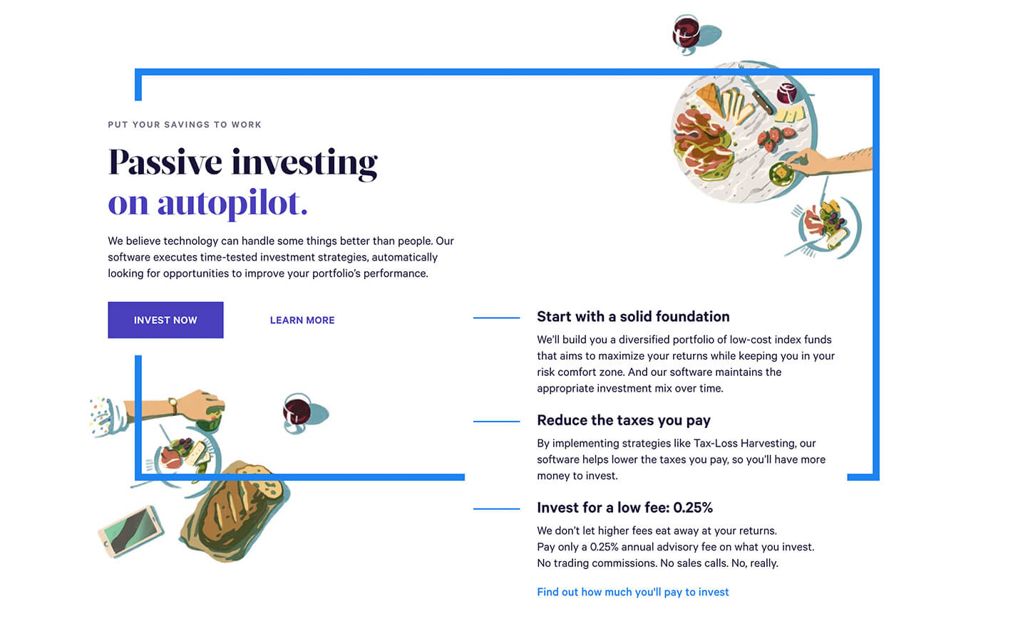
Notice the message addresses concerns:
- Your savings work, not you.
- We help with the hard stuff.
- Don’t pay for unnecessary taxes (again, we do the hard stuff).
- It’s not going to kill you with fees.
- No sales calls. No, really. (Repetition of the experience positioning against heavy-handed sales alternatives).
Notice, we’re given two options: Invest Now, or Learn More.
This is choose your own adventure.
But, what’s the most important information to the customer? Hint, what’s the last item?
This is important to note: most people think you put the most important items at the top, and go down the list in a diminishing hierarchy. But, consider how humans operate… we can get excited, but we can also get bored very fast, especially on the internet. When someone reads through the list, the most exciting information is reserved for last, which gives the user momentum and excitement enough to keep going down the journey.
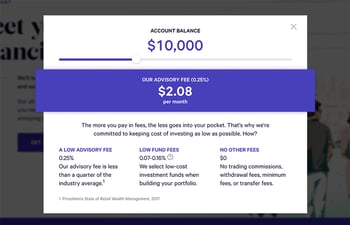 In this case, we’re talking about fee percentages.
How many people want to do math in their head to figure out how much that is?
Exactly, no one. So, notice the convenient link directly below the content: find out how much you’ll pay.
That’s the logical next step!
They consider what the customer wants at every step, and rather than trying to force an experience, they do their best to provide the experience the customer naturally wants.
Example 2: Slack
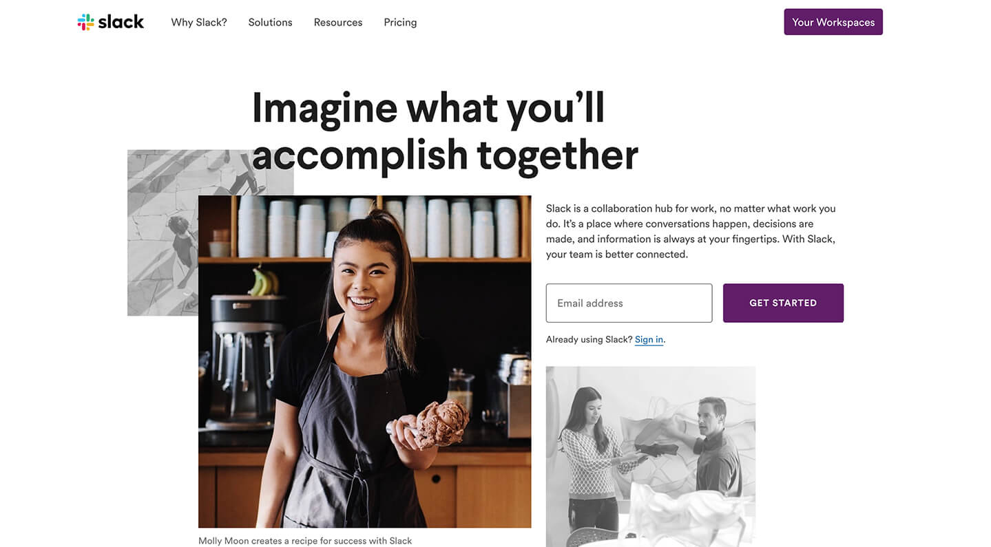
Slack is a case study for marketing done right. But, their website is also a pretty good case study in building a buyer journey based on what the customer needs in order to arrive at the decision stage.
Notice their UVP headline: It has nothing to do with the brand.
Absolutely nothing. It’s 100% about the customer.
It’s not “look at how we help you.” It’s “Imagine what you can do if you collaborate!”
They Love Their Buyer Personas
One thing I love about this site is that it recognizes that most people know what Slack is. They have the name recognition. And, if someone is visiting their website, they understand the customer is after information on how Slack might work for their organization.
This is their page for their Project Manager persona:
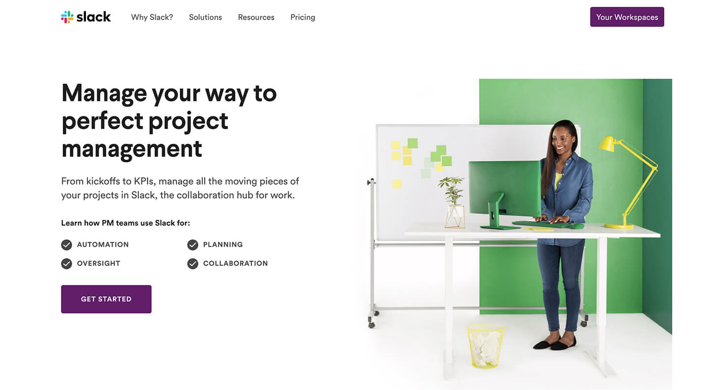
So, they don’t go as TOP-of-Funnel with their message as others have to, nor should they. This is market awareness.
When was the last time you went to Apple’s about us page?
Exactly.
Slack knows their website visitors are after one thing: to understand how Slack could fit into their organization. So, they give them that information right in the navigation.
Under solutions, they provide the logical next step is to visit pages based on their target personas.
On every persona page, their UVP headline addresses the primary motivation of each persona.
Example 3: StoryBrand
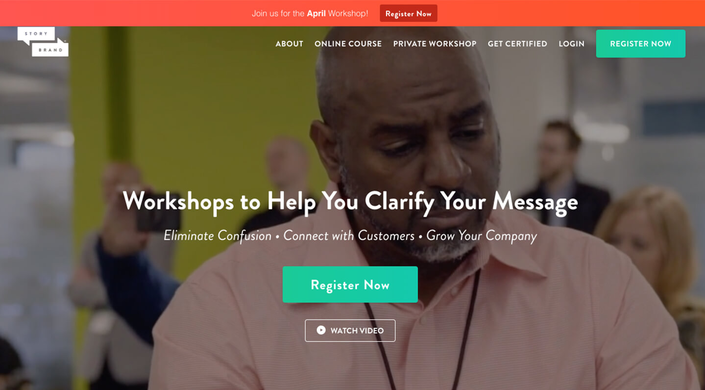
Storybrand is an interesting case study. Their CEO is a celebrity, but not necessarily in the marketing space. Donald Miller is an author whose books are featured in the Christian section of your bookstore, his most notable, Blue Like Jazz.
He doesn’t have the visibility with his prospects like Gary Vee does.
So the Storybrand website leans heavily on education, “this is what we’re about.” Although, this message is wrapped in the customer’s viewpoint: we’ll help you clarify your message, which will grow your company.
What they’ve obviously found is that not everyone who arrives at their site is ready to buy. There’s no momentum, or at least, not enough. So, while I might understand that my message could be better, I might not be ready to explore paying for help.
What do they do?
They back up a step, and allow their customers to build momentum.
Since the logical next step of the Storybrand website is to buy a workshop, they need to back up.
So, they launched The 5-Minute Marketing Makeover website.
This website is for their prospects, and wrapped in a package that says, “this will help you, it’s valuable to you, and we’re giving it to you for free.”
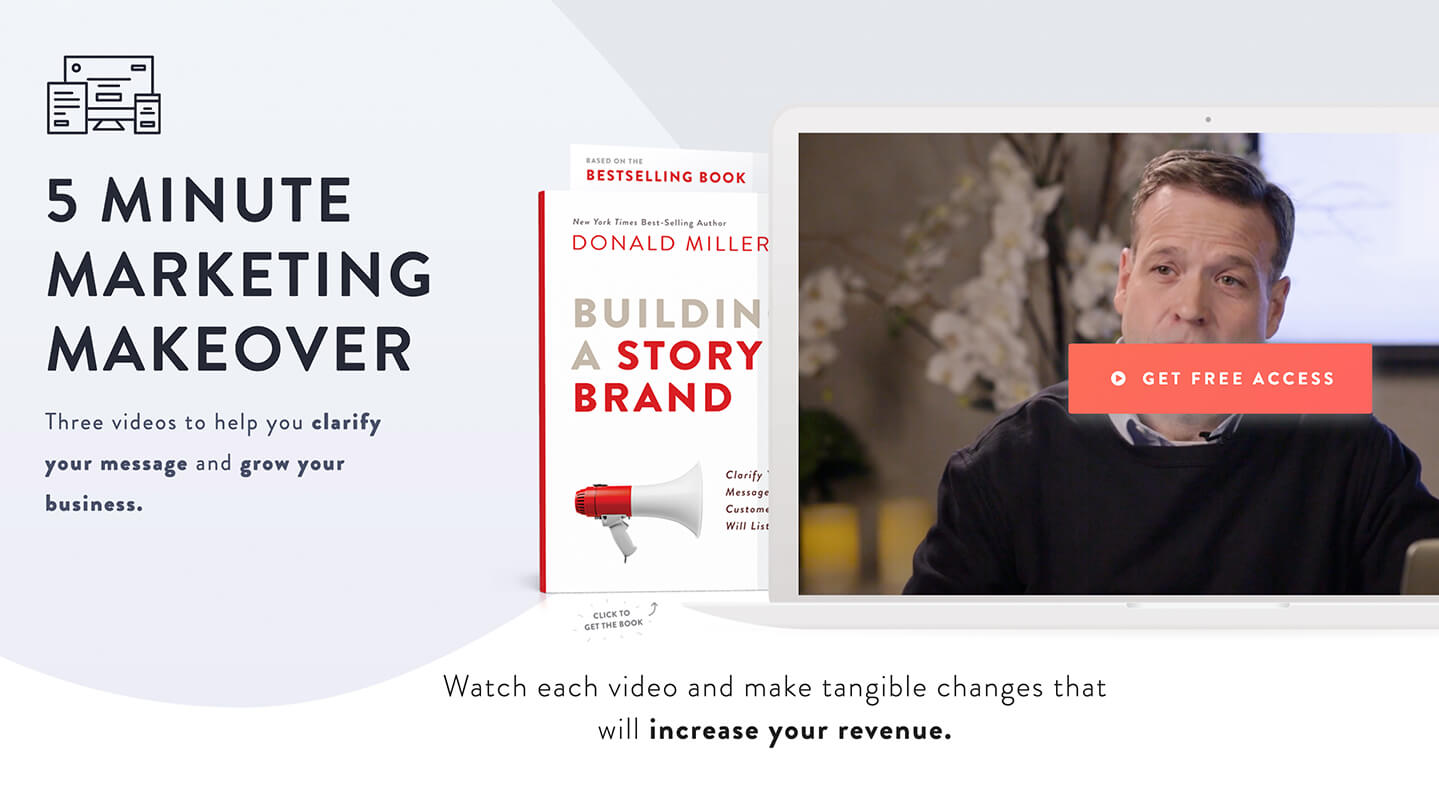
Notice their message at the top:
- Clarify Your Message
- Grow Your Business
- Increase Your Revenue
Notice their message at the bottom:
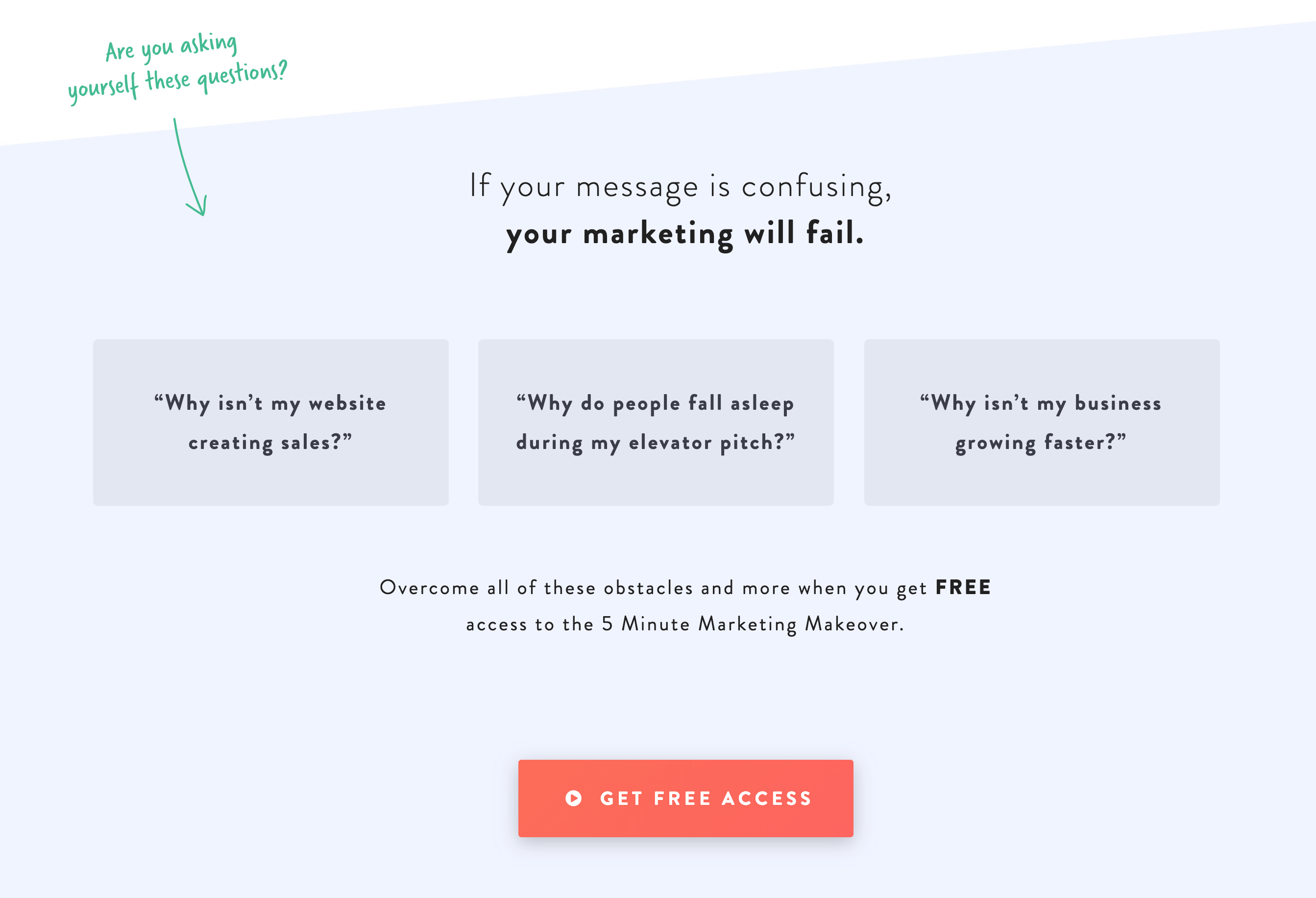
If that didn’t sell you, let me speak to your fears.
- Your marketing will fail.
- Your website won’t create sales.
- Your pitches will be boring.
- Your business won’t grow.
The logical next step? Get this free stuff.
When you jump into the “free” stuff, you are really just opting into a lead nurturing campaign. And, this campaign will provide value, sure, but it will ultimately lead you to the logical next step, purchasing the full workshop.
Brilliant, no?
Example 4: Neil Patel
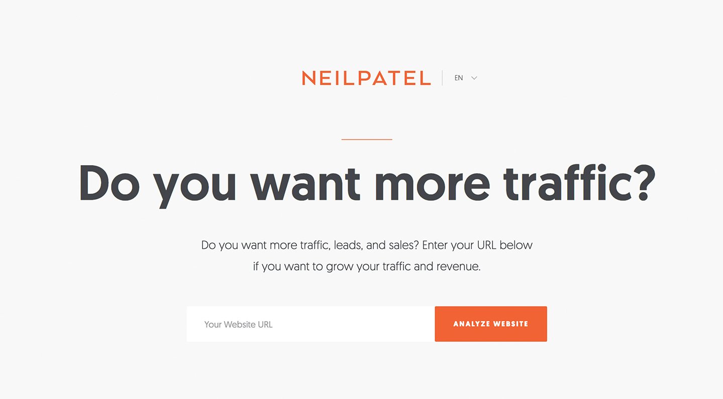
Neil is a content genius, of course. And, his website is an example for that reason.
When you go to his homepage, you get a question: do you want more traffic?
Nothing about his services. Nothing about his products. Just a question that the vast majority of his audience wants an answer to.
On his blog, you get a timeline layout of all his great content. Notice the very first entry, very blog-like...
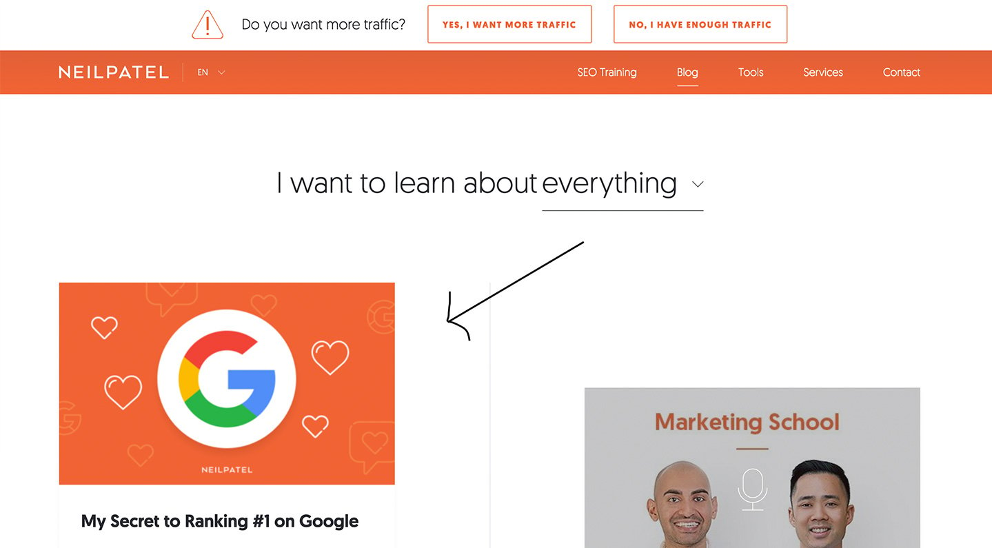
Yep, that’s his consulting page.
Why didn’t he just say, “need consulting?”
Because he understands his target customer is after Google rankings. And until they think they need consulting, they aren’t going to buy consulting.
Look at the consulting page: it’s a piece of content that shows the value of ranking on Google, which is the information his audience is looking for. Then, look at the bottom: he gives them the logical next steps in order.
The Cost of a Customer-Centric Buyer Journey
If your marketing isn’t customer-centric, your only hope is to get insanely well-known. Otherwise, your website visitors will more than likely pass you over for a competitor who gives them a better experience.
Remember, your website visitors are there on their own terms. And, they care about their problems, and their wants. Period.
They don’t give a hoot about your brand, at least not at first. If you play your cards right, you can change that.
And, it all starts with giving them the experience they want. Talking about what they want to talk about. And addressing their concerns. The moment a brand decides to force their topic, concerns, or wants on the prospect, they start pushing them away.
Here’s the deal: you’re going to have a website anyway.
Even Gary Vee, who doesn’t mention websites ever, has a website. You’re going to have a website. You’re going to invest in design. It’s going to have a message. It’s going to have all the moving parts, if for nothing else, keeping up with the Joneses.
So, the only cost of having a website with a customer-centric buyer journey is pride.
I don’t know why it’s so hard for companies to stop talking about themselves, but they must stop. Do you know how many times your prospect has heard a brand say they offer the best support?
If you’re B2B, then your whole industry is full of competitors who are like a chorus of Charlie Brown’s teachers. They harp about themselves, and their fake USP’s so much customers are turning deaf.
The moment a brand steps out of the Broadcasting Choir, puts their talking points in their pocket, and asks the customer with genuine concern, “how can I help you?” they win. Big or small, they will crush every other competitor out there who thinks of their website as a broadcasting tool or brochure.
Not only will they convert more leads. They’ll attract more customers.
And because a brand has finally taken the time not just understand how to sell to them, but understand them; they will become raving fans.
All of us have had experiences with selfish companies. And, we all know (and avoid) people that talk about themselves all the time.
All of us have also had experiences with brands we felt really, truly cared and understood our needs. They listened to us. They talked about the things we cared about. And, after giving them our money, we walked away happy we actually did business with them.
Be that brand.
About Lean Labs
The only outsourced growth team with a track record of 10X growth for SaaS & Tech co's. 🚀
Explore Topics

Discover the Hidden Strategies We Use to 10X Our Clients Growth in 36 Months!
The Growth Playbook is a FREE guide to planning, budgeting and accelerating your company’s growth.


