
5 Reasons Lead Conversion Rate Relies On Compassion
A few weeks ago, I was on a delayed American Airlines flight from Syracuse. I'd most likely miss my connection in Philadelphia. I felt anxious, so I asked one of the flight attendants for our arrival gate.
"I don't know," she said dryly, handing me a package of cookies. I declined.
"Well, I think I may miss my next flight. What should I do if that happens?"
"I don't know," she repeated, before heading back down the aisle.
I associate that experience with the entire airline now.
That kind of service can be detrimental to brands over time, even when it's not face-to-face. Customers need to know that you care about their process. Even a flawed website can suggest that you're not investing in making it any easier.
Now, for airlines, the resolution is straight-forward. Train your attendants to treat your customers better. However, for websites, the answer lies in gaining some empathy and compassion for your visitor.
Why Conversion Rate Relies On Compassion
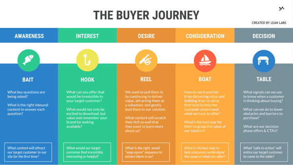
Similar to an airport, every visitor that visits your site has a destination. They're all seeking a separate endpoint, whether it's baggage claim (the answer to a question) or a connecting flight (signing up for a trial.)
But what if the journey through the airport was confusing and disorienting? What if whenever someone went to gate G2, the traveler found an exit? What if they followed the signs for baggage claim and there was an airport Starbucks with a long line?
It would be chaos, right? And while a dead-end page isn't going to be as disastrous as missing a flight, facing challenges at crucial conversion points will irritate the heck out of your customer. In my experience with American Airlines, my frustration was not that our flight was running late or that the attendant didn't know the arrival gate.
It was because the flight attendant didn't care.
That's why as a business, the most powerful tool you can use to optimize your site is empathy. If you approach your website from the customer's perspective and put yourself in their position, you can quickly identify points of friction. You can use those insights to streamline the customer experience.
With this information, you can make your site much more intuitive and even fun to use. As a result, your conversion rate will skyrocket, and you will gain the trust of your customer. In my experience, here are the top reasons that compassion is critical to conversion, as well as the specific actions you can take to improve your site.
#1. If You Don't Respect Customer Preferences, They're Gone
There are many digital marketing trends and best practices out there. However, not every trend will apply to your industry and customer. For instance, Amazon is a beast and makes a ton of money. But what works well for Amazon on their site may not apply to your audience.
Customer Example
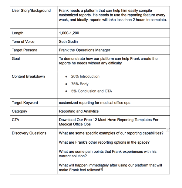
Frank is an Operations Manager at a neurosurgery clinic, and a critical part of his job is revenue tracking and document classification. After an abysmal quarter, his supervisor requests specific reports to get a better idea of where they're spending funds. However, his current Medical Office EMR & EHR Software is outdated, and he has difficulty creating these kinds of customized reports.
Frank needs to find a better platform, fast. He does a few Google searches and comes across your platform. There's a blog post about creating reports, and he starts to read it. The information is confusing to read. There are only one or two images, and the content doesn't demonstrate how your reporting features work with enough detail.
Frank figures your system is just as complex as his existing one and moves on to another platform.
How To Fix It
Content is much more than churning out some 1,000+ word count articles. You need to optimize your posts to attract and energize incoming visitors. In this case, Frank needed content that gave him relief and explained the ease of use. What he found was content that added to his frustration.
If you put yourself in Frank's position, you would realize that providing him useful content was critical to gaining his trust.
That's why we prioritize the quality of our content. There are a few ways we ensure readability for our blog material. First, we always start writing content with a detailed outline. The outline is vital to conversion because it makes sure the writer follows a narrative.
A post targeted towards Frank and his reporting challenges might look like this.
Second, we align the content with a buyer journey stage. That way, we're aware of the customer's intent and current frame of mind.
An additional document that helps us do that is our Business Model Canvas, based on The Lean Canvas by Ash Maurya.
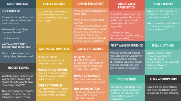
The canvas helps us identify our persona's frustrations, trigger events, and needs in a solution.
When the writer completes the content, we run it through a final optimization process.
- Do we mention the target keyword a few times in the copy, including at least once in our introduction and title?
- Is there an H2 tag with the keyword?
- Is each headline an H3 tag?
- Are there appropriate next steps that relate to the search that brought the visitor here?
- Does the CTA match the intent and buyer journey stage?
Then, you should check the readability. I use tools such as Hemingway and Grammarly to check for readability, spelling, grammar, and plagiarism.
If you still have issues with content quality, consider hiring a website content writer. It will be well worth the investment to get better material that engages potential leads.
#2. A Lot of Companies Still Neglect Mobile
It's 2018. That means you need to optimize everything for mobile. But shockingly, a lot of companies still do not prioritize it. If you're one of those companies, this is an opportunity for improvement. Trust me; your customer is tired of struggling with your website on their phone and tablet.
Customer Example
Joan works as a developer. She likes the work she does, but she desires more of a work-life balance and wants better pay. Joan begins to look for a recruiter. One day on her lunch break, she finds your tech industry recruitment company through a blog post on your site. She's on her phone since she can't look for jobs from her work computer.
She likes what she's reading. She decides to reach out and contact you for a consultation. But when she tries to click on the "Contact Us" CTA, the button is small and difficult to tap. Finally, she gives up and reminds herself to look at your site later.
She gets busy and forgets. When she finally decides to put more time into her job search, she uses LinkedIn.
How To Fix It
Your customer is busy. In Joan's case, a majority of her job search was on her phone. If your customer is in a similar position, it would be foolish not to make that process as straight-forward as possible. That's why when you think about the customer experience, it must extend to mobile.
All your CTAs, forms, headlines and content need to be easy to interact with from any device. You can do this by going through and QCing every pages just as you would on your desktop site.
I also use HubSpot to track the performance of our CTAs. I can look and see how many views and clicks every call-to-action is getting from within their reporting dashboard.
You can also use narrow down poor-performing mobile CTAs with HubSpot and Google Analytics. Find the content that has the highest bounce rates from mobile devices.
If all of your mobile CTAs work well and you're still not getting the results you need, you can try to:
- Swap out the CTA. You may have the wrong offer in place for that page. Try experimenting with different material.
- Check the buyer journey stage. It's possible you're asking the visitor to trust you before you've earned it. Don't place a BOFU or MOFU offer on a TOFU blog post.
- Update the language. It's possible your button text isn't enticing. Try to use action-oriented verbs.
- Show contrast. You want a CTA that stands out. Use brighter colors or a better picture to get more attention.
- Get to the point. I should be able to tell what happens as soon as I click your CTA.
Also, when updating or design website pages, make sure your definition of "optimization" is consistent with what your developer thinks. If you purchase a template, double check that it immediately scales pages down and fits them to any screen size. Mobile optimized means that there are no issues when someone uses the site from a device.
#3. Some Conversions Are Easily Missed
This section reminds me of that quote from Horton Hears A Who. In this famous book by Dr. Seuss, Horton the elephant hears a little who cry for help. The who is living on a floating orb, which turns out to be an entire planet of microscopic creatures.
He tries to protect the planet and usher them to safety, because "A person's a person, no matter how small."
Well, it's the same with conversions. A conversion is a conversion no matter how small. These blink-and-you-miss-it conversions, or as Moz puts it, the micro-conversions, still matter. Someone is taking time out of their day to interact with your brand.
Customer Example
Amber just got hired at a startup as their Marketing Director. One of her first initiatives is to implement email marketing. She decides to make a case for an email marketing platform and starts assessing her options. And you guessed it; you're one of the email marketing platforms she's considering.
Throughout the few weeks, Amber compares solutions. There are a lot of them out there, and she feels a little overwhelmed with all of the choices. During that time, she clicks on one of your ads to create a free account. It directs her to a landing page.
She glances over the landing page, which has a few walls of text, lots of images, and your site's navigation. There's also a form with ten mandatory form fields, including her phone number and credit card information. She goes to the navigation and clicks off the landing page.
Eventually, Amber needs to make a decision. She signs up for MailChimp, a platform that her peers use and recommend to her.
How To Fix It
Amber is only going to give your landing page about a 30-second glance. From that, there are two paths she will take. She will convert or leave. It's frustrating, but a more productive way to approach this inevitability is by feeling some empathy for Amber. She's occupied. She needs to make a choice.
You want to do anything you can to help her see the value in your product and convert. There are a lot of optimizations you can make on a landing page to help accomplish that.
My go-to optimizations are to:
- Deliver an impactful UVP headline. A headline with your unique value proposition shows the visitor the value of your service right away.
- Use intriguing, emotion-inducing media. You should include a video or photo on your landing page, but it needs to be relevant. You want that media to convey their desired feeling.
- Go beyond SEO optimization. Of course, you need to optimize your page title, URL, and metadata. But you also need to make those details excellent. It's one of the first things your visitor sees, and they will decide whether or not to click based on those components.
- A laser focus on value. Putting a ton of information on your landing page is tempting. But you need to stick to the value of the offer. Otherwise, it's too much to comprehend and will confuse your visitor.
Additionally, another consideration to make is your industry. If you're in a space with well-known solutions (such as MailChimp, Survey Monkey, etc.), you're already competing with word of mouth. Everything you put out into the world needs to be exceptional. It needs to differentiate you from the pack.
When I create landing pages, I use two templates to complete this step. First, the Jobs To Be Done template that conveys the jobs the customer is hiring me to do.
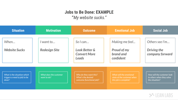
Second, the Who Are You Stealing From, where I document my competitors and identify how my solution is different.

Both of these tools help me write better content for landing pages.
I also recommend tracking how users are currently interacting with your landing pages and your overall website performance. You can monitor the bounce rate, click-through-rate, and time on page. You can use this data to find places to make improvements.
#4. Everyone Wants Your Customer To Buy
On any given day, companies overwhelm your customer with opportunities to convert. And a lot of those companies don't care how your customer becomes a customer. They want to sell. That means there are a significant amount of websites, that probably include your competitors, that unintentionally irritate your customer because they focus too much on the sale.
Customer Example
Beau just installed your app that helps him track his sleep patterns. He gets the freemium version, even though it doesn't have as many features. Beau uses it on the first night and is happy with all of the data it collects. However, shortly after he creates the freemium account, he begins to receive a lot of emails from your company.
The emails are long-winded. Each one focuses on getting Beau to upgrade to the paid version. Every subject line has a different discount or limited time offer on the subscription cost, which Beau considers to be too high. Over time, Beau grows tired of tracking his sleep and stops using the app at all. Beau deletes the app.
How To Fix It
You cannot annoy your customer into buying from you. And even if you're successful at getting someone to convert on an email like this, these types of aggressive efforts won't gain their loyalty in the long-term. In the beginning, the lead only wants to hear about how you're going to help them with their challenges.
Beau wasn't ready for a sale. He wanted to learn more about using your tool. But you bypassed an opportunity to earn his trust and sold to him instead.
You can connect with leads like Beau with a series of thoughtful, educational emails. With an indoctrination sequence, for instance, you could explain to him what the sleep data means. You can recommend tactics to get more restful sleep. All of your content should focus on Beau's goal, which is to get better rest.
Later, when he's been using the app for a while, you can nudge him to premium. If using the app is a part of his day-to-day success, he will probably go for it.
You can use the buyer journey to inform the type of material you prioritize for email. But you can also utilize a strategy document called a customer journey map.
The idea is to fill out two customer journey maps, one that reflects their current experience and one that illustrates an ideal experience.
.png?width=600&name=customerjourneymaptemplate%20(1).png)
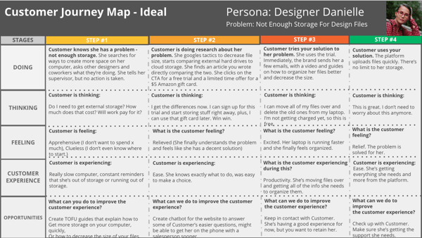
The customer journey map forces you to see things from the customer's perspective and will help provide clarity on areas of improvement.
A few additional optimizations and best practices I use for email are:
- Test out your subject lines. You can customize subjects with a personalization token, emojis, statistics, and questions. Experiment and run A/B tests.
- Test out your CTAs. You should use different language, colors, placement and sizes of your email CTAs.
- Try different lengths. Some people will sit down and read a long-form email, and some people won't. It depends on the customer. You can try both and see what the results are for your audience.
I also stay up-to-date about current email trends. Sometimes, I come across a gem and can include it in my testing strategies.
#5. Customers Are Judgmental
No one knows a quality experience better than your customer. On a day-to-day basis, they're working with customer-centric companies like Amazon, Hulu, and Apple. Because of that, even if they're not getting that level of support from your specific industry, they expect it.
Customer Example
Sarah works in human resources for a mid-size company. The company is considering a few new time-tracking and payroll platform, and she's involved in the selection process. There are a few platforms they're selecting from, including yours.
When Sarah visits your site for the first time, she goes right to the trial sign-up. Sarah assesses the form and the landing page content. It doesn't seem any different from the other solutions she's considering. Sarah decides to check out the trial anyway. She completes the form and gets sent to a generic thank you page.
Later, she gets the email with her login credentials. She forgets to check it. Then, she sees an ad for another software. It catches her eye. The trial landing page has a lot of bright colors and iconography walking through features. She signs up and the thank you page logs her into the platform right away.
Ultimately, she recommends that platform.
How To Fix It
When your customer is so close to a conversion, you have to make sure that you don't fumble. In Sarah's case, she needed a little nudge, and you didn't give it to her. If you can appreciate that she's evaluating a lot of solutions and wants to make sure she has the best one, you can see why it's so essential for your content to be incredible.
Because of this, even the language on your thank you page can break a sale. If there's nothing memorable about the process, it's too easy for your almost customer to get distracted and forget about you. You need to wow them at every turn and find a way to engage them during this critical touchpoint.
A few ways to improve your thank you page include:
- Direct them to the offer. Provide access to the offer on your thank you page. Don't make them take another step or wait for an email. Get them there immediately.
- Give them additional resources. On the thank you page, you can also provide ways for them to ask questions, such as a contact us page, or find resources, such as the link to your blog.
- Say something. A simple "Thanks!" isn't that exceptional. Try to leave an impression on your customer.
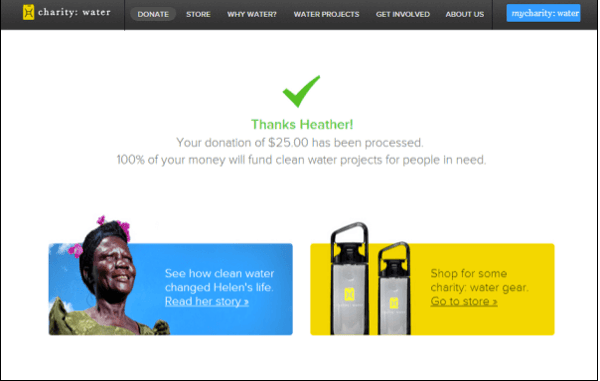
I like this example from Charity Water, which tells the individual exactly where their donation is going.
Source: Wish Pond
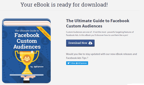
There are also a few options to visit other content or products. AdEspresso does an excellent job of a link to their guide right from their thank you page.
Another example is Nomadic Matt, a travel blogger. He tries to get the user to sign-up for another offer.
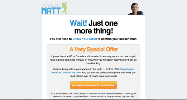
Overall, your thank you page can be an excellent source of more engagement and conversions if you get creative.
Your Customer Needs To Convert
Eventually, your customer will need to solve their problem. And they don't need a company to help them solve it. They need a guide. If you want to be that guide, their problem needs to become your problem. You need to feel their pain and make it as easy and enjoyable as possible to solve their problem with you.
Because if you can get into the head of your customer and translate those insights into flawless customer experience, you're going to crush conversion. You can use any of the strategy documents from this post to start, which are all in our free SprocketRocket Strategy Kit.
About Lean Labs
The only outsourced growth team with a track record of 10X growth for SaaS & Tech co's. 🚀
Explore Topics

Discover the Hidden Strategies We Use to 10X Our Clients Growth in 36 Months!
The Growth Playbook is a FREE guide to planning, budgeting and accelerating your company’s growth.


