-
1. Don't Make It About You
-
2. Keep it Short
-
3. Don't Make it TooComplex
-
4. It Needs to Explain What You Do For the Client
-
5. It Should Be The First Thing Visitors See
-
6. Sometimes You Need a Subheading
-
7. It Should Complement Your PrimaryCall to Action
-
8. It Should Be Tested
-
Why You Need a Great UVP

How to Come Up With an Effective Unique Value Proposition (With Examples)
Your website should be your best salesman. But just like its human counterparts, it needs to say the right thing at the right time to be effective.
It's the companies who don't put forth the time and effort to find a compelling UVP who complain that their website isn't working, isn't generating leads, and isn't contributing to sales. They'll be the ones who say inbound marketing doesn't work. And they'll be losing sales because of it.
The number one thing your website homepage should do is clearly communicate your unique value. And it has to do it very quickly. That's why we recommend putting your Unique Value Proposition (UVP) as the main headline of your website.
Just putting a headline at the top doesn't mean you have an effective value prop. Hacking the perfect sentence, phrase, or word that communicates both what you do and how it makes your customers life better is not an easy task.
8 Keys to a Perfect Unique Value Proposition
Coming up with a compelling UVP is one of the things we spend a lot of time on for our clients. And we're going to pull the curtain back on some really great, and some not-so-great UVPs to show you what yours should be.
1. Don't Make It About You
One of the most common mistakes we see people make with their UVP is making it about their company or their features. People don't care about your company when they hit your website for the firs time. They're looking to solve a problem.
Your UVP needs to clearly communicate how you solve that problem.
Take Unbounce.com for example. Their target customers are marketers who want to build landing pages and run a/b tests. Their product allows them to do that. So the first headline that pops to mind is "Landing Page Builder," or something similar.
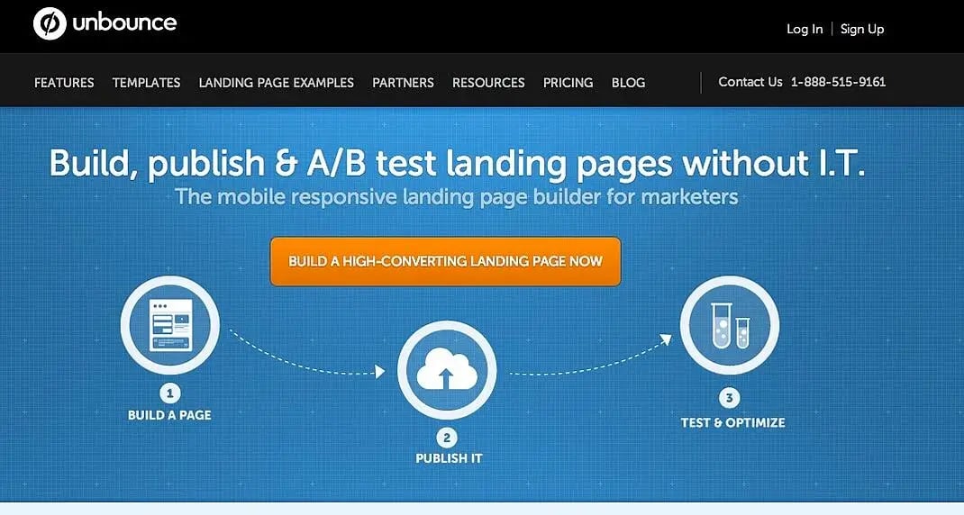
Unbounce realizes the real pain of their buyer personas, however, and doesn't merely tout their product. Instead, they communicate to the problems marketers have without Unbounce: They have to rely on developers to build their landing pages for them.
As a marketer, I can tell you it's frustrating, and takes forever, to rely on developers to build landing pages for you. (Thank you HubSpot for making this super easy!)
So their UVP goes beyond just "build landing pages," or "a/b testing for landing pages." Instead, they go for "Build, Publish, and a/b Test Landing Pages Without IT." They successfully explain what I can do with their product, and the biggest pain point I face.
And, they have a compelling Call to Action that connects directly with their UVP. But that's for #7.
2. Keep it Short
Unbounce's UVP is longer than I like. Sometimes you can't say something in 4 words or less. But if you can, you should.
This is why I love websites like CodeSchool.com. Their UVP is 3 words that explains exactly what I will get out of CodeSchool.com - "Learn By Doing."
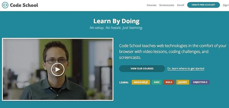
The weakness of this UVP is that it doesn't communicate what you'll be learning. But for their personas, they are looking for a way to learn to code. It's not confusing to them, so they get a pass on genericness of their statement.
The power of a short value prop is that people can instantly digest it. Unlike NewRainmaker.com.
3. Don't Make it Too Complex
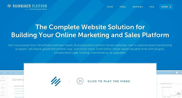
While NewRainmaker.com's UVP is easy to understand, I have to mentally grab my eyes and force them to focus and read the entire sentence.
It's not a situation of "I read it without even realizing it." Which is what you want if you can make it happen.
Your UVP should be easy to read and comprehend without little-to-no on the part of the visitor.
4. It Needs to Explain What You Do For the Client
Again, this doesn't need to be about your features or your product pitch. It needs to be about what the client can accomplish with you. It needs to explain why they would want to engage with you.
Take Positionly.com, for example. They are a Search Engine Results Page (SERP) tracker. I've used them and think their product is worth the investment. However, their UVP isn't a value prop at all, it's only explaining what they are, not what problems they solve for the client.
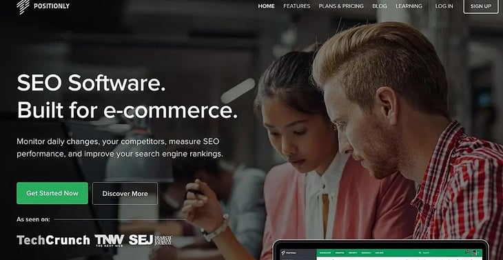
"SEO Software for people," doesn't tell me anything. There's a ton of SEO software that doesn't do what they do. They've only told me they have something that will do something for SEO, but there they left out the unique in the UVP.
They took the identical text effect that HubSpot uses on their landing page, switching out words to better communicate everything they do. But, unlike HubSpot, they're words are showing who uses their product, not why they use the product.
HubSpot, on the other hand, uses this text effect very well on their homepage. "Grow Your Business," directly tells me the benefit I get in using HubSpot. They don't say "marketing automation software." That would be about their product, a feature. Instead, they take it back to the root.
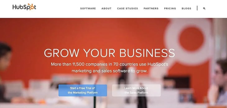
They start with why.
Why would someone want to use HubSpot? To grow their business, to grow their leads, to grow their sales, to grow their website traffic. This is captured beautifully in 3 words (well, more if you count the switches.)
A better UVP for Positionly would be something like:
- Track Your Search Engine Rankings
- Track How Your Performing on Search Engines
- Track Your SEO Performance Against Competitors
5. It Should Be The First Thing Visitors See
Slack.com is a startup that's seeing explosive growth.
But I still don't like their homepage for one reason: If I'm the business owner who's been hiding under the rock and I'm searching for the solution they provide, the headline of their site doesn't tell me anything.
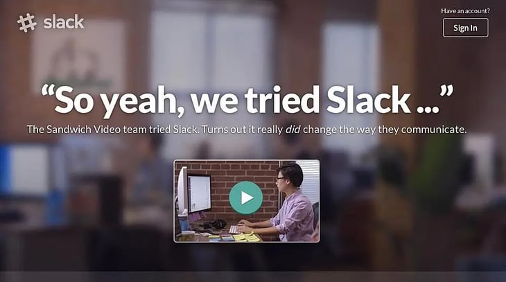
Now, I know what they're doing. They are trying to spur interest in a story, which can work if done right. And it's obviously working for them. However, they're the exception to the rule and their growth is spurred by excellent off-site marketing to their personas.
Their headline is, "So yeah, we tried slack..."
This tells me nothing.
The unique value is found at the end of the subheading, and not even clearly communicated. "Change the way you communicate," would be a much more benefit-driven headline.
The downside of trying to entice with a story teaser is that, you lose non-curious people. Why leave those leads on the table by trying to be cute?
For the visitor who's never read or heard about slack before, it just doesn't connect.
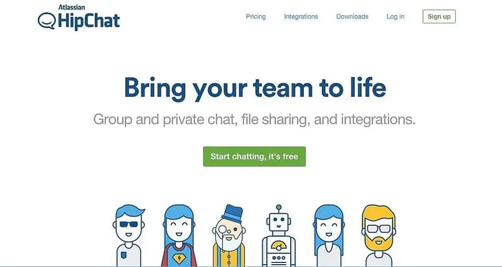
Slack's competitor, HipChat.com, doesn't do a much better job with, "bring your team to life."
My team isn't dead, we're just remote. And your subheading is just listing features of your software.
They would get more conversions by addressing my problems and pains, like "easy team collaboration: with real-time chat and file sharing."
6. Sometimes You Need a Subheading
For anyone that's had to go on the perilous quest for a project management software, you've no doubt heard of 37 Signals and their software, Highrise.
37 Signals is famous for having simple, and even sometimes ugly landing pages. But these work for them. Why? Because they are masters at communicating benefits over features.
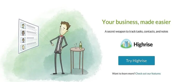
For Highrise, though, their main benefit must be qualified. It doesn't have standalone power. "Your business, made easier," could be anything. For a plumber, it may be a new pipe cutter. But with the subheading, suddenly that main benefit is very attractive to people searching for such a solution.
"A secret weapon to track tasks, contacts, and notes," makes the promise of a easier way to do business seem like a great promise.
Notice though, they didn't have to take 400 words and 6 bullet points to qualify their UVP headline. It's still short, sweet, and to the point. It's always better if you can make a UVP that doesn't need a qualifying subheading. However, if you need one, keep it short and sweet as well.
7. It Should Complement Your Primary Call to Action
Every website header should have two things: a clear UVP headline and a compelling call to action (CTA). And they should complement each other.
I love the home page of Casper.com. It's named after a ghost, so the brand name doesn't clearly communicate what they offer. However, their UVP is instantly noticed, instantly comprehended, and goes to the primary benefit for the customer.
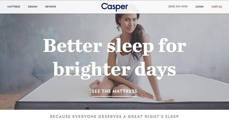
Go back to the why:
- Why does someone shop for a new mattress? Answer: They want better sleep.
- Why do they want better sleep? Answer: So they won't be so tired during the day.
See how Casper.com expertly addresses both of these "why" questions with a benefit-driven UVP headline.
Now, notice the logical next step. You can almost audibly hear the exchange.
- Salesman: "You'll get better sleep a Casper mattress."
- Customer: "Can I see it?"
Their CTA is the logical next step the customer will want to take after they are intrigued with the benefit-driven CTA. It's brilliant.
8. It Should Be Tested
You need to test your UVP. Actually, you need to test both your UVP and your primary call to action, but not at the same time. Sometimes we think we come up with a golden slogan or UVP, and the audience just doesn't connect with it. If your customers aren't connecting with your UVP, it should be changed - no matter how much the CEO loves the current one.
There is no one on your company payroll that can dictate the perfect message of your website better than your customers can. That's why you need to test different UVPs and see which one's perform better. Then run tests on your CTA to see which performs better. Then, run tests to see how the best performers work together.
Don't kick yourself if you get a negative test. Getting a negative result, as in less CTA clicks, conversions, or sales, is a positive thing. It means you know another version performs better; the previous version. Go back, and try a new test agains the top performer and keep tweaking.
Eventually, you'll find the optimized UVP and CTA combo. And you'll reap the rewards.
Why You Need a Great UVP
It's the single most important item on your website. Most people will only stay a few seconds on your homepage. The best way to keep them on your site and convert them to leads is by having a compelling UVP that tells them how you make their life better.
If you can convince me you make my life better in some way, I'll be interested in what you offer. Otherwise, I'm off to the next website to find someone else who can.
About Lean Labs
The only outsourced growth team with a track record of 10X growth for SaaS & Tech co's. 🚀
Explore Topics

Discover the Hidden Strategies We Use to 10X Our Clients Growth in 36 Months!
The Growth Playbook is a FREE guide to planning, budgeting and accelerating your company’s growth.


