Raise your right hand if you’ve ever ended up on a website with so many links, tabs and buttons you didn’t know where to click first. Now place your left hand on your stomach if you’ve sat around waiting for a website to load because they’re still using flash to woo you on their homepage. Last one, nod five times if you’ve read an entire homepage and had no idea what the company was selling.
By this point you AND the guy who built those websites looks silly. You can resume your normal reading position now.
Too often company executives lead online efforts and micromanage a website’s development, stomping all over the direction sought by their creative team. Easy navigation and clear calls to action (CTAs) are replaced with bells and whistles that clutter a website. A jazzy look and elaborate features make the big wigs feel good about their site, but when a customer tries to visit the page they’re inundated with all the noise and can’t see the information they came for or the place to find it.
Revisit those times we mentioned earlier: the ones where you’re on a page with a thousand drop-down menus. The ones that won’t load because it’s bogged down with early 2000s tech, and the ones with incredibly vague information. What did you do? You left. Your time is valuable and you can find the information on a dozen other websites. You went in search of that information elsewhere without a second thought. Your customers will respond the same as you. Take the time to create a website they need and they will reward you by using your products and services.
Here’s some simple tips to keep in mind that will help you walk the line between making the boss happy and giving your customers what they want:
Design for the Customer
Remember all those experiences we talked about earlier? Don’t put your customers through that. Empathize with their needs and design your website for them. Use your buyer personas and spend some time trying to think like they do. Start with a simple navigation that offers a menu to the top content you know your customers will be searching for. Have contact information easily accessible for those who want to give you a call and talk to a person. Be creative and have a fun, unique design but try to avoid going overboard to avoid taking attention away from the real reason your visitors are there: information. And lastly but nowhere near least, create a clean homepage that puts the most important information first.
Tell visitors what you’ve got to offer
Topping the list of the most important pieces of content to put on your homepage should include the unique value proposition of your company (UVP). All too often people visit websites and enjoy the design, enjoy the navigation but can’t seem to pinpoint the UVP. Don’t hide this information on a subpage. Don’t even make them click once. Serve them your offer on a shiny platter as soon as they walk in the door. You can check out a great example at the Hupspot homepage.
Help your customers decide what to do next
Establishing a clear CTA is vital to the converting visitors into customers. Even a beautifully built website with easy navigation is going to fail if it doesn’t tell people what to do next. As you’re building your site, identify areas where quality content intersects with a place the customer will need to take another step to get more information. Put a clear and simple CTA right there. Now when your customers are reading through your site and they get to the point where they want more of what you’re offering, you’ve told them exactly what to do in order to see more content.
Make a visit to your website an enjoyable, repeatable experience
You don’t have long to make an impression on a visitor to your website. If you don’t have their attention in a few seconds, they’re out of there. Designing for the user experience is an easy way to make sure you get repeat visitors. With so many websites giving us the daunting memories we talked about earlier, a visit to a cool, intuitive one will automatically leave your customers choosing you as the information source of choice.
Similar to the first bullet, you’ll need to put yourself in the customers’ shoes. Picture yourself learning about your product or stopping by for some information on what you just purchased. Put the most prevalent information where they can find it. Organize it in a way that makes sense to them and make it easy to get from one place to the other. All those elements combined will ensure a great user experience.
Make it mobile friendly!
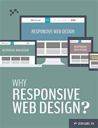
This year mobile web traffic is predicted to exceed desktop traffic, which means if you haven’t adopted a responsive web design now is the time. More and more people are using the Internet on their phones and tablets. It’s important to create a website that adjusts to these different screen dimensions and offers a simple, fast navigation. Many mobile users are on the go and their internet presence is just one piece of their multi-tasking. If your website doesn’t accommodate the mobile surfer, you will miss out on a huge and ever growing demographic.
If you’d like to see how your current website is serving your customers you can visit resources like UserTesting.com. It’s important to test what you have, learn from the results and improve as you go.
Jason Thomas has been helping launch and develop start ups for 10 years. Jason's passion is working with motivated entrepreneurs to validate and implement ideas that grow their business.
Jason is a husband, father, and homesteader in training. In his spare time he's generally outside working with his hands and getting dirty.


