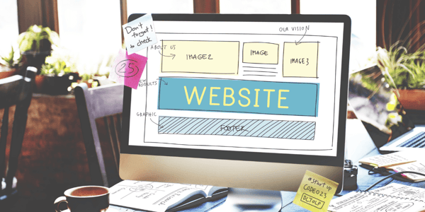
The 6 Critical Homepage Elements Necessary for Hooking an Audience
First impressions are a big deal.
According to some, all it takes is seven seconds to make a first impression. And the first impression of your website is no different.
Your homepage is one of the most essential pages on your site. Everything else stems from that single point, and it must captivate your audience at first look.
We've built a ton of homepages, and we've found that there are six critical elements that high-converting homepages all have.
6 Critical Homepage Elements You Need to Optimize
While a homepage needs to include the following items, how you structure the page is equally important.
We use the Hook, Story, Offer format for building pages. To do this, open with a bold brand promise at the start. This headline is your unique value proposition, and it's what hooks the user to continue further into your page.
Then, you'll start the story by showing them where they currently are, and what's possible (watch this TEDTalk to see what we mean). You can have multiple iterations of the "what is and what could be" set up, but each needs to build on the previous. This story continues to drive them towards the path to the ultimate solution. Then you deliver the offer that sends them to the next actionable step.
By placing the following points into that structure, you'll create a homepage that users can't help but engage with.
1. Headline

To effectively write a headline, it should follow the Four U's (Unique, Useful, Urgent, and Ultra-Specific) and display a benefit to the reader. It should be obvious what the reader stands to gain from your page. This means making your headline clear and concise.
A great way to test the clearness is with the Grunt Test. This strategy, coined in Donald Miller's Building a Storybrand, explains that if a caveman couldn't understand the concept, you're missing the mark. This forces you to keep the headline direct.
By nature, the headline will start a story. The hook gets their brain churning as they think about how it relates to them. That's when the sub-headline offers a bit more tale to drive them down the page.
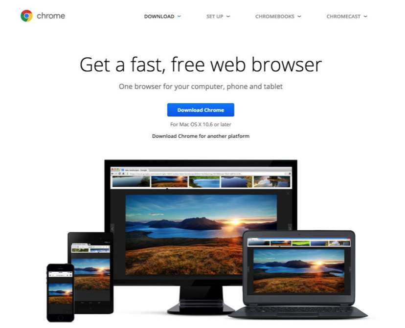
You can see how Google Chrome does this, opening a loop that gets the user to continue on the page.
The sub-headline should only be used if it brings something useful to the audience. If it's just a catchy phrase that doesn't encourage a next step, consider going directly from your headline to a CTA. The sub-headline will only serve as a distraction in this case.
2. CTAs
There are at least two CTAs you should have on your homepage, and both should be directed towards the same next step.
First, somewhere near the top of your page should be a CTA that guides any users to the next step you want them to take. This CTA is more effective for hot traffic that knows they're interested in your solution. Cold traffic will generally move further down your page to gain more information.
Still, you must have a way for highly interested users to take action immediately. Forcing them to search for a way to work with you throws convenience out the window. And if customers have to work, you'll likely see conversions fall.
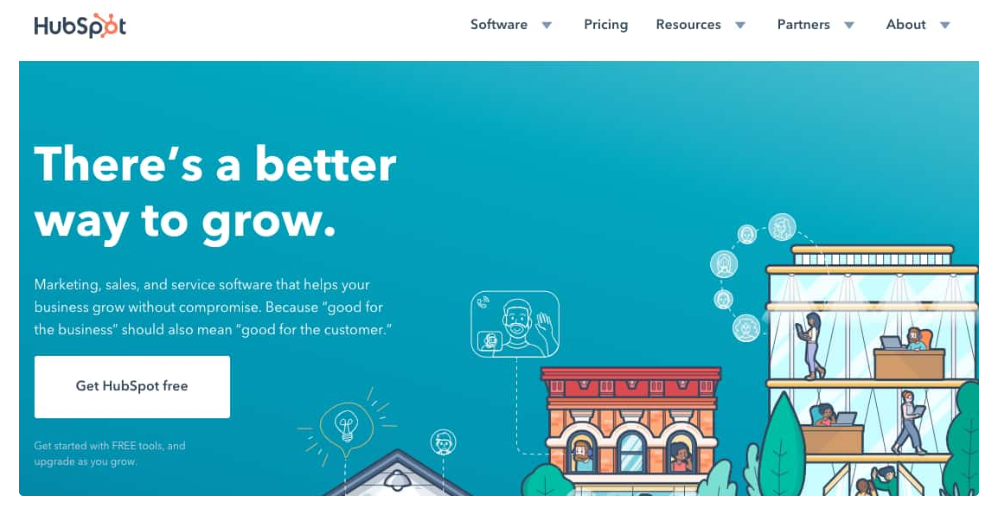
HubSpot is a great example. The color of the CTA stands out against the background without breaking the flow of the page.
The second CTA guides your audience to the same location as the first but is located further down the page. It's meant to capture a conversion from anyone who made it to the end.
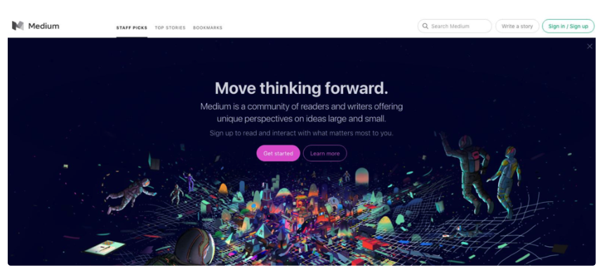
3. Graphics
If you really want to catch the user's attention, you'll need to put some thought in the imagery at the top of your page. Some brands will use gifs or videos as the background. Others will use solid colors to make their headline stand out more. There are a lot of ways you can go with the imagery.
You could use an animated design like Medium.
Or you could use a photograph that's connected to your brand like Scratch Wireless.
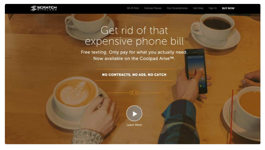
Regardless of what you choose, the concept is the same. You're using the graphic to hook your audience further.
4. Benefits and Features
Benefits and features go hand in hand. Depending on your product, you may need to focus on one or the other.
For example, if you're selling an umbrella, people are looking for the benefit of staying dry. The only reason someone would care about the features of an umbrella is if they have a specific reason, like limited storage space, or they need a more durable shielding.
This doesn't mean that you should avoid features, though. An IT technician is going to care far more about the RAM and storage of his computer than whether he can play the newest video games. He understands the specs that are required to play games so that he can focus on that.
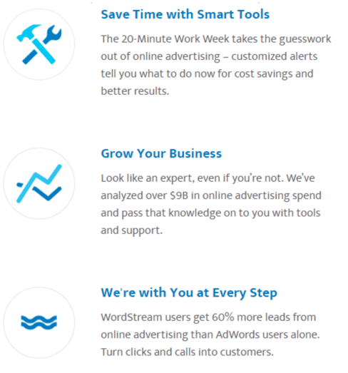
Either way, you want to link the benefits and features to the problems that are solved because of your product. You can do this through bullet points, imagery, or any other way. This example from Wordstream uses icons with benefit-driven copy
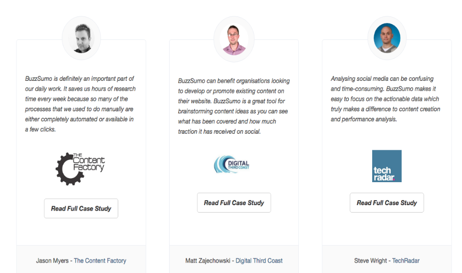
Social proof includes testimonials, reviews, ratings, lists of previous clients, and much more. Social proof is incredibly powerful because we have a natural fear of missing out. One study even found that more reviews on Amazon led to an increase in sales, even if there was a wider disparity in opinions.
There are many ways to use social proof, but you should find one that engages your audience. BuzzSumo highlights their case studies, showing you brands you may have heard of to build their authority.
Others will include the number served or a few quotes from happy clients. Just ensure whatever you use is punchy and promotes the parts of your brand you're focusing on with your homepage.
6. Resources
Finally, resources are a great way to offer your audience something else to engage with. Depending on the incoming traffic, your audience may not be ready to engage with your main offer. They may be looking for more information on their problem.
This is where you can send them to your blog, case studies, or any lead magnets that could help them along the buyer's journey. It gives them a way to learn more about your product without being forced into a quick sale.
Pulling Your Homepage Together
If you can group all these assets, you'll find your homepage producing better results.
It's a good idea to try out different elements until you find the one that engages your audience best. You can measure this by running A/B tests and letting the data dictate how you design the page.
No matter what elements you choose to incorporate on your homepage, be sure the decision is deliberate. Your homepage is one of the most trafficked on your site, and with effort, you can turn it into one of your brand's most powerful assets.

About Lean Labs
The only outsourced growth team with a track record of 10X growth for SaaS & Tech co's. 🚀
Explore Topics

Discover the Hidden Strategies We Use to 10X Our Clients Growth in 36 Months!
The Growth Playbook is a FREE guide to planning, budgeting and accelerating your company’s growth.


