-
Examples Of Calls To Actions That Get Conversions And Clicks
-
1. Show Me (Nutshell)
-
2. Get HubSpot Free (HubSpot)
-
3. Show Me My Heatmap(Crazy Egg)
-
4. Preview The Landing Page Builder(Unbounce)
-
5. Learn More About Our Customers (Woopra)
-
6. Test Drive Survey Gizmo (Survey Gizmo)
-
7. Inspiration (Balsamiq)
-
8. Request Trial (User Testing)
-
Creating High Converting CTAs On Your Website

8 Examples Of Call To Actions That Drive A Ton Of Clicks
Call-to-action copy. It can literally determine whether or not you get a website conversion.

Still, it's easy for a lot of people to overlook. It's just a few words, right?
It's so much more.
The right CTA copy, in the right place, can drive a website visitor to action. It can be the last little nudge to download an offer or sign-up for a trial. And while copy like learn more, read more, click here can be great in the right context, it's beneficial to mix in some other language, especially if you're not getting the kind of conversions you want from your website.
Examples Of Calls To Actions That Get Conversions And Clicks
Before we go into the examples, first, some expectation setting. While it's useful to switch out CTA copy and it can improve your conversion rate, without other critical website components, the change will not be drastic.
Aside from great CTA copy, if you want to improve your conversion rate, you also need:
- A stellar site flow that makes it easy to navigate your site and tells a cohesive story.
- The right entrance paths to your website and the appropriate next steps.
- Something exceptional behind every CTA, such as an incredible offer or lead magnet.
Because conversion is all about giving customers the buyer journey and the content they want. If you feel you don't have this foundation already, check out our Growth Driven Design page to learn more about building a high-converting website.
However, if you have great offers and a pretty good website, here are a few examples of website CTA copy that you can test out and get massive clicks.
1. Show Me (Nutshell)
Nutshell, a CRM, uses a lot of standard CTA copy on their website, such as "Free Trial," "Get A Demo," and "Learn More." The one that stands out is a CTA they use to to drive traffic to a comparison page that says "Show Me."
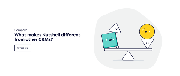
The CTA is on the home page, so anyone who already knows what Nutshell is, and looking to make a comparison, can click here and get the exact information they need.
2. Get HubSpot Free (HubSpot)
Personally, I like CTA copy that directly addresses an obvious pain point or disarms the customer.
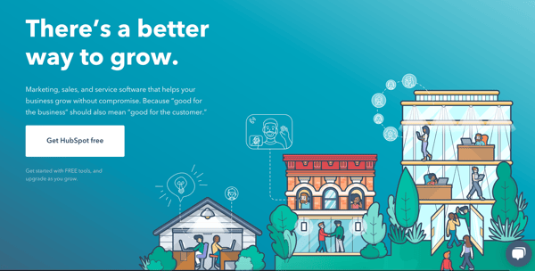
"Get HubSpot Free," is one of those examples. It's straightforward button copy that tells the website visitor exactly what they'll get - HubSpot, for free. HubSpot has this on their homepage and leads to their getting started page.
3. Show Me My Heatmap (Crazy Egg)
Crazy Egg is another site that has really direct CTA copy. Crazy Egg, a platform you can use to record heat maps on your website, uses the CTA copy "Show me my heatmap," on their homepage to direct to a free trial.
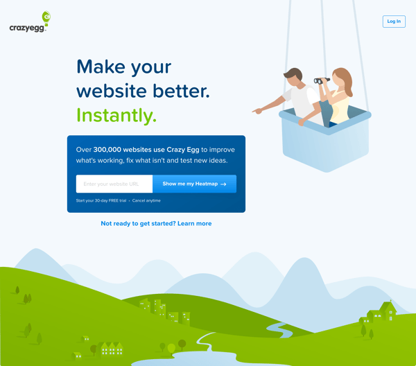
While I admit that there's a small expectation that you'll immediately be able to get a heatmap when you click on this, a 30-Day Free Trial is still a pretty good next step.
4. Preview The Landing Page Builder (Unbounce)
Another fantastic use of CTA copy is on Unbounce's homepage, in both their hero and halfway down the page on an offer bar.
The CTA button copy in the hero, "Preview The Landing Page Builder," sets an immediate expectation and gets motivated website visitors in the right direction.
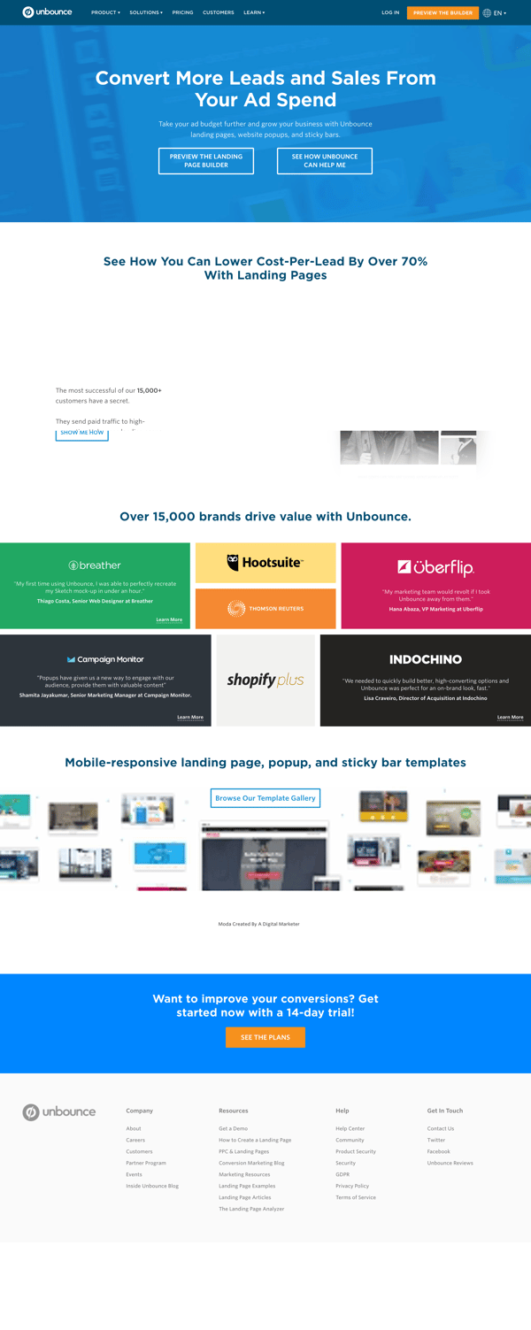
Lower down the page is "Browse Our Template Gallery," which also directs visitors to the right resource.
Obviously, there's a difference between someone who wants to build their own landing page versus someone who wants to grab a template, and the Unbounce homepage address that, and gets site visitors on the right path.
5. Learn More About Our Customers (Woopra)
If you're going to use "learn more" on your site, you should consider adding some more context to it. What is the website visitor going to learn about?
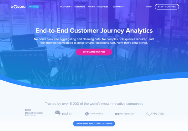
For Woopra, the answer is their customers. They use this CTA to direct to a customer page with video case studies.
6. Test Drive Survey Gizmo (Survey Gizmo)
I love this example from Survey Gizmo, a CTA that avoids the words "trial" and "demo" and instead, uses creative, actionable language. "Test Drive Survey Gizmo," is different, but says the same thing: give us a shot.
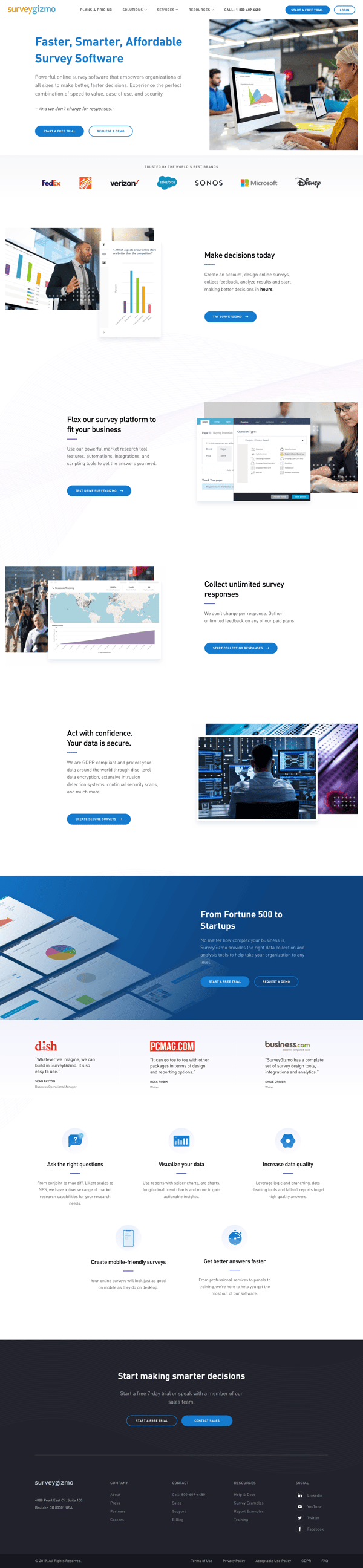
Survey Gizmo also has a lot of other creative CTA copy, such as "Start Collecting Responses," and "Create Secure Surveys," which both lead to their pricing page.
7. Inspiration (Balsamiq)
Balsamiq, a wireframing tool for mobile apps, has a minimal approach to CTA copy. I really like it. Rather than writing longer copy, they stick to one or two word CTAs, such as "Articles," and "Inspiration."
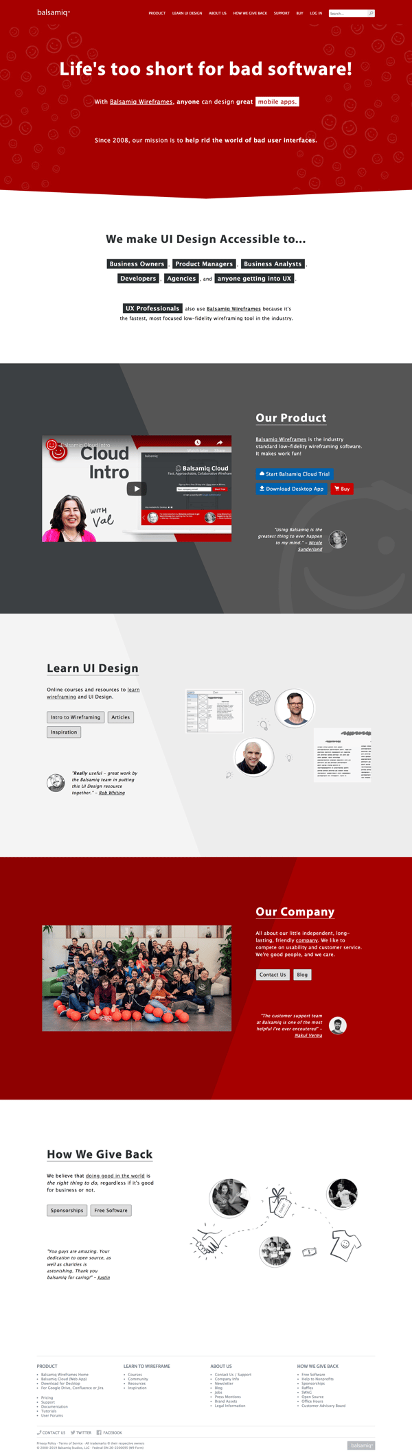
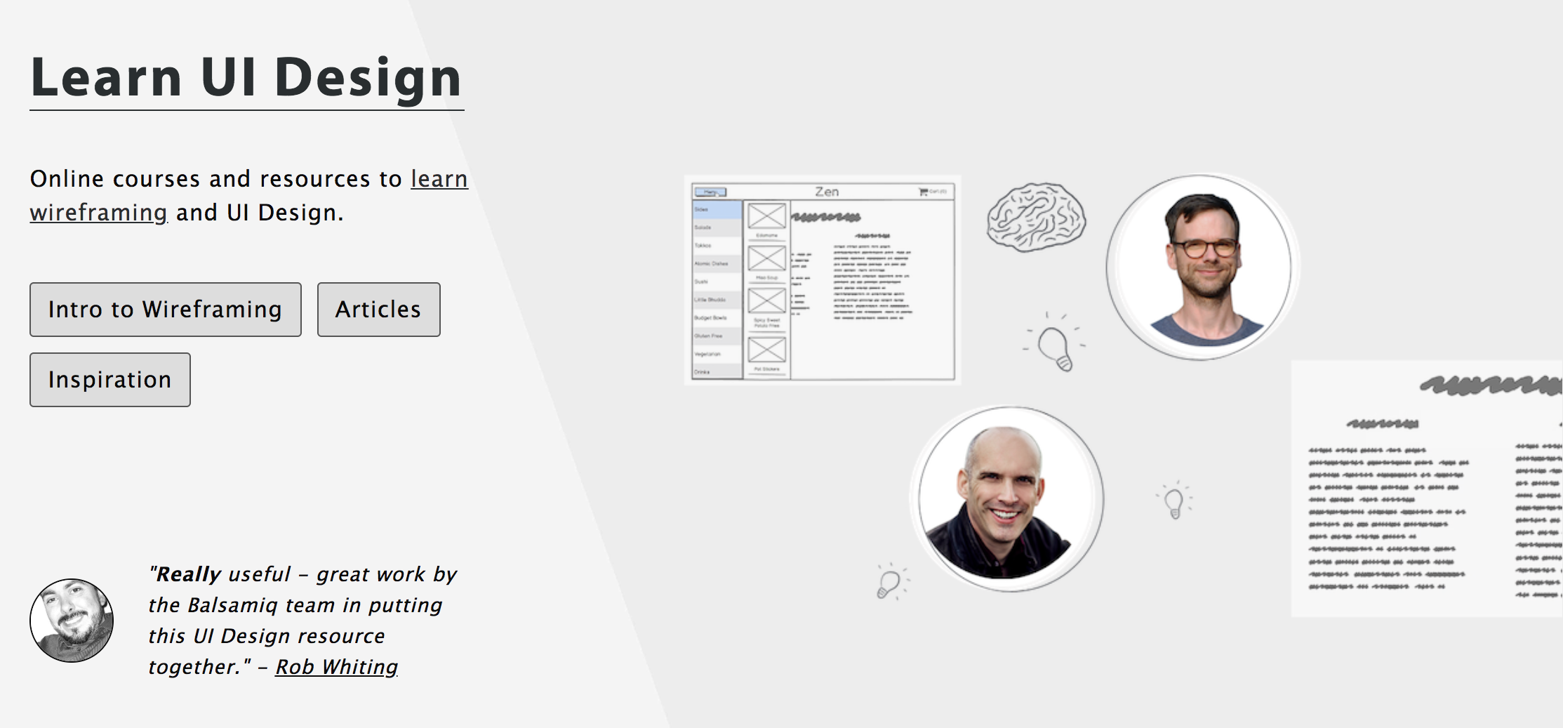
They even put a lot of these CTAs side-by-side, which works, since the copy is so specific and directs the visitors exactly where they need to go.
8. Request Trial (User Testing)
There's only so many ways to write Free Trial copy. I like User Testing's copy for their Free Trial offer because it's simple, but also tells you something about the next step: you need to ask for a trial.
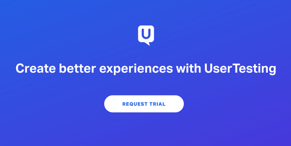
You don't just get a trial. And if you're a company that's not looking to give out trials to anyone who wants one, this is good copy to experiment with.
Creating High Converting CTAs On Your Website
If you're trying to improve your conversion rates, you should do more than tweak the copy on a few buttons. You need to go through your website and consider how relevant every CTA is. What does it help the customer accomplish?
Because increasing your conversion rate is all about giving the customer what they really need. And with the right CTAs, you can establish a smoother page flow and better customer experience, skyrocketing your conversion rates and acquiring highly valuable leads.

About Lean Labs
The only outsourced growth team with a track record of 10X growth for SaaS & Tech co's. 🚀
Explore Topics

Discover the Hidden Strategies We Use to 10X Our Clients Growth in 36 Months!
The Growth Playbook is a FREE guide to planning, budgeting and accelerating your company’s growth.


