The Marketer's Essential Guide to the Psychology of Color
What if I told you colors were so important they could affect your marketing results?
That doesn't sound too crazy, right? I mean, studies have shown being surrounded by green scenery can actually lower your chance of nonaccidental death by 12%.
Well, another study found that store interiors painted blue increased their perceived attractiveness and fairness while increasing excitement and even patronage.
As a marketer, this is exciting. This is an opportunity to explore another avenue for appealing to your customer base. And all it takes is a bit of understanding and the right palette.
Mastering the Psychology of Color for Better Designs
There are debates over whether color has an actual effect on marketing, but science has shown clear correlations between how people react to different ones. The real debate is mislabeled, and shouldn't be "do colors affect us," but "how do colors affect us?"
Take red and yellow, for instance. In many cultures (and in nature) these colors are a symbol for danger or warning. They even tell you to slow down or stop while driving. McDonald's uses both of these colors it's branding and doesn't seem to have an issue. If anything, people are slowing by the golden arches so they can stop for a burger.
So while some of the colors may have different effects based on cultural norms, we'll discuss the proven information, and then share some of the other potential uses of them.
How Colors Affect Us
Colors work some impressive wonders on the human body. In fact, they can even drive hormones by interacting with the hypothalamus. When blue-green light comes at dawn, our body releases cortisol to wake us up. When we're hit with warm reds as the sun sets, our body releases melatonin to help us sleep. This is also one of the reasons blue-light block glasses are becoming popular as a pre-bedtime accessory.
One study found that colors can even drive heart rate changes, and while more are constantly ongoing about how we can be affected, the real question is why does this happen? Why does red excite us in marketing while blue makes us feel more competent?
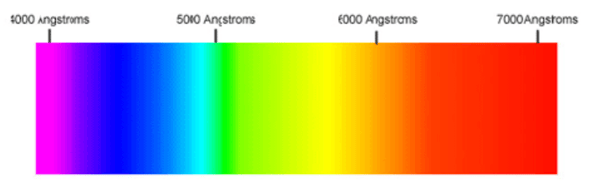
The simplest description involves our circadian clocks and the need for consistency. Before modern amenities, humans lived by the passing of the sun, and we needed those colors to send signals that kept us on time. There's also a theory that we're more sensitive to shorter wavelengths because they're easier for us to see. This means colors like violet, blue, and green have a more significant impact on us than the longer wavelengths, like yellow and red.
Oppositely, a lot of the impact of colors may be from subconscious memories we hold. For example, if you grew up with a rough childhood, but your bedroom was a place of comfort, that color paint may bring you peace, even if it was puke-green. This is the main counter-argument to the idea that colors actually influence our decisions. Regardless, however, both sides acknowledge that colors play a role in our lives.
The Capabilities of Each Color
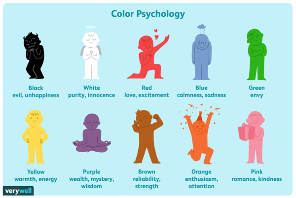
Above are the traditionally acknowledged affects colors can have on your mood and it's where many believe color psychology gets too mystical.
VeryWellMind.com, the same site that created the image above, does in-depth break downs of each color, explaining why white represents purity, why green symbolizes good luck, and why purple is regal.
Amplifying Your Brand's Personality Traits
Depending on how you want your brand to be perceived, you can choose the color that best does it. If you're interested in a refreshing, yet eye-catching logo, using orange is a good bet.
Additionally, you should choose a secondary color to capture other parts of your brand's personality. If orange is your primary, it'll stand out more with blue as a secondary color because they contrast each other. This will make graphics like your CTAs pop on the page.
Your site should use these brand colors in a way that doesn't overdo it but harnesses their power. For instance, if everything on your page was orange, customers would be faced with serious eye strain that would turn them away from your site. Use these colors sparingly so that they really stand out to your audience.
Establishing Your Brand With The Right Color
While some companies may invest days in selecting the right color for a brand, the effect of these colors isn't enough that you'll draw immense amounts of traffic by changing from one to another. If you pick the colors that best represent your brand, you may find some benefits, but the only way to know is to execute.
Some things that will have more effect on your traffic are your brand's character and voice. If you can hone these two pieces of your brand's image, it'll be easier to draw the specific audience you're after because you'll feel authentic and have a clear message they can resonate with. Check out our free Brand Character and Voice Workbook to see how you can create best image for your business.

About Lean Labs
The only outsourced growth team with a track record of 10X growth for SaaS & Tech co's. 🚀
Explore Topics

Discover the Hidden Strategies We Use to 10X Our Clients Growth in 36 Months!
The Growth Playbook is a FREE guide to planning, budgeting and accelerating your company’s growth.


