-
What’s the Benchmark Conversion Rate?
-
The Generic Form:
-
10 Elements to Create a High Converting Website, Contact Page
-
Step 1: Develop a Communication Plan
-
Step 2: Clear Messaging
-
Step 3: Let them know what to expect
-
Step 4: Remove the objection: “the sales team will pester me”
-
Step 5: Personalize your Greeting Message
-
Step 6: Get Straight to the Point with a “Book a Meeting” Button
-
Step 7: Form Placement
-
Step 8: Make your Contact Page Easy to Find for Users
-
Step 9: A Simple yet Attractive Web Design
-
Step 10: Use Social Proof for Contact Form Conversions
-
Summing It All Up

Key Elements of Contact Pages that Convert
All professional websites have one thing in common: they all have a contact page. After all, the whole point of having a website is being discovered and contacted. And most of the time, these websites only have this one conversion point on their website.
But why are the stats on them so bad if this is such a significant “money” page. In fact, typically, 93% of visitors to SaaS websites don’t convert to customers.
That’s not good.
And despite increasing traffic growth, many businesses fall at the final hurdle.
If this sounds like you, then this is the article for you.
Whether your contact page allows visitors to send a message through a form or simply features an email address or phone number, your eventual success is measured by the percentage of people who decide to contact you.
The medium doesn’t matter and depends heavily on your business.
But, in this guide, we’re going to cover a few universal principles that will help maximize the conversion rate of your contact pages.
What’s the Benchmark Conversion Rate?
For a site that’s been built strategically with multiple conversion touch-points - landing pages, pop-up forms, newsletter signups, and an optimized contact page, you can expect 2-3% of visitors to convert.
Now imagine you not only have a beautiful site that works,
But more traffic.
This way, you could widen the funnel at the same time as optimizing your conversion rates. In the end, you’ll see a greater return on your hard-earned lead generation efforts.
The Generic Form: 
Imagine this is an image you see relatively often. For the average prospect, this is not a good sign when a company has not taken the time or thought to win you over. Think of it like this: It’s unlikely that you’d go on a second date with someone who took you to Maccy D’s.
So what do visitors want?
10 Elements to Create a High Converting Website, Contact Page
Step 1: Develop a Communication Plan
When it comes to your contact page, there are two ends of the spectrum:
- Option 1: They want instant action but feel you will ignore them if they fill this form in.
- Option 2: If I fill in this form, the sales team will pester me until the end of time.
Depending on their internal motivations, past experiences and needs will depend on how they prefer to interact with your company. This is why it is crucial that you should create a killer communication plan based on market research. A strong communication plan will define the strategies and processes that help capture the attention of people outside of your company. Only then, offer various touch points for your leads so they can choose how they prefer to contact you.
We will talk about this in the next sections.
A few items to think about in your communication plan are:
- Define your USP - your competitive advantage so you can channel that on your contact page
- Identify audience segments
- Select ways to communicate with each of your audience segment
- Establish a feedback loop
- Determine what success looks like: what conversion rate are you looking for? Do you want them to book an appointment with you or just contact you?
- Create a mission statement
Step 2: Clear Messaging
Like any strategic copywriting, it’s your job to engage and win over the customer. And you do this, by having the reader in mind before thinking of your sales message.
Today’s audience is skeptical, savvy and does their own research. As such, they know straight away when something is poorly written, duplicitous or ‘salesy’.
Step 3: Let them know what to expect
For the customers who feel like you’ll ignore them if they fill out the form, the best option is to make sure you tell people what will happen after the submit button and when. Please don’t leave it up to their imagination.
People tend to feel more comfortable when they know they’re contacting an actual person rather than just a bot. So, include that in your message. Use the opportunity to talk about how important connection is to your company and how you pride yourselves on communication. This can make users feel more comfortable filling out the form to send you a message.
Talk about what they can expect when they reach out to you, including how long it might take for someone to get back to them. You don’t have to give a great amount of detail; a simple ticketing system or an automated phone call, text, or email will suffice.
Step 4: Remove the objection: “the sales team will pester me”
“If I fill in this form, the sales team will pester me until the end of time.”
We have all been on the bad side of too many sales calls, which makes us skeptical when giving out our phone numbers or calling a business. So, on your contact page make sure to tell them how you will use their contact information.
Some people avoid filling out contact forms or calling because they don’t want their data stored, or they don’t want to sign up for emails of any kind.
Be clear about this. If you’re storing information, you must disclose it. If you’re not, make that known, too. Sometimes, that can mean the difference between someone sending you a message or not.
If you opt to include your phone number and email instead of a form and they decide to directly call you, you can incorporate a skill-based routing (SBR) to reduce the likelihood of them becoming annoyed. SBS assigns incoming calls to an operator with high-experience levels rather than a present operator. As a result, the customer won’t have to deal with representatives who lack the expertise to serve them.
Step 5: Personalize your Greeting Message
Suppose your site visitor has already filled in a form to download a paywall or gated piece of content. In that case, you can add personalization to the contact page.
Adding the smallest amount of effort like personalized messaging will grab their attention and give them a tailored experience, setting you apart from your competitors.
Step 6: Get Straight to the Point with a “Book a Meeting” Button
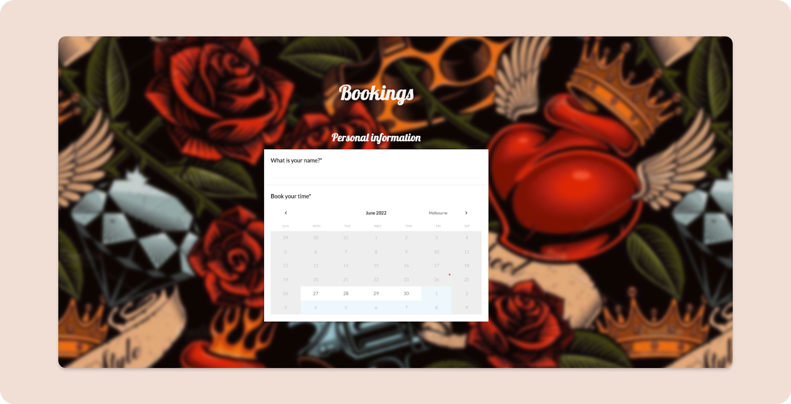
Solution: Instead of making your potential customers contact you to book a meeting, which requires a lot of back-and-forths, cut out a step and add a booking widget or alternative booking form.
Alternatively, a simple button below the form would segment the bottom of the funnel (BOFU) visitors, who are ready to commit, from those who want to ask a few questions.
Step 7: Form Placement
Don’t hide the contact form on the page.
The contact form is often something added at the last minute or an “extra” you might feel obligated to attach to your website. Unfortunately, with that mindset, you’re more likely to reduce your conversions.
If someone isn’t interested in a website or can’t find what they’re looking for, a user will leave the site in 10-20 seconds.
So, suppose someone is trying to get a hold of your business, and they can’t find where to do so. In that case, your lead might leave your site without ever getting in touch and instead start looking at your competitors.
When your contact form is a small, pre-made template at the bottom of a page, it’s less likely that it will stand out to people, and they will probably keep scrolling or clicking by.
Step 8: Make your Contact Page Easy to Find for Users
Your contact page shouldn’t be an afterthought. Instead, it should be easy for your site viewers to find. Remember, you may only have a few seconds to make an impression!
You want to encourage engagement with potential customers and give them a better experience. Experts expect that strategic customer journeys will become more significant than most other buying influences like price very soon. In fact, 86% of customers say they will pay more for a product or service if their experience is better.
Hiding your content page away at the bottom of one section of your website can be frustrating for a user and sets a negative impression and tone. Even if they do eventually find the form, the difficulty of discovering it can leave a negative impression before they even reach out to you.
So, if someone wants to contact you with a question or comment, don’t make it a treasure hunt for them.
Some tips for making your contact page easy to find include:
- Having a separate tab in the navigation bar
- Including a “contact us” box on every page
- Incorporate some low-stress conversion offers. If the ‘wanderers' aren't ready to book a meeting, offer them content offers like signing up for the newsletter, a downloadable white paper, or offer them lesson emails. But remember, like any landing-page form, only have one form per offer. Not only for the sake of your form analytics but to ensure you don’t confuse your visitors.
Step 9: A Simple yet Attractive Web Design
For a good user experience (UX), we know the page has got to be visually appealing, which makes sense since you only have 50 milliseconds to grasp their attention. It’s not enough to use a standard template that’s easy for users to ignore. Thankfully, creating a contact page that will stand out and grab people’s attention with one click is not difficult. Keep these UX design tips in mind to help your contact page look its best:
- Customize the questions you ask users
- Aim for clarity and simplicity: Please keep it simple with two or three question fields, so it’s easy to fill out
- Don’t play too much with design patterns: The colors should be visible but neutral
- Aim for clarity and simplicity: Focus on only including essential form fields so as not to overload the user
- Make your website more scannable: Less clutter boosts conversions, so have more white space around CTA buttons
The single most precious form of marketing is word-of-mouth from happy customers. One sure-fire way to buck the trend of poor contact pages is to incorporate customer reviews. Some simple marketing hacks to include:
- Display the logos of any other businesses you’ve worked with or awards you’ve received over the years.
- Incorporate a testimonial carousel at the bottom of the page
- Make it easy for customers to leave a review
People are naturally skeptical about companies they’ve never heard of. But paradoxically, 85% of customers trust online reviews as much as personal recommendations which means you can build trust in your brand by showing potential clients honest feedback from existing customers.
You can also include some examples of your recent work or projects you’re proud of so users can know what they’re getting before they even start to work with you.
Summing It All Up
To summarize, your contact page should be an extension of your overall website and should truly represent your business. They should feature clear, personal messaging, build trust at first sight, and be simple to use. It’s also a good idea to create a success page to set your leads’ expectations. For example, you might inform them that you will get back to them within 24 hours or provide a phone number that they can call in case of an emergency.

About Lean Labs
The only outsourced growth team with a track record of 10X growth for SaaS & Tech co's. 🚀
Explore Topics

Discover the Hidden Strategies We Use to 10X Our Clients Growth in 36 Months!
The Growth Playbook is a FREE guide to planning, budgeting and accelerating your company’s growth.


