How To Improve Your Blog Design To Drive More Clicks and Engagement
When I visited Porto, Portugal last year, I went to Livraria Lello, one of the most famous bookstores in the world. I never plan on returning.
The line to get into the store was massive. I couldn't browse through the books, because there were too many people. The famous red staircase in the store was worn and had graffiti carved into it. It was a mess, and there wasn't a cashier or an associate in sight to help.
I can't help but see parallels between my poor experience at Livraria Lello and a lot of company blogs. Despite having great blog content, the UX is awful. It takes too long to find anything. Even when I do find a useful article, the layout gives me a headache.
That's why if you publish great SEO content, but you still have low traffic, clicks, and engagement, I'd bet that your blog UX could use some work.
Like me at that bookstore, people can't find what they're looking for. It's difficult to get around, so they leave. And that low engagement tells Google that your blog isn't that great, which impacts your traffic.
Thankfully, to get a blog that drives massive clicks and engagement, you don't have to undergo a massive redesign. However, there are critical UX components to address as soon as you can. Because if your poor UX goes unresolved, your blog performance is only going to get worse.
How To Improve Your Blog Design With Ideas From Media Influencers
When I say "blog design," I'm not referring to only aesthetics, such as the colors or pictures. I'm talking about the experience that your customer has using it. If you've ever left a company blog because it was too difficult to navigate, you know what I mean.
Since a lot of companies make similar blog design mistakes, they're not too difficult to identify. A lot of companies are crushing blog design, and there's a lot you can easily apply to your blog to improve the flow.
1. Have A Creative Way To Sort Content
A few weeks ago, I was traveling in London and desperately needed a new pair of flats. I went to one of the nicest department stores in the city, only to find that their shoe section was a complete wreck. I was motivated to buy and knew what I wanted, but couldn't deal with sorting through all of that chaos.
It’s the same as when you go to a blog or resource center. When you know what you’re looking for, but can't find it because there's no rhyme or reason to how things are organized, you leave.
A lot of people assume that categorizing their blog content is difficult, but it can be as simple as sorting all of your content into 4-5 overarching topics.
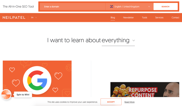
Neil Patel's blog is a great example of a creative, minimal way to find content, with a fill-in-the-blank at the top of the page that says:
"I want to learn about _________________."
From there, you can select between categories such as everything, content marketing, eCommerce, and email marketing in a drop down. It's not fancy, but it works.
2. Simplify The Overall Look
To make a company blog a good resource, a lot of companies go overboard. They add too many places to click, a lot of images, and an endless amount of categories, making it more difficult for the reader to find anything.
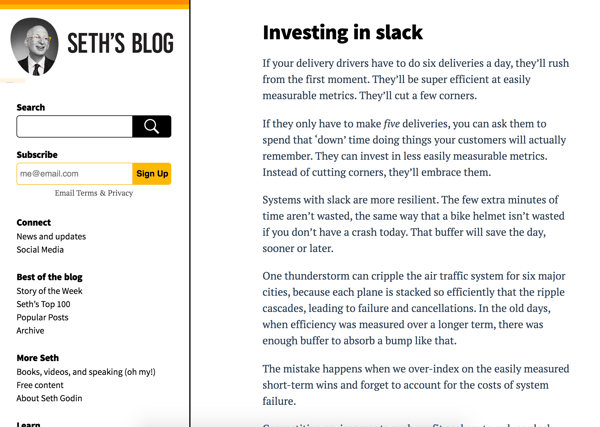
That's why one of my favorite blogs is Seth Godin's. He has a lot of short, concise posts, and the blog doesn't have too much to click on. I'm not necessarily encouraging short content, but there is something to be said about removing unnecessary clutter, Marie Kondo-style.
It's important to note that Seth Godin is a well-known marketing thought-leader, so he doesn't need to rely on SEO content and can make a choice between longer and shorter content. However, he understands that when it comes to blog design, less is best, which is something we can learn from.
3. Highlight Different Blog Articles
In my opinion, one of the best changes in blog design is removing the publication date. However, there ARE pros and cons to this. One disadvantage is helping the reader choose what to read.
I know that when I go to a blog for the first time, I usually look at the newest content. If I don't know what that is, I might not read anything, because I don't know what’s new and noteworthy.
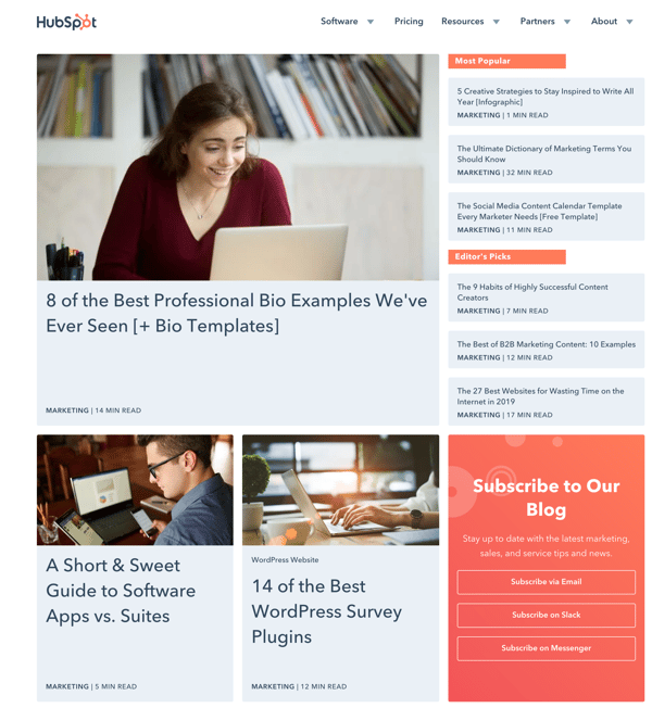
HubSpot has a great solution for this. HubSpot's blog has two great sections on the right-hand side (Most Popular) and (Editor's Picks) where they regularly highlight blog articles and content, which acts as a helpful suggestion to visitors.
4. Update Your Typography
It's a seemingly small change, but updating your blog typography is a quick way to refresh the look and feel of your blog. A modern, easy typeface can make a significant impact on your blog.
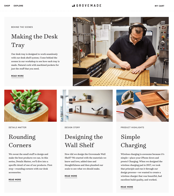
Grovemade's blog, for instance, uses a really clean looking typeface on their blog.
Nailing Your Blog Design And Drastically Improving Engagement
The goal for every blog is the same: you want to provide great content to your reader and get engagement. You want website visitors to read your articles, watch your videos, listen to your podcasts, share them, leave comments, and then convert on your lead magnets and offers.
Those are the reasons any company starts a blog. But to get that kind of continuous engagement on your blog, you need to consistently track, monitor, and make adjustments to the flow and UX. You need to keep writing high-quality SEO content. Because you're never done providing an awesome experience for your audience.
About Lean Labs
The only outsourced growth team with a track record of 10X growth for SaaS & Tech co's. 🚀
Explore Topics

Discover the Hidden Strategies We Use to 10X Our Clients Growth in 36 Months!
The Growth Playbook is a FREE guide to planning, budgeting and accelerating your company’s growth.


