-
HubSpot Lead Capture Landing Page: The Most Critical Thing
-
One Target Persona
-
An Awesome Offer With A Clear Benefit
-
A Compelling Narrative/Flow
-
A Place In The Buyer's Journey
-
A Crystal Clear CTA And Button
-
An Overall Mood Or Vibe [Image/Video]
-
Exceptional Copy
-
Easy To Use Form
-
A Thank You Page
-
Building The Perfect HubSpot Lead Capture Page

The Perfect HubSpot Lead Capture Landing Page Revealed
Thanks to HubSpot, a landing page can be a lead vending machine.
You can build a modular, customer-centric landing page that converts high-quality leads like crazy. Those leads can be enrolled nurturing workflows and moved through your funnel pretty seamlessly. As a result, leads stay engaged, and you have a stronger foundation to build real relationships with potential customers.
However, to get leads like that, your HubSpot lead capture landing page needs to have all of the right components.
HubSpot Lead Capture Landing Page: The Most Critical Thing
A lot of companies focus on the design and look of their landing pages.
I prioritize the story. The right message, flow, and tone on your landing page will naturally attract and capture the attention of the best leads.
While pages that are aesthetically beautiful and sleek are great, without that strong, cohesive story, you’re going to get a lot of leads that don’t really understand what you’re selling. And that will be a conversion killer.
Here are all of the components I believe go into creating an excellent narrative for your landing page and are necessary to create a high-converting HubSpot lead capture landing page.
One Target Persona
When you get into the specifics of who your customer is, what they care about, what their triggers are, etc., you can get exceptionally specific about what kind of messaging and website content you need on a landing page.
Without that context, your landing page language will be too broad. You also risk attracting the wrong customer because you didn’t tailor it for a specific person.
It’s no surprise that HubSpot itself has one of the best examples of buyer persona data in play. From the copy of this module on their homepage, as well as their Get Started landing page.
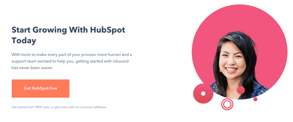
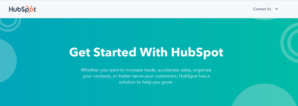
From the content on these pages, you can deduct that the buyer persona they’re targeting is:
- Looking for more growth from their marketing or sales efforts
- Feels that inbound marketing is difficult
- Needs to increase leads or accelerate sales
- May not be serving their customer as well as they should be
You can document this information with a one-page buyer persona template. HubSpot has a great Make My Persona tool, but we use a one-page template that looks like this:
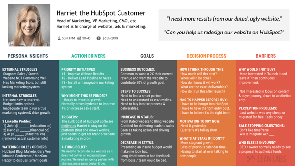
We use this template to record our persona’s internal and external struggles, obstacles, goals, and blockers. All of those insights can be used to write much more effective headlines, body copy, CTA button copy, and more.
An Awesome Offer With A Clear Benefit
If you have a weak offer, your conversion rate is going to be low. Visitors don’t want to waste their time with another EBook or worksheet that's going to sit in their downloads folder. The offer has to be great, period.
Admittedly, I like Tony Robbins. But that’s not why I like this offer from his website. As a marketer, I respect it. The coaching session from a coaching expert a great offer. And if I go through the coach session, not only will I get advice, I will get results.
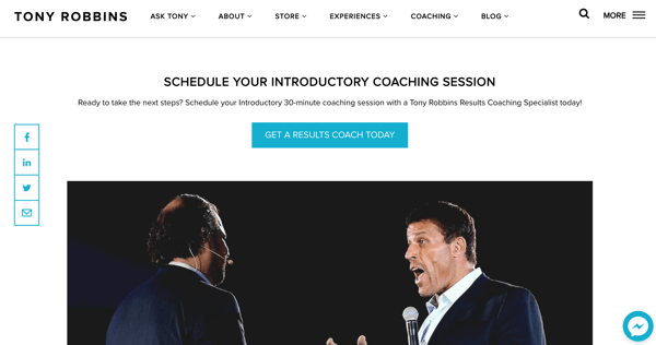
How do I know I'll get results? It tells me, right on the copy of the CTA button.
"Get a results coach."
If you want to get conversions, you need to make a compelling offer like this. You need to spell out the value for the visitor because they will not want to spend the mental calories to figure it out.
If you need guidance on what that value is, try a Jobs To Be Done exercise.
-1.png?width=600&name=jobstobedone%20(2)-1.png)
If you can figure out what emotional job your offer fulfills (for Tony, it's making the person feel proud and ambitious), you can use that language on your landing page. Another critical job to do is the social job, which is how others will perceive your lead after they use the offer.
A Compelling Narrative/Flow
You wouldn’t write a story or shoot a film without an outline or script, right?
It’s no different for your landing pages. When landing pages don’t have a narrative, with a distinct start and finish, your content will come off disjointed and can be confusing. I like this example from Bolt, an end-to-end solution for payment processing and checkout for SaaS companies.
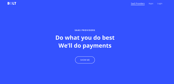
You get a clear idea of what you can do with Bolt. Then, there's an actionable next step: show me. From there, the page guides you through what you can do with Bolt.
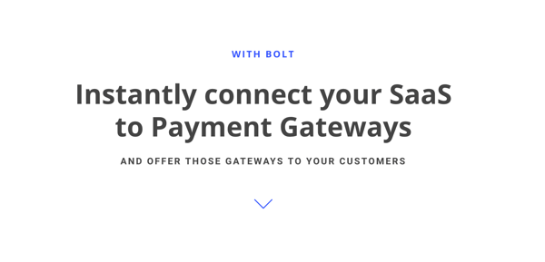
From there, Bolt also provides specifics (through the use of modules) about the product. From there, you can find out more information (leading to more content) or you can sign-up.
A Place In The Buyer's Journey
You want every offer to fit somewhere in the buyer’s journey. Otherwise, your website content and landing pages will feel disjointed from your marketing strategy.
You can determine where your offer fits using a buyer journey template, where you can brainstorm the messaging and content needed at every stage to move the lead forward.
We use a buyer journey template that looks like this:
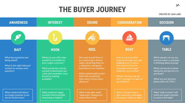
Every stage serves a particular purpose. For instance, the interest stage consists of TOFU offers, such as podcasts, ebooks, and infographics to attract first-time visitors. Those assets (and the landing pages that support them) have a clear place.
To ensure your landing page and the offer fit in your buyer journey, ask yourself a few critical questions:
- How does the offer on this landing page help the customer move forward in the buyer journey?
- How does the lead access the landing page? What CTAs do they need to click on or pages they need to visit?
- After the lead converts on this page, what happens next? What does that tell us about their interest? What have we learned about them because they took that action?
Overall, you need your landing page to fit into your buyer journey, so there's a clear path for visitors to become leads and leads to become prospects, and so forth.
A Crystal Clear CTA And Button
When it comes to CTAs, there are two things to focus on:
- The CTA button copy
- The context leading up to the button, such as the header and sub-header.
For both, you want to avoid being generic at all costs. You need to be extremely specific and direct about what the CTA is and what happens next.
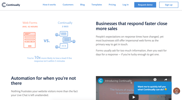
I like this example from Continually. The call to action is actually at the top of the page (which I don’t hate), with a lot of great messaging.
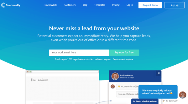
“Try now for free” is the button copy, and there’s a lot of additional information. The landing page copy assures the visitor that the trial is free up to 1,000 views, they do not have to give their credit card information up front and they can cancel whenever they want.
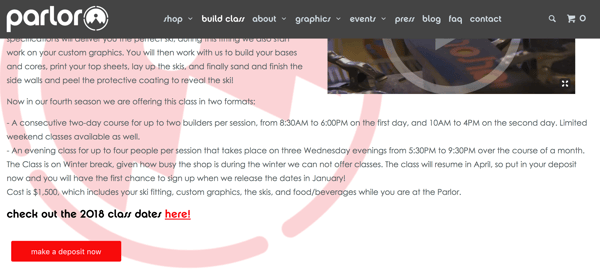
When it comes to CTA button copy, I like this one from Parlor Skis. It’s not lead generation (they sell skis, obviously,) but their CTA copy on one of their conversion pages directly relates to the content on the page.
After talking about custom skis, the next step is to “Make A Deposit Now.” When you click, a cart with a “$500 Deposit” pops up. You know what they’re asking you to do. You know what will happen when you proceed to checkout. They’re using the ask (the offer) to craft the CTA button copy.
Here are a few other examples of great CTAs:
.png?width=600&name=Screen-Shot-2017-10-31-at-20.02.14%20(1).png)
Each CTA is direct and relates to the material and content on the rest of the landing page.
An Overall Mood Or Vibe [Image/Video]
How is the offer supposed to make your persona feel when they get to it? Relieved? Excited?
It depends on who you’re selling to, what their mindset is, your industry, and your brand voice. You need to consider the mood when choosing images, graphics, illustrations, writing headlines, etc.
Take Legacy for example. Legacy is a fertility site for men. The site is pretty serious, promising the client privacy, quality, and security. They use a lot of language like "safeguard" and "private."
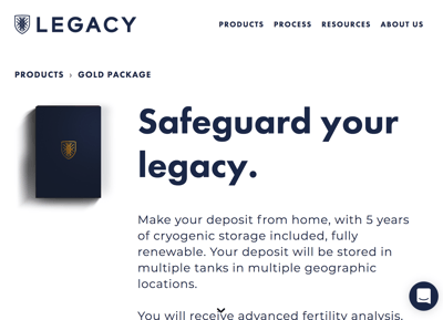
If you wanted to add additional imagery or video to their client products page, you would need to select something that fit that tone.
A father and son image like this would be a good fit:
.jpg?width=500&name=tina-bo-677005-unsplash%20(1).jpg)
While a father and son image like this would not:
.jpg?width=500&name=filios-sazeides-293019-unsplash%20(1).jpg)
The differences between the photos are subtle but impactful. Because for this particular subject matter, you want to stick with the theme of security and trust. Words that convey anything fun, casual or breezy may break the mood and deter leads from moving forward with you.
You can also lose the trust of your customer or potentially offend them with the wrong choice of imagery or videography.
Exceptional Copy
All of these steps naturally lead to one of the most critical components of a landing page: the copy.
On your landing page, the message is everything. You need to prioritize writing exceptional headlines, having a compelling offer title, enticing CTA button copy, modules that clearly explain the values and benefits of your offer for your landing pages to be successful.
Here are a few landing page copy examples that inspire me.
Continually uses modules to explain what you will get from using their product.
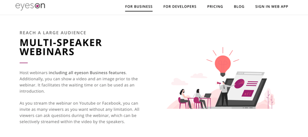
Eyeson includes the benefit of each of their product features.
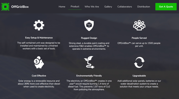
OffGridBox uses statistics and proof points to break down the complexities of their product.
To write this kind of copy, you need three things:
- An incredible writer (if you do not have one, hire one.)
- What your lead needs to hear about your product or service to convert. You can get this from your buyer personas if they're detailed enough.
- A page flow, or landing page outline.
A key page flow is basically a series of questions with a recommended structure for lead capture landing page messaging.
The one I use looks like this:
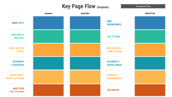
Using this, I have all of the direction I need to write excellent lead capture page copy. I start from the bottom and work my way down, documenting all of this from the customer's point of view. Then, I go back and polish and use the template to create my landing page.
Overall, your lead needs to know that the offer they're going to receive is worth the click.
Easy To Use Form
Another critical component to any HubSpot lead capture landing page is your form. You want to build a form with form fields that match the intended buyer journey stage, asking for the appropriate information at the right time. You also want the form to be easy to use, especially on mobile.
Here are a few examples that I like a lot:
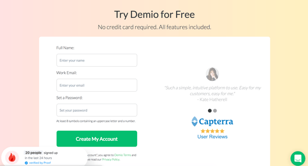
Demio adds to their form with a few Capterra user reviews, which cycles through actual reviews from a third-party review site.
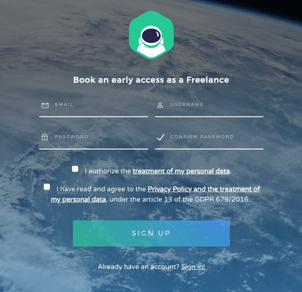
Coderblock also has a great form on their freelancer landing page, which asks for a minimal amount of information.
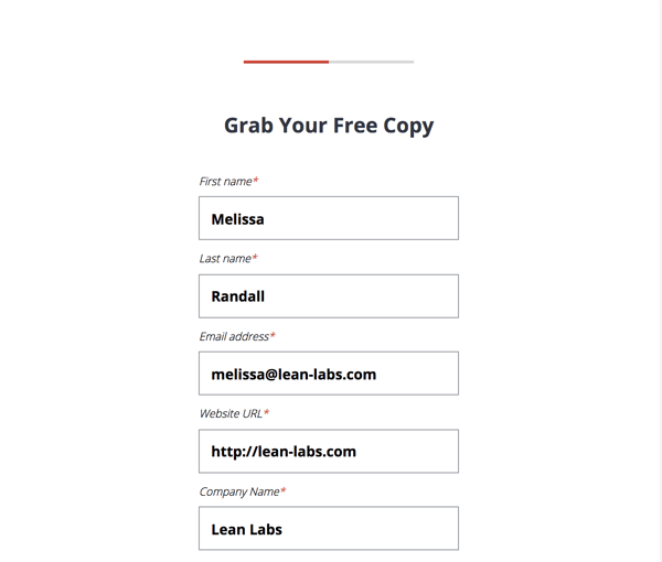
Our playbook form has additional fields, but with progressive profiling, the forms will decrease when information is known or not known. In this case, I'd be a new lead since the form asks for first name, last name, email address, etc.
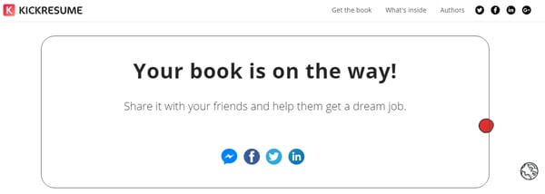
A Thank You Page
Having a thank you page is also a critical component of a HubSpot lead capture page. A thank you page acts as a logical next step for the lead, providing context to how they will receive their offer, give a link to that asset, as well as share links to additional blog content or social media links.
Here are a few great thank you pages that give an actionable next step, communicate context about the offer, and more.
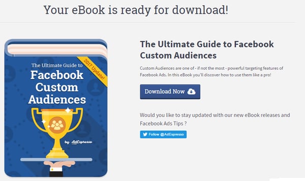
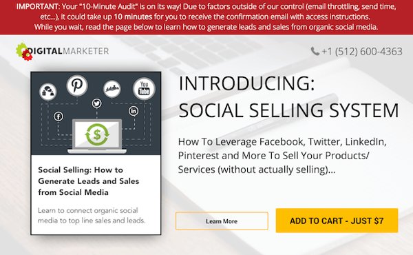
The example above, from Digital Marketer, is great because it not only provides essential information about the offer but recommends another offer that's related to the one they just downloaded.
The thank you page is critical. Without it, there's nothing for the customer to do but leave. And you don't want there to be any drop-off pages for your customer. You always want to have a relatable recommendation of how they should move forward.
Building The Perfect HubSpot Lead Capture Page
To create a HubSpot lead capture page that drives conversions and delivers ROI, you need to have an exceptional understanding of your ideal customer. As long as you conduct in-depth customer research, have a great offer, and strong messaging, your HubSpot lead capture page will convert like crazy.
However, there's more to lead generation than just landing pages. You also need a customer-centric website and a buyer journey. Using our free Strategy Kit, you can gain access to website strategy documents that will inform a better site, and help you attract and convert high-quality leads.
About Lean Labs
The only outsourced growth team with a track record of 10X growth for SaaS & Tech co's. 🚀
Explore Topics

Discover the Hidden Strategies We Use to 10X Our Clients Growth in 36 Months!
The Growth Playbook is a FREE guide to planning, budgeting and accelerating your company’s growth.


