No matter how many new and exciting social platforms are launched in the coming years, email marketing isn't going anywhere.
A whopping 77 percent of consumers prefer to receive permission-based marketing communications via email, according to a 2012 survey conducted by Salesforce. The reason being?
It's simple, private, and relatively free of distraction.
That is, unless you've accumulated several opt-ins and your Inbox looks more like a flea market than a relaxing hangout. It happens to the best of us—check out unroll.me to unsubscribe from as many newsletters as you want with one click.
So how do you create emails that simply work?
How To Write Amazing Emails
The reality is people will unsubscribe from your list, and that's OK. You want people to disqualify themselves if they're genuinely not a good fit. But you also want to make sure you're not scaring, boring, or annoying the crap out of your prospects! And that you're positioning your emails to be as well-received as possible.
That means:
You know what else is important? Designing emails that are reader-friendly and easy to share. For the rest of this article, we'll reveal a step-by-step blueprint for structuring "the perfect marketing email."
How to Increase Open Rate of Emails
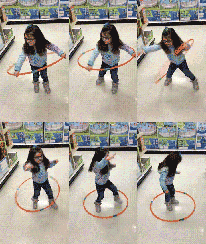
 I know some of you are like this hula girl. You really want to get results from your email marketing campaigns, but your customers just won't cooperate. Don't worry, we're going to have you rockin' the email marketing hula hoop in just a few steps.
First things first—you can have the most interesting email in the world, but it won't matter if no one opens it. Here's how to make sure that happens:
1. Choose Recognizable "From Names"
How did your prospects first interact with you? If it was as "Gary Smith" from Company X, it may be appropriate to just put "Gary Smith" in the from section. Otherwise, your best bet is to go with something like Company X, Gary from Company X or Team X. Though this may seem obvious, not recognizing sender names is the number one reason emails don't get opened.
2. Write Compelling Subject Lines
The subject line has one job: to sell the click. If people aren't intrigued enough to open the email, it's a waste of time.
In this case, "compelling" means clear, curiosity-invoking, and/or benefit specific.
Keep text under 50 characters; 32 characters is ideal for mobile device cutoffs. This translates to roughly four to seven words. Although, some have had success with longer subject lines. Test it out and see what length works best for you.
Also, avoid WRITING IN ALL CAPS (no one likes being yelled at) and using excessive punctuation (it's annoying)!!!
3. Use Pre-header Text
Your pre-header text is the first line of copy that appears beneath email subject lines. It's generally visible as a preview on mobile devices. Most will display between 75 to 100 characters. Take advantage of this precious real estate by making sure your first five to eight words are on point.
How to Get People to Actually Read Your Email
Your email was opened—congratulations! Obviously, on-target content is the most important factor in getting your emails read. But there are a few other things you should do to support engagement:
4. Optimize For Mobile
According to MovableInk's 2015 U.S. Consumer Device Preference Report, 66 percent of all email in the U.S. is now opened on smartphones or tablets, yet a surprising 42 percent of marketers say they rarely or never use email responsive design ( ExactTarget). Obviously, this is a HUGE opportunity cost for businesses.
Solution: Choose a mobile-responsive template (e.g. the email adapts based on the size of the screen it’s being displayed on) or a single-column template (e.g. texts and images are stacked on one another).
5. Maximize For Readability
Have you ever looked forward to curling up with the manual to your DVD player after a long day at work? Or how about a long, academic paper? Such texts are notorious for being long and cumbersome. Take a cue from general newspapers by taking a "less is more" approach.
Font Choice: Choose a legible serif or san-serif font; don't get fancy. Arial, Verdana and Times New Roman are all popular options. Google also offers a bunch of fonts that are specifically designed with screen reading in mind. Additionally, stick to no more than two font styles per email (i.e. one for headers and one for body copy).
Paragraph Length: Break paragraphs with hard returns every two to four sentences. Though this will make your emails look longer, they will feel more inviting.
Text Length: Remember, your email should primarily function as a general CTA. Keep copy moving toward the general goal of getting readers to clickthrough onto your site or a pre-determined landing page. On average, the shorter the text, the higher the clickthrough rate.
6. Follow Principles of Good Design
If content is king, then presentation is queen.
Design matters.
A lot.
There's a reason the "7 Wonders of The World" captivate us, just like there's a reason most of us will gravitate toward name-brand products over generic when given the choice—we're naturally drawn toward beauty. Things that are symmetrical, balanced, and complimentary in color command attention.
Include Your Logo: Position your company logo top and center. That way, readers will be reminded exactly who it's coming from.
Choose On-Brand Colors: If your logo and Website primarily utilize blues, grays and whites, don't use a random template with polka-dots for your email newsletter! Though it may seem obvious, it bears mentioning: Design your email template so it matches your brand. Use no more than three to four colors, and NEVER use light text on a dark background (it's too hard to read).
Use Images Sparingly: Images give color and life to emails, as they breakup the monotony of text. With that said, too many images can be distracting. Stick with one to three images max. Additionally, make sure to write clear image descriptions that can be displayed in the event images have been disabled. Images give color and life to emails, as they break up the monotony of text. With that said, too many images can be distracting. Stick with one to three images max. Additionally, make sure to write clear image descriptions that can be displayed in the event images have been disabled.
Increasing Click-Through-Rate and Inspire Action
Again, the primary goal of your email marketing campaign should be clickthroughs. Whether you're inviting someone to read your latest blog article or fill out a questionnaire, your goal is to get readers to "take a next step." Here's how to do it:
7. Utilize Social Sharing
Prominently feature your preferred social sharing icons at the bottom of each email. Make them large enough to see and verbally remind readers to share the content if they found it useful. Sometimes getting those shares is as simple as asking.
8. Include Clear CTAs
What is the ONE primary action you want your readers to take? While it may be appropriate to provide readers with a couple different options (i.e. a link to book a free consultation and a link to download your new white paper), you want to keep things simple. Position your main link toward the top of the email,that way the primary purpose of the email is clear.
A rule of thumb: Include no more than 3 to 4 links. It's even better if you give one option, and link to that one option 2-3 times.
Once you've formatted your perfect marketing email, you're almost ready to hit "send". Before you do, make sure to check that all links actually work as intended and evaluate attachment sizes (10mb or less).
Bookmark this article and refer back when crafting your next email campaign!
Read More: 28 Must-Learn Email Marketing Tips


 I know some of you are like this hula girl. You really want to get results from your email marketing campaigns, but your customers just won't cooperate. Don't worry, we're going to have you rockin' the email marketing hula hoop in just a few steps.