
The 4 Essential Tenets of Website Branding (Ignore Them At Your Own Peril)
If you’re like me, you send a lot of text messages.
Often, I reply to my friends and family while I’m doing something else, with a quick response. However, when I need to have a serious conversation, I call them. Because as anyone knows, it’s difficult to determine tone from a text or email.
It’s not what you say, but how you say it.
And in website design, that’s the difference that tone of voice creates. Design evokes emotion on a subconscious level. Before you notice a single individual element on a website, your brain will evaluate what you see and make assumptions in the matter of milliseconds.
I’m not an expert in web design, but I know how critical website branding can be during a site design. That's why I enlisted a few members of our Growth-Driven Design team to give their candid answers about the most critical components of a design.
A lot of their answers were surprising (especially when they didn’t entirely agree), and one thing is clear. The right website branding has a significant impact on the customer experience.
The Components of Website Branding
Website branding is the look, feel, and tone you convey on your site. Website branding introduces your customer to who your brand is and what your brand is about. There are a few things that go into website branding, each of which is critical to have a consistent voice and branding across your site.
Here’s what a few of our GDD team members had to say about each one.
1. Brand Voice
Your brand voice is the tone you’ll carry throughout all of your website design and content, as well as all of your marketing channels.
During the early stages of our SprocketRocket strategies, before we determine any messaging or make any design decisions, I have brands fill out a few brand voice templates, such as this grid. We study popular brand voice types, which include sophisticated brands, fun brands, and innovative brands.
Here are a few different brand voice styles in action:
Sophisticated Brands
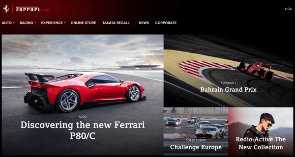
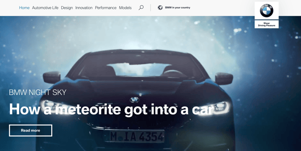
A lot of sophisticated brands, such as Ferrari and BMW, use sleek design elements and high-resolution photos.
Ferrari
BMW
Competent Brands
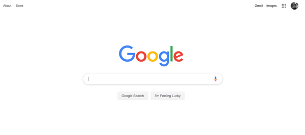
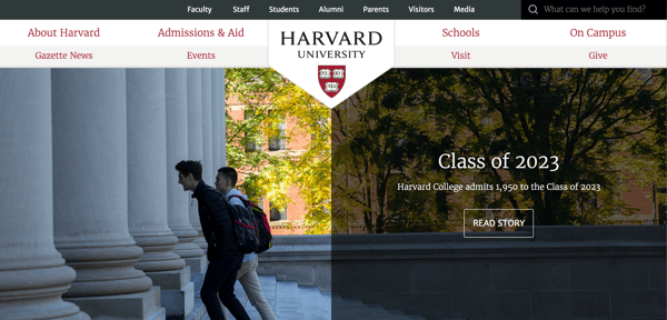
Authoritative brands like Google and Harvard use simple, straight-forward language and professional looking graphics.
Harvard
Trusted Brands
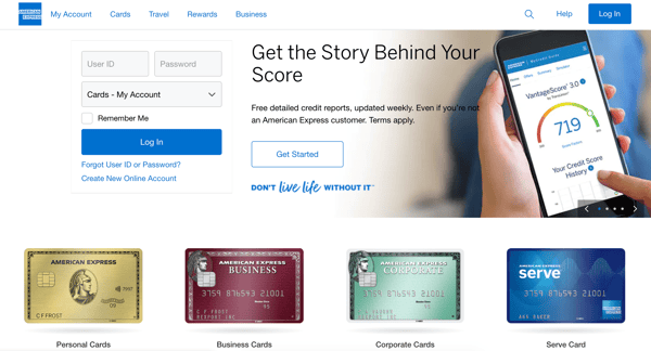
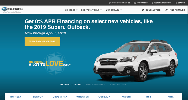
American Express and Subaru both desire to be trustworthy brands, so they rely on honest language and friendly colors.
American Express
Subaru
Excite Brands
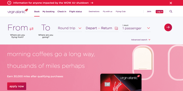
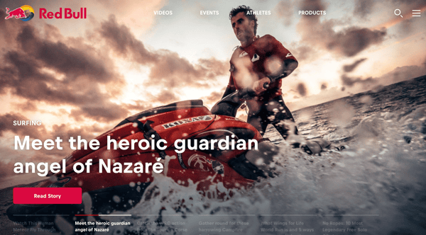
Brands that want to convey excitement, like Virgin Airlines and RedBull, often use bright, vibrant colors throughout their website.
Virgin Airlines
RedBull
Creative Brands
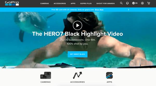
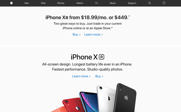
Creative brands, such as GoPro and AppleOne, both use a minimal design and impactful imagery.
GoPro
AppleOne
From the beginning, your preferred brand voice will have a huge impact on your site. It’s critical to identify it to inform decisions about photography, video, imagery, and messaging.
2. On-Brand Imagery
In website design, consistency is key, especially with imagery. People are visual, so the imagery that you choose will have a significant impact on conversion rate. People can recall at least 2,000 pictures with around 90% accuracy.
During the early stages of your website design, you can use that to your advantage by choosing a photo, icon, and graphical theme that reflects your brand. Giles, one of our designers, says:
“The choices must fit together, and align with the brand voice."
If you can determine what emotion or after state you’re trying to convey in imagery, you can set an ongoing standard for the style of images and icons for your website, as well as content.
When it comes to actually choosing imagery, Cris, one of our designers, says that “a good starting point is to focus on outcome.”
“By using your product or service, what would they achieve? Would they have more time? More success? Be happier?”
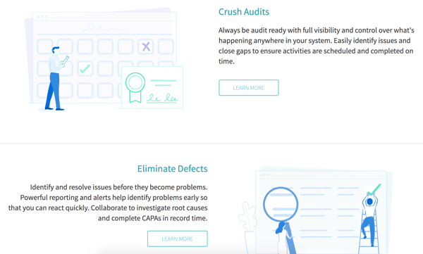
Additionally, there’s a decision to be made regarding icons and illustrations. A lot of brands, such as Qualio and Slack, are using iconography within their website branding.
Qualio
Slack

“Iconography can show large amounts of information,” says Brad, another Lean Labs designer.
3. Logo Usage
The best website branding will determine logo usage, or how logos are permitted to be used throughout your website and in content. You'll find that a lot of brands, like Twitter, post these standards on their website as well.
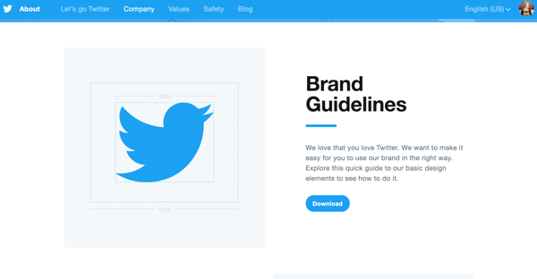
This helps with consistency. Anyone working on your website will use the logo in the appropriate way. Anyone who downloads your logo or uses it within content will use the correct formats, as well.
Cris has a few tips for effective logo guidelines, such as:
“Because of the shape of navigation bars on websites, rectangular logos work best. That doesn't mean you can't have square or round logos, but they will probably have to be shrunk down to fit in the websites navigation.”
“The easiest logos to work with are rectangular shaped, with an icon positioned to the left of the brand name. this gives you the option to use only the icon, or icon and brand name.”
4. Typefaces
A typical website will use 1-2 typefaces for copy, headlines, and CTAs. Personally, I’ve seen more fonts being used on a site, with a lot of interesting (and ineffective) combinations of various typefaces.
“Before you decide how many typefaces you use,” says Cris, “You need to understand that typefaces work in pairings.
"it’s a bit like food. You wouldn’t want to mix up Sushi with Swedish Meatballs. It’s best to keep typefaces to just one or two (separate typefaces for headings and body text).
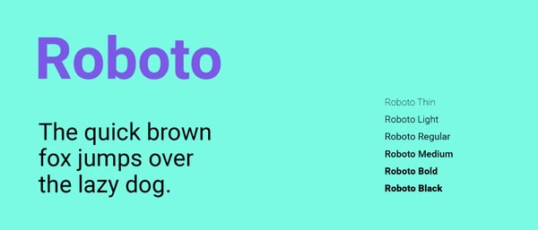
A few popular modern typefaces include Google Webfonts such as Lora, Playfair Display, Roboto, and more.
5. Color Palette
Colors are the primary trigger for emotion; and using the right color palette can send a message and inspire a sense of familiarity.
While Giles and Cris disagree about color theory (Giles says it’s BS), Giles says:
“Two contrasting colors work great, primary and secondary. If you start adding more, things can start to look out of place or off brand.”
A few guidelines for using colors include:
- One Primary Color - Use one primary color for links, primary calls to action, and headings.
- Secondary Colors - Use as accents for specific actions, such as success, info, warning, error.
It’s important to choose colors that you feel are in line with your intended brand voice as well. Brad says:
“For example, blue is a VERY common colour, especially for software companies."
“Blue can suggest security and power.”
With this context, you can see why certain brands chose their primary and secondary brand colors:
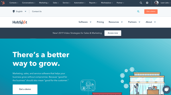
HubSpot
Reliable and Trustworthy - Blue And Orange
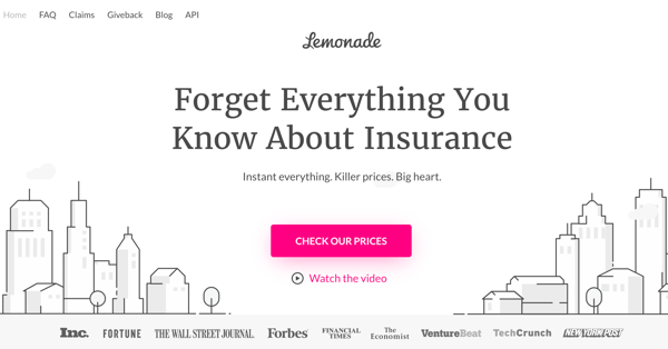
Lemonade
Lemonade, Bold and Innovative - White, Black, And Pink
Lean Labs
Energized, ambitious - Blue And Green

Will Better Website Branding Improve Your Site Performance?
Website branding plays a critical role on your website. It demonstrates your brand’s personality and often, helps deliver the right first impression. And if your website branding is drastically off, or there’s no strategy to it, it can definitely impact the performance of your website.
To properly assess the quality of your brand, check out our Brand Character and Voice Workbook.
About Lean Labs
The only outsourced growth team with a track record of 10X growth for SaaS & Tech co's. 🚀
Explore Topics

Discover the Hidden Strategies We Use to 10X Our Clients Growth in 36 Months!
The Growth Playbook is a FREE guide to planning, budgeting and accelerating your company’s growth.


