How to Build a Landing Page Design That Doesn't Suck and Converts Leads Like Crazy
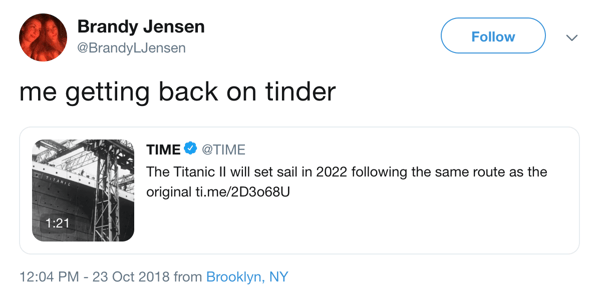
Before my current relationship, I was on Tinder.
For those of you unfamiliar with Tinder, it's an app that connects singles. The functionality is simple. You sign on, upload a picture, and create a profile.
From there, you "swipe" through singles in your area. If you're interested, you swipe right, and if you're not, you swipe left.
I spent a lot of time swiping left. My disinterest wasn't due to a lack of impressive local guys, it was that the profiles were terrible.
I couldn't get a clear idea of who these people were. A lot of the profiles had blurry or old photos, incoherent sentences, or awkward attempts at humor (which most of the time, didn't work.)
I eventually deleted the app and met someone in real life. And the reason I agreed to date Chase exclusively wasn't because of his photos or that he checked off a few boxes.
Instead, it was something much more meaningful.
Connection.
A connection is something real.
When you compare the connection necessary for finding a partner with the connection you need to land a customer, there are clear parallels. And in the long run, the businesses who learn to make these authentic connections are better at acquiring long-term customers.
Rather than focusing on the sale, they strive to establish a relationship and engage for the long-haul.
They're not looking for a fling. These companies seek purposeful, mutually-beneficial relationships. And when you create marketing materials, such as landing pages, you should prioritize on making those connections over anything else.
Using my tactics, you can easily optimize your landing page assets and start engaging with the right customers.
Swipe right.
My Secrets To Better Landing Page Design
A lot of businesses get mediocre results from their landing pages. Even with a great aesthetic and a decent offer, conversion and engagement rates are less than ideal. And in my experience, it's always because of one thing.
Companies take the same sales-oriented approach every time and expect different results.
In business (and also in dating), this rarely works.
To connect with a customer, you need to stand out from the pack. Companies are already inundating consumers with emails and ads. We all get a constant stream of requests to purchase, download, buy or sign-up for something new.
It gets boring and pretty annoying. As a result, your landing page strategy cannot be "buy from us now."
Instead, you should position your landing page around something a customer wants and needs. It needs strong messaging that leads them through the page. And if you can get the flow and language down, your landing pages can get more quality conversions for one simple reason.
They're valuable and easier to understand.
Here are my best tips for taking this approach.
#1. Use A Key Page Flow
Imagine if you tried to make a film without a script. The story would be all over the place. And while landing pages have a more straightforward message than a movie, the idea is the same. You want a cohesive narrative that hits all of your best points. You want a climax and some intensity.
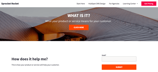
For the best success with landing page copy, I use a page flow to organize my thoughts. It starts with defining what your brand/service is and how it helps the lead.
Here is the template I use:
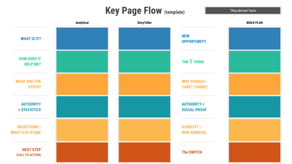
I go section by section, and complete:
What is it?
In the "what is it" section, you want to define the benefit of your offer into the simplest terms. The simplicity and focus on how the product benefits the customer are absolutely key.
Otherwise, you end up with too much copy that only talks about your product, which typically turns into content like this:
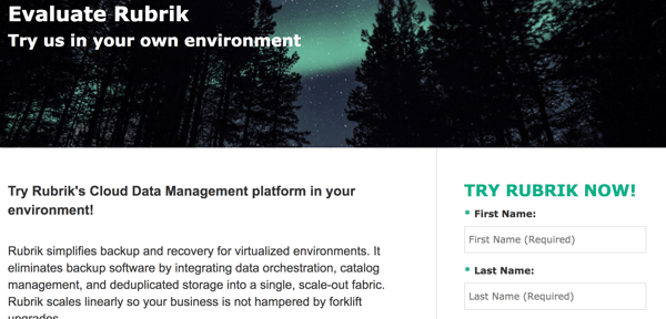
While yes, Rubrik is a cloud data management platform, in the first ten seconds of skimming, all I see is
TRY US NOW!
It completely neglects the customer.
You want to write content that outlines precisely what the customer will get from your offer. For instance, Moz is an inbound marketing and marketing analytics software. But more importantly, when you use Moz, you get an opportunity to get better rankings in the SERPS.
You get better leads and results you are proud to show off in the C-Suite.
When you focus on that, you come up with more impactful content, such as:

Moz Pro: Higher rankings. Quality traffic. Measurable results.
From an analytical perspective, yes, Moz is software that helps users improve and track their marketing efforts. But from a storytelling approach, Moz enables you to get better results through higher page rankings and more qualified customers.
See the difference?
How does it help me?
Your customer wants to know how your product or service is going to help them. Don't assume that they know.
In my opinion, this Workplace by Facebook landing page takes a stab at communicating that but fails to pull it off.
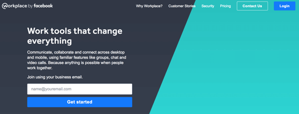
"Communicate, collaborate and connect across desktop and mobile, using familiar features like groups, chat, and video calls. Because anything is possible when people work together."
Communicating and collaborating is fine, but I could take that tagline and apply it to literally any other platform like it. How does Workplace by Facebook specifically benefit the customer? How is it different? I can't tell from this landing page.
I can, however, immediately understand how Muzzle can help me.
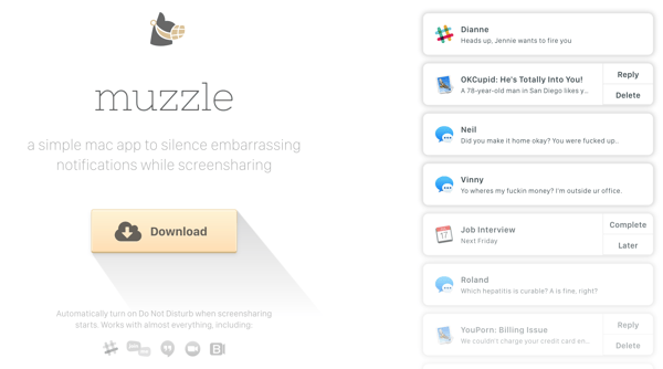
Muzzle, a Mac app, automatically turns on a Do Not Disturb alert whenever you're screen sharing on join.me, Slack, Google Hangouts and more. It prevents you from embarrassing yourself when you're on calls and in meetings.
Of course, Muzzle could easily say, "we help you focus more on work and meetings," and that would be correct. But it would not have the same emphasis as the copy they've written above.
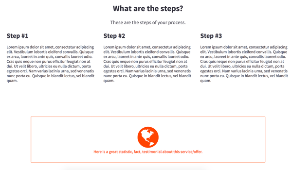
What are the steps?
Customers want to understand your process before they commit to anything. They know that as soon as they fill out a form, you will follow up with them. They know you will enroll them in workflows, hit up their inbox, call them, etc. They want to know that dealing with that noise is going to be worth the payoff.
That's why you need to communicate how your product works very clearly to get them to convert on an offer, demo, or trial.
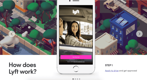
Consider this example from Lyft.
Lyft knows the question many potential Lyft drivers ask first is: how does Lyft work?
This section on Lyft's landing page answers that beautifully. And the language isn't fancy, it just gets to the point. You apply to drive and get approved. You download the app. You accept your first ride. You make money.
See how clear that is?
Authority and stats
Another critical part of your landing page content is having data that reinforces your authority. Let's use the dating example again. My boyfriend told me he was a nice guy before we starting seeing each other, but it was the recommendations from people who knew him that convinced me it was true.
They had no reason to sugar-coat anything. I could take their word for it. Him saying, "I'm a nice guy!" doesn't mean as much as an unbiased opinion. That's why when you add authority to your landing pages, you don't want to make them up yourself.
You want to include real customer quotes, third-party statistics, etc.
TransferWise, a relatively unknown money transfer platform, bolsters credibility with these types of insights.
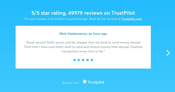
A majority of their reviews come from Trustpilot, TrustRadius, and Capterra. They have no say on how positive those reviews are. If they weren't a good platform, they would not get high reviews.
You can utilize similar review sites to seem even more credible. If that doesn't apply to you, you can also obtain positive reviews from existing and previous customers.
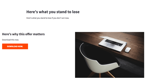
Objections and what's at stake
On your landing page, you also want to talk about what's at stake for the customer if they don't convert.
It's like the climax of your favorite action movie.
If Rey doesn't defeat Kylo Ren, the Jedi will be vanquished forever.
If Peter Pan doesn't stop Captain Hook, he will take over Neverland.
If Batman doesn't stop The Joker, he will reap havoc in Gotham.
Now, what will happen if your customer does not convert? What's the risk?
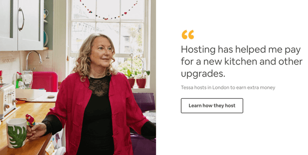
For potential Airbnb hosts, the risk is being stuck in a limited budget. If they don't find an easy and enjoyable way to make more money, they will miss out on additional income to travel, make home renovations, and more.
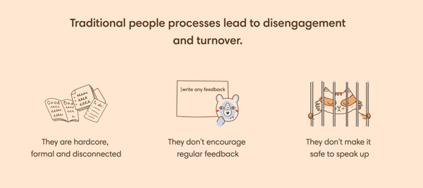
For teams considering switching to the Teambit platform, the risk is losing unhappy employees and getting a higher turnover.
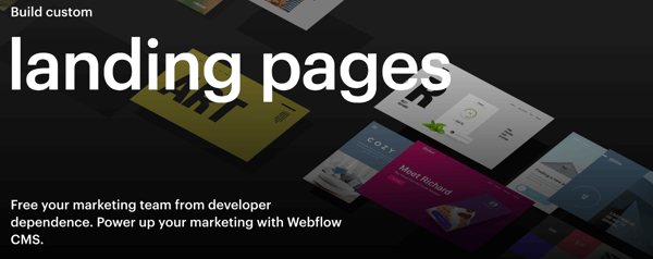
For businesses considering Webflow, the risk is a continued dependence on developers to finish landing pages.
You get the idea. You want to include particular, meaningful pain points that resonate with the customer and make them think, "Oh no. I better do this, or else...."
Next step
Finally, there's the CTA or call-to-action. It's the finale of every landing page. And for your customer to click on that CTA, it needs to be very compelling. It has to be impactful enough to make the customer believe it will change something for them.
Here are my favorite CTA examples:
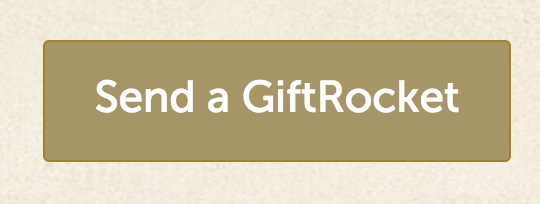


.png?width=600&name=CTA%20(1).png)
As you can see, the most compelling CTAs speak for themselves.
When you don't even know the name of the brand and you can still tell what the benefit is, that's powerful.
Once you finish page flows, you have a solid outline for your landing pages.
#2. Prototype
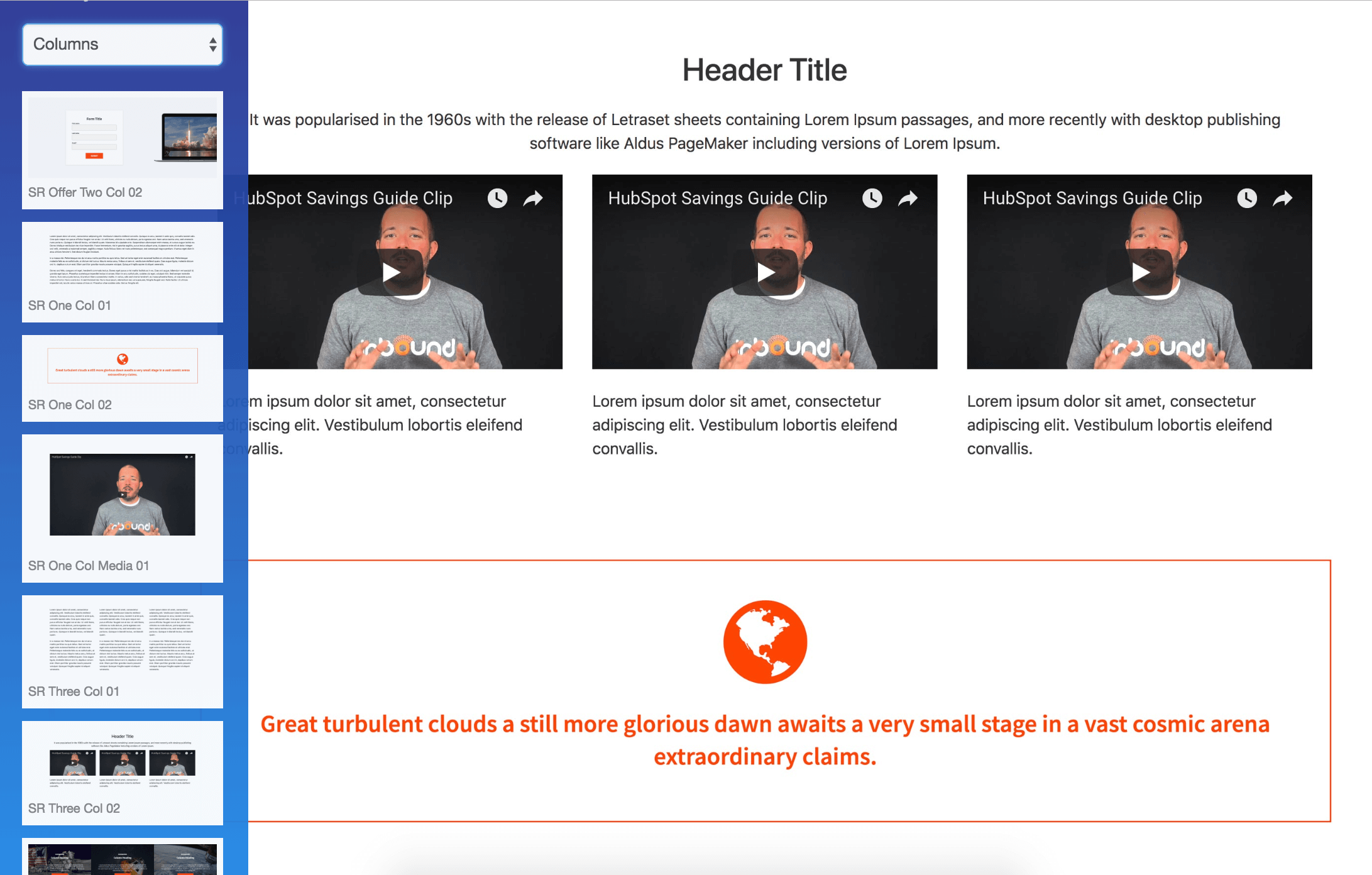
The next step to a killer landing page is your prototype. You have your flow, and you can prototype (draft) your page. I use our SprocketRocket tool and custom modules to rapidly prototype pages.
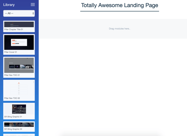
I open the builder and sort through our modules to outline the page. I drag and drop how I want the page to appear, using my page flow as a guide. I can't edit text yet, but I can plan exactly where to place content on the landing page.
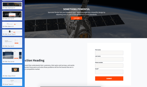
I grab a hero, an offer bar, a few columns, and text boxes, as well as a call-to-action for the bottom. At this point, it has the bones of a landing page and looks like a template.
When I'm done selecting the boxes I want (I can add or delete additional sections later), I publish the page to HubSpot.
From there, I can edit all of the parts. I take the information from the page flows and start dropping it into the page.
After I do this, I have a rough landing page.
#3. INVEST IN YOUR Message
As soon as you have these pages prototyped and in HubSpot, you can polish the message. It's not time to design yet.
Exceptional copy will have a significant impact on your conversion rate. Landing page copy that feels generic or confusing will not entice your customer to do anything but leave.
If you're not a writer, I would recommend hiring a website content writer to help with this. It's worth the investment, and you can easily find a writer on Upwork.
Here are a few examples I found that could have used a writer's magic touch.
Atlassian Statuspage
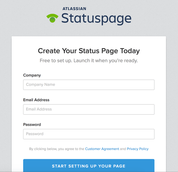
Let's say I visited the Atlassian landing page, but got distracted and left the tab open. When I came back to it, I would have little to no context about what the Status page was or how it would benefit me.
Why should I create a status page? What will that help me do?
Slunk Enterprise 2.0
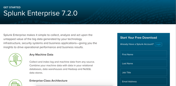
There's a lot of copy here. And it's not necessarily effective copy. Terms and phrases like "business results" and "operational performance" are too vague.
What kind of business results?
Are there any statistics from existing customers that you can share?
Why should I believe that you can help me? Because you say so?
Jamf Pro
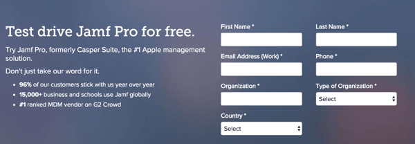
I like that Jamf Pro added statistics here, but I think they could be more compelling.
Why do 96% of your customers stick with you?
What type of results are they seeing?
Zoom
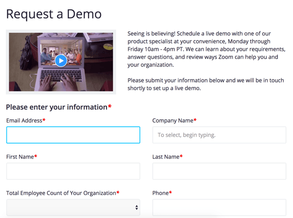
When I see "seeing is believing," I hear "I don't know how to explain this product to you."
This demo page quickly jumps to a live demo with a product specialist. Before that, the page does not tell me why using Zoom will actually help my organization.
MailChimp
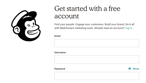
Again with the generic language. I know that MailChimp is a suite of marketing tools, but what will they help me do?
I'm a little harsh here, but businesses need to get better at writing content. These pages lack specificity and charisma. They look nice, but the message is flat. Get a free account. Sign-up for a trial. Get started.
We get it. You want us to convert.
When customers come across these pages, they're going to wonder what's in it for them. Don't assume they can figure it out.
One company that answers this is Salesforce.
Salesforce
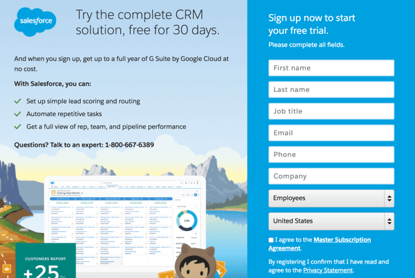
They offer a free trial but also find a way to:
1) Make it more enticing for the customer with a 30-Day trial.
2) Provide a bigger payoff with the free full year of Google Cloud.
3) Give an overview of what the platform does.
If I were writing this page, I'd probably go further into pain points. But overall, the message is consistent. Someone who is close to signing up for Salesforce will probably read this and convert on the trial. If the lead is unfamiliar with Salesforce, the context is there.
You understand the value within ten or so seconds. It's easy.
#4. KEEP THE DESIGN Minimal
A lot of people choose to prioritize design over the content. I get why. You want your page to look nice. You believe that pages that look pretty convert better.
But to go back to the Tinder example again, aesthetics aren't always the most critical component to a conversion. The in-house sociologist at Tinder, Dr. Jessica Carbino, actually finds that the most successful people on Tinder aren't necessarily the most attractive.
"They're the ones who are creating a profile that presents an authentic self," says Carbino. "And then go about matching with people who they believe will be compatible."
It's the same idea for a landing page. A landing page that looks great but lacks context may generate leads, sure, but they may not be the customers you want. Because vague language will attract people with broad needs, different expectations, high and low budgets, etc.
Here are a few pages that use minimal design and do an incredible job of speaking to their ideal customer.
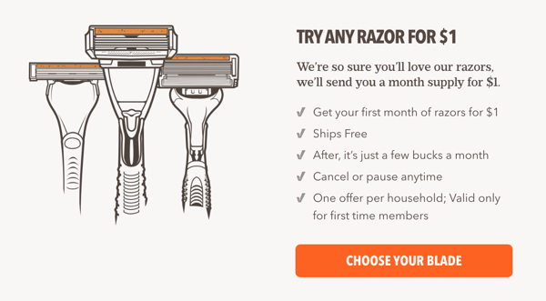
Dollar Shave Club
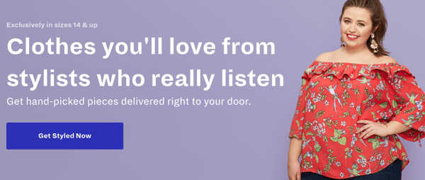
Dia & Co
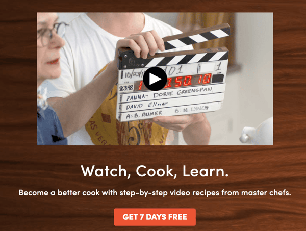
Panna
Now, in my opinion, here are some pages that focus way too much on aesthetics.
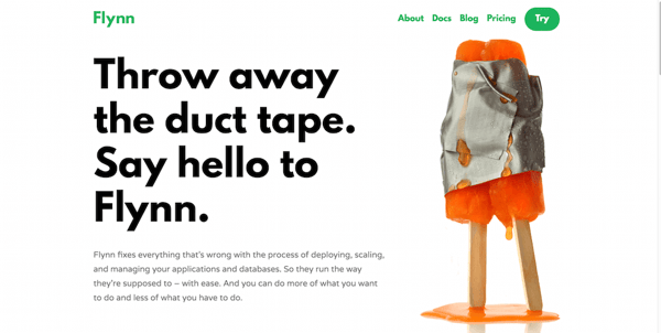
Flynn
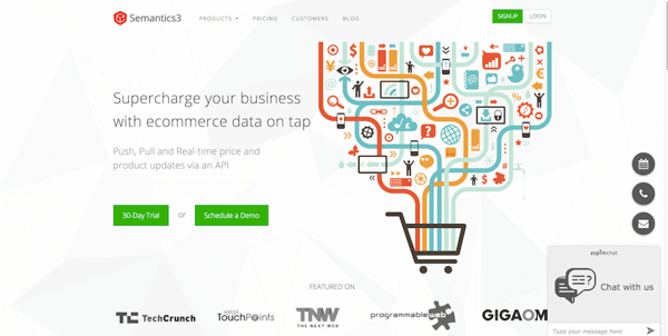
Semantics3
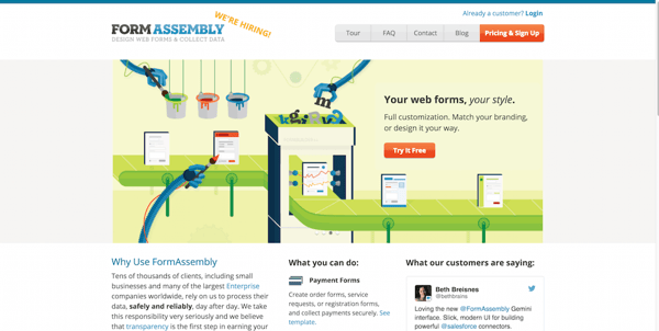
Form Assembly
MailChimp
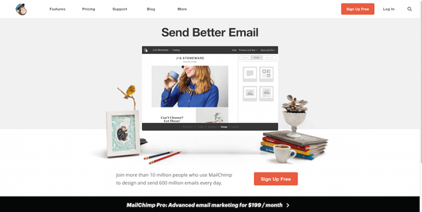
The design of those pages are great, but I can't tell what they're selling me or why I should buy it.
The lesson here? Don't rely on aesthetics to obtain customers. Content matters. Your narrative is important. And that's why the message of your landing page should take priority over the design, every single time.
When I'm working on landing pages, I provide Giles, one of our designers, with all of the page content before he does anything. It's already prototyped in a HubSpot page draft.
From there, Giles can focus on what he does best - creating an awesome landing page design. He doesn't need to think about what the objective of the page is. He doesn't need to squeeze copy into a page he's already designed.
He gets more context and because of that, he can make a far better design.
#5. Make It Simple To Convert From Any Device
Honestly, I can't believe that companies still skip mobile optimization. The average cell phone user checks their phone 47 times a day, people. That means at some point, your new and returning leads will access your landing page from their Android or iPhone.
If your pages have small text, CTAs you need to zoom in on to see, or forms that are impossible to fill out, it's a headache and a half to try to use them. Your fingers hit the wrong things, the page reloads, etc. It's frustrating, and people won't stick around to try to figure it out.
Here are some exceptional examples of mobile-friendly design and a few that fall flat.
Good
HubSpot masters the small screen experience. The CTAs are clickable, and the text is easy to read.
Even their graphics translate well to mobile.
Poor
A HubSpot competitor, PipeDrive, doesn't do as well. Their desktop experience translates awkwardly to mobile.
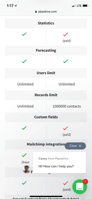
Plus, their chat comes up and clutters up a page that's already challenging to use.
Good
Netflix has a great mobile site. The messaging addresses that the person is on their phone and shows their next step.
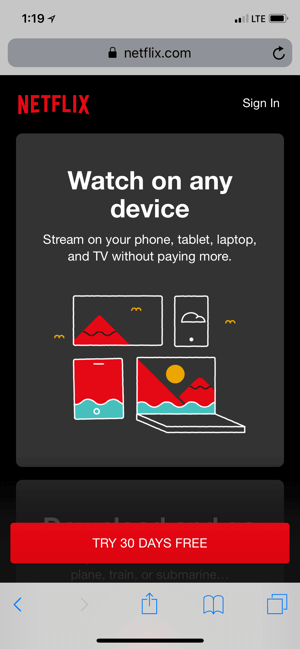
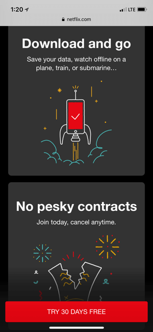
Immediately, I get what the benefit is from downloading the app and signing up for a trial.
Poor
Netflix competitor Hulu doesn't fare as well on mobile. While the text is easy to read, a section that promotes all of their entertainment categories disrupts the flow of the message.
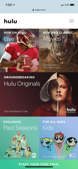
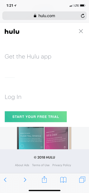
If I'm on the free trial page, I don't want to click and go to a list of television shows. I want to sign-up for an account first. It's difficult and confusing to take action here.
Good
Flock is an alternative to Slack. Now, I love Slack but Flock's site is way easier to use on my phone.
(Shame on you, Slack.)
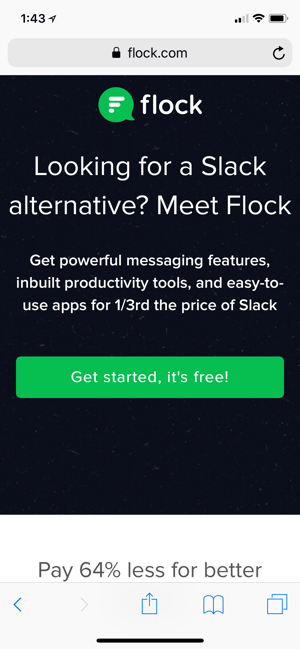
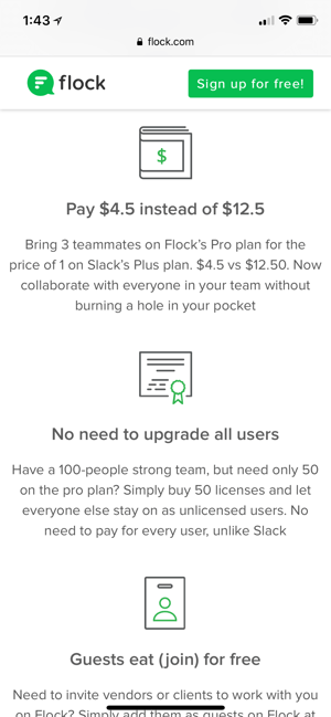
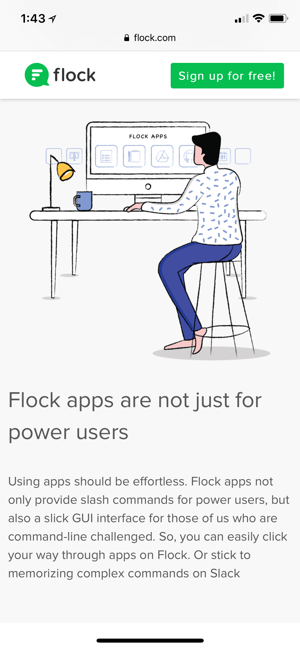
The iconography fits the page, and the copy is well written. I think it also does a great job at differentiating the software from Slack. Whoever is on this page will know right away if they're a fit for Flock.
Poor
Slack has a great design, but again, the copy falls flat for me.
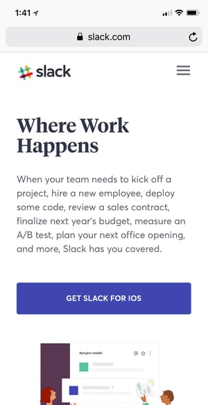
The headers describing the features are too broad. It doesn't communicate the benefits clearly enough. Additionally, there's too much content (case studies) for a mobile user. I don't know about you, but I'm rarely reading case studies on a trial page from my phone.
It's too much.
Overall, the goals for your mobile landing page design should be the same as your website landing page design.
Easy to read, use, and understand.
#6. Always Be Testing and Optimizing
The last part of achieving landing page design success (and passing the Melissa test) is testing and optimizations. It's an essential part of improving your landing pages. It helps you focus on performance and your customer's perception and usage of the page.
Otherwise, you make a lot of assumptions about what your customers think and that never turns out well.
One last dating example. If Chase brought me to a football game and everything about my body language, feedback, etc. showed that I had a terrible time, he wouldn't bring me back there for a date.
If he did, I would assume he didn't understand me.
If your ideal customers come to your landing pages, and something about using the pages doesn't work for them, they'll leave. The next time they come back (if they come back) or someone similar to them comes back, you want to have adjusted the page to resolve those issues.
I keep an eye on a few key performance indicators for landing pages, which include:
- Click-through rate
- Bounce rate
- Time on page
- Conversion rate
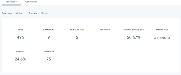
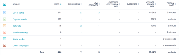
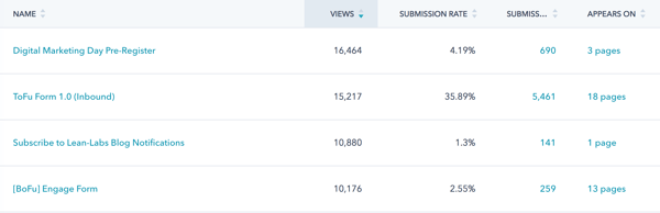
If you're using HubSpot, you can track all of these metrics from their "Analyze tool."
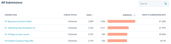
I can monitor how many submissions, contacts, and customers my landing pages are generating. I can also go through page-by-page and measure overall results, as well as the performance by source and views.
.png?width=600&name=views%20(1).png)
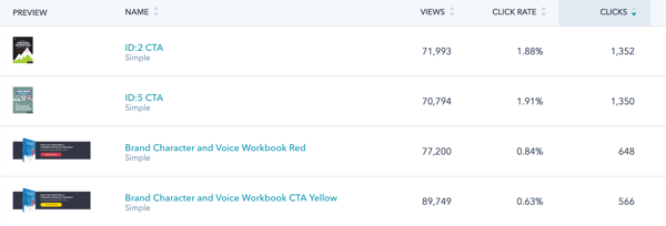
I can improve those metrics by running A/B testing and experimenting with various components, such as:
- Button color
- CTA text
- UVP Heading
- Supporting Images/Video
HubSpot also makes that pretty easy. I can track the performance of my forms and calls-to-action.
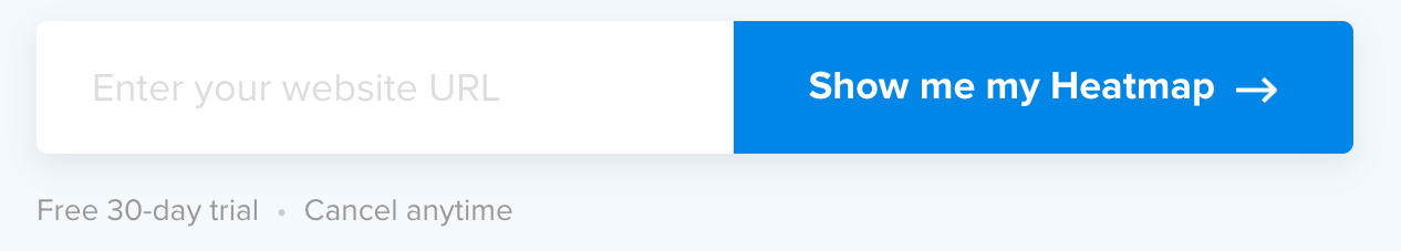
Installing screen recording and heat map capabilities can give you more feedback on how people are engaging with your pages, especially if you do not have HubSpot. Without HubSpot, you need a variety of tools such as Google Analytics, Crazy Egg, etc. to obtain the same information.
Connecting With Potential Customers
Customers, like potential dates, always have other choices. There are plenty of free trials, demos, and platforms in the sea. That's why it's critical to build customer-centric landing pages. If you're going to invest time in creating pages, it's worth doing to the best of your ability.
Another critical part to connecting with your customer, however, is larger than the flow of your landing pages. To support the overall customer journey, you need an overarching marketing strategy. You can learn more about putting a better strategy in place with our inbound marketing guide.
About Lean Labs
The only outsourced growth team with a track record of 10X growth for SaaS & Tech co's. 🚀
Explore Topics

Discover the Hidden Strategies We Use to 10X Our Clients Growth in 36 Months!
The Growth Playbook is a FREE guide to planning, budgeting and accelerating your company’s growth.


