-
The Key To Website Conversion Strategies That Work
-
1. Consider The STAGE
-
2. Optimize THE Narrative
-
3. OPTIMIZING CTAs
-
4. OPTIMIZING FORMS
-
5. Consider The Aesthetic
-
6. Optimize For MOBILE
-
7. Integrate ChatBots
-
8. Use Tripwires
-
9. Create An Interruption Funnel
-
The Truth About Website Conversion STRATEGIES

The 9 Website Conversion Strategies You're Not Implementing
At my first marketing job, I learned one of the most valuable lessons about lead generation.
Quality over quantity.
For one of our clients, my role was to ensure they hit a monthly number of leads. From the client's perspective, the quality of these leads didn't matter (mediocre was acceptable) as long as that magic number was hit. Every month, they became impatient waiting for results, and insisted that I run aggressive paid campaigns.
They hit the number sometimes, but were never satisfied with the leads we got.
Throughout our contract, I explained their challenges to generate qualified leads was less about their budget, and more about the buyer journey. Their website desperately needed a redesign. The process to actually become a lead was not smooth. Their offers needed work.
In the end, my company stopped working with them. Because no matter what the data said, the client was convinced the way to get leads and improve conversion rate was through their wallet. And while large companies with deep pockets can get away with this sometimes, it's not an approach that will work for many.
Since that experience, I prioritize showing the value of a strong buyer journey from the very beginning of a client engagement. A part of every campaign is ensuring that conversion paths are seamless for website visitors. I do this using some of my favorite website conversion strategies.
The Key To Website Conversion Strategies That Work
“If I had an hour to solve a problem I'd spend 55 minutes thinking about the problem, and 5 minutes thinking about solutions.”
―
I recently went fishing on my father's boat on Lake of the Woods. It's a remote spot in Upstate New York. At first, my over exuberance failed me, resulting in a lot of tangled fishing line and not much to show for it.
However, when I swapped out my pole for one with a braided cord, used live bait, and focused on one secluded fishing spot, I found success.
 Proof.
I was proud of those four or five black crappies. It wasn't just the catch, but the satisfaction of unlocking the right combination of tools and process. And it's the same with "catching" leads on your website.
To get better leads, you need to study your existing process, assess the results, and make changes.
Here are a few tried and true website conversion strategies I use all the time to improve conversion rate and the quality of our leads.
1. Consider The STAGE
One of the most significant conversion killers is a lack of context. Not every visitor is going to understand who you are or what you do. They won't all be ready to convert right away. That's why it's important to consider where they're coming from, how they found that page, and their intent and likely buyer journey stage.
For starters, there's the homepage. It's the first impression your brand will make and often caters to new visitors without knowledge of your brand. A lot of brands use this page as a BUY NOW billboard, hoping to get as many conversions as they can ASAP.
However, visitors aren't coming from some magical "I want to buy something now" search engine. They're googling keywords and seeking answers, coming through from social media, following up on a recommendation from a friend, or clicking on an ad. Sometimes, it's a current customer looking for a way to log-in, or book a meeting with you.
That's why your homepage cannot only speak to new visitors or existing customers. It has to cater to everyone. That's why an exceptional homepage strategy will include ways to do that, utilizing smart website content, an effective UVP headline, and multiple offers.
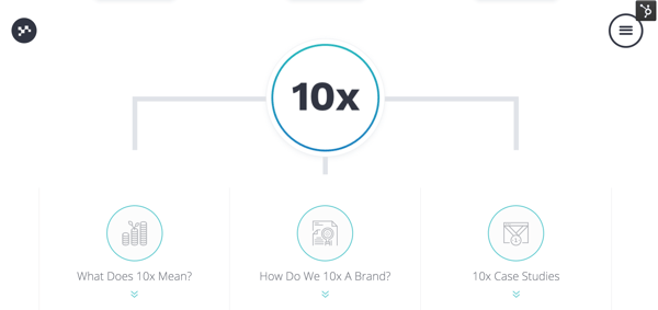
Take our homepage. We start by featuring our two primary services, Customer-Centric Marketing, and Growth-Driven Design.
Right off the bat, the visitor can branch off to either of those topics, depending on where their interest lies.
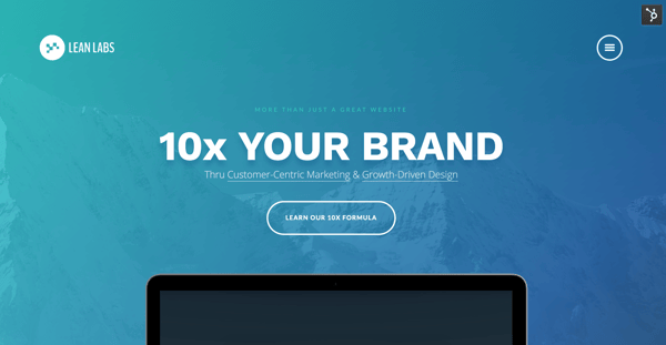
They can also continue to scroll down the page and self-select where they want to go next. There's an opportunity to view our availability, connect with us directly, or download a free playbook. 
This way, our homepage provides gateways to the most critical parts of our website.
You should approach your other pages in the same way. Where is the lead coming from? What do they want to do?
For example, our Conquering The Inbound Marketing Mountain guide is primarily for TOFU, or top-of-the-funnel leads. Right now, our visitors find that page through our Resources center, clicking on a CTA within a few different blog posts, or through organic search. By knowing where they're coming from, we can ensure:
- The language matches their stage (we're not talking to a TOFU lead like we would a BOFU lead).
- The route is easy to navigate (all of the links work, and the offer is easy to locate on each referring page).
- The path to get to the page makes sense.
Personally, when I'm working on conversion rate optimization, I like to click through various paths on my website. From the homepage, I'll go through page by page clicking on anchor text and CTAs to see where I end up. If you did this on your website, what obstacles would you uncover?
What pages desperately need additional context?
Where does the process break down?
What aspects feel unnecessary or complicated?
If you're too familiar with the site to evaluate it objectively, you can also employ co-workers, peers, or friends to click through the site with fresh eyes.
On an ongoing basis, you can also use heat-maps and screen recordings. You can pair that data with Google Analytics and HubSpot and get a better picture about how visitors are traveling through your site.
2. Optimize THE Narrative
A lot of website and landing pages are boring. There isn't a consistent narrative and it seems like they're only trying to sell to you. That's why if you can present compelling points and provide genuinely useful and intriguing content, you can drastically improve your conversion rate.
However, if you've ever written website content, you know this isn't an easy feat.
When I'm developing website pages and landing pages, I use a page flow. A page flow helps me organize my thoughts. My message is better because I'm planning it section by section.
The page flow looks like this:
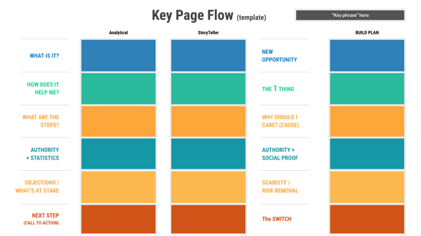
Every section has a specific purpose.
What is it?
The "what is it" box helps you define the website page. I'll use our homepage as an example again. If I were to build the Lean Labs homepage from scratch, I would fill out each block with what Lean Labs is to the customer.
Analytical: "A way to 10x your brand through Customer-Centric Marketing & Growth-Driven Design."
Storyteller: "You need more than a great website. You need a resource that will help you get substantial results from with exceptionally effective marketing and growth tactics."
The analytical description is the most straight-forward way to define the content of the page. The storyteller summary is a longer, flowery way of saying the analytical version. From there, you can compare both descriptions and identify which one presents a new opportunity for your visitor.
What haven't they heard before? The answer for our customer is a way to 10x, or increase their traffic, leads, and conversions by 10% MoM.
After we optimize and polish the message, the "what is it?" section reads like this:
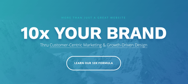
Ultimately, "More than just a great website, 10x your brand," was the best way to explain to our incoming traffic what "it" is.
How does it help me?
When your visitor lands on any of your pages, they want to know they're not wasting their time. That's why you want to gain their trust as quickly and effectively as you can. You use real examples, testimonials, and proof points.
Anything that explains your solution and demonstrates how it works (without bias) will work here.
For our homepage, that translates to a section explaining what 10x means and how it has a positive outcome for a brand.
What are the steps?
The next section breaks down the steps. You want to explain how you bring your solution to fruition. The analytical overview can be a minimal overview of the steps. The storyteller shows why these steps are critical to development and growth.
If I were to explain the steps of our 10x process, I would describe them from an analytical perspective, which would be:
- Growth Strategy
- Elevate Brand Experience
- Activate Buyer Journey
- Customer-Centric Marketing
- Growth Driven Optimizations
From there, I would add the storytelling aspects and fine-tune the copy to become:
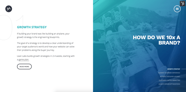
Each step explains the process and builds excitement for the customer.
Authority and stats
The authority and stats section provides information that shows the lead you know your stuff. A lot of that can come from customer quotes, stats, and more. For instance, if you're a B2B, you can quote positive reviews from sites such as TrustRadius and Capterra.
Another option is case studies. If you have content that shows the effectiveness of your work, this is a great place to add a few helpful highlights.
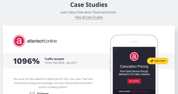
We use case studies that show our 10x process in action and the content speaks for itself.
Objections and what's at stake
Before you provide the next step or CTA, you want to raise the stakes a little. I like to compare it to the moment right before the climax of a movie. You get the visitor's heart beating a little faster. You incentivize them to take action. And you do this by identifying what will happen if the lead does not convert on your offer.
In our case, if the visitor doesn't convert and either contact us or download our playbook, their next project could be a flop. They could continue to experience gaps in their team. Everyone has something to lose, and if you can identify it, you can create messaging that speaks to it.
Next step
What do you want your visitor to do next? For our homepage, we have a few CTAs. For a pricing page or offer page, the ask will be different. It depends on the types of visitors that come to that page, where they come from and their buyer journey stage.
That's why for each page, you want to identify the ask that makes sense. It would be great to get your visitor to sign up for a trial right away, but asking them to take that action from your team page may not make the most sense. Instead, you could send them to a contact us page.
3. OPTIMIZING CTAs
A lot of marketing teams place a CTA and let it be static, with no improvement. If you do this, and don't learn from your mistakes, you're wasting an opportunity to get better performance. Because a CTA can make or break a conversion.
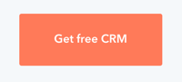
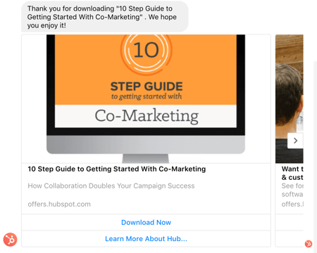
For example, let's look at this CTA from HubSpot.
Beautiful, right? A lot of time, optimization, and fine-tuning went into making this CTA great.
Here are the elements of a CTA to focus on to develop something like this.
A Strong Offer
If a particular CTA does not perform well regardless of the page and placement, the problem may be the offer. Look at the HubSpot offer. Who doesn't want HubSpot for free?
Start with your title. Is it appealing? Consider a small change to the phrasing. The Guide To Inbound Marketing could become The Best Inbound Marketing Guide You've Ever Seen.
There are a lot of ways to refresh existing material and make it more appealing.
Fits The Stage
If I'm a top-of-the-funnel lead, I don't want you to push me to sign-up for a sales demo. I'm not ready. That's why your CTA needs to relate to the intent of the user. For example, if I visit a HubSpot blog post about video marketing, the CTA on the article won't be for a customer support software demo.
Why? Because it's too soon for a demo and the content doesn't match the intent of my visit, which is to learn more about video marketing. A guide about how to start video marketing or how video fits into inbound marketing would be more appropriate.
If you have multiple offers and you're placing CTAs on a homepage or a conversion website page, you can provide a few options.
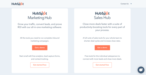
On the HubSpot homepage, there are CTAs for marketing, sales, and customer support software. The user can self-select which one matches their interest.
The Style
Here's a riddle. Which CTA performs better, an ugly one or a pretty one?
The answer is neither. It's the one that stands out the most.
The whole point of a CTA is to grab attention. And you won't accomplish that if your CTA is blurry, has dull colors, is difficult to read, etc.
As you can see from HubSpot's CTAs, the language and design are always simple, but the copy is easy to understand and the style of the button is eye-catching.
The Urgency
If your CTA offer is good and there still isn't an increase in conversion, try adding some urgency. You can make your content a limited time offer. A free demo could be "free" for the next week, or the availability for a complimentary worksheet could expire shortly.
I would also recommend running regular experiments with language, size, positioning, and phrasing on CTAs and forms. You can create variations and conduct ongoing testing.
4. OPTIMIZING FORMS
When it comes to making optimizations, forms are often overlooked. By making a few strategic changes to the forms on your site, you can drastically improve performance. Here are a few things you can tweak.
The Submit Button
Try out different colors and sizes for your form submit button. My favorite offer buttons are vibrant, such as HubSpot's go-to orange. It catches the eye and stands out against plain backgrounds.

You can switch out the submission copy. If you typically use generic language such as "Get Started," or "Download Now," try something more direct or intriguing. I like HubSpot's approach on this as well.


They typically use "Get" in addition to whatever the offer is or stick to minimal copy.
The Headline
The headline of your form matters. It's one of the last things your lead will see before deciding whether or not to convert. When I write headlines, I tend to be straight-forward and specific. Rather than "Download Our Offer," I would try "Download Your Free Inbound Marketing Guide."
You want to be crystal clear about what happens when they click that button. Additionally, if the user leaves the landing page window up and comes back later, you want to remind them what your offer is. The more specificity, the better.
The Form Fields
There are best practices to follow when it comes to selecting the fields for your form. It can be challenging to strike the perfect balance. You want to collect as much information as you can without being pushy.
But the number of fields can also depend on the buyer journey stage. For example, here is a form that HubSpot uses on a TOFU offer.
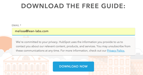
It's one short form field.
Now, compare that to a form we use on our hire us page.
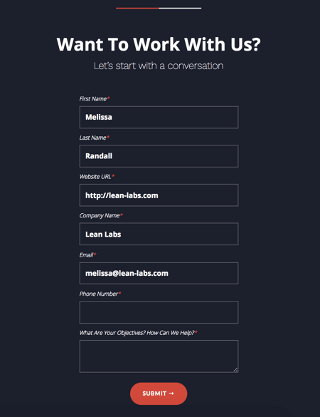
If they're ready to hire us, they're in the later stages of the buyer journey stage. And since we need to determine whether or not we're a fit, we need to ask more questions.
If you have HubSpot, you can also employ progressive profiling fields. With this feature, you can hide fields as soon as you capture the data or info you've collected on their previous form fills. You won't ask for someone's name twice, and the form will automatically populate another question or shorten the form.
5. Consider The Aesthetic
When it comes to web design, aesthetics aren't everything. However, I would recommend having some consistency. You want to use the same fonts, headline sizes, and page layouts throughout your site. Use some variety, such as different CTA colors, but don't go crazy.
At Lean Labs, something that helps us maintain consistency is using a modular design approach. We use the same building blocks to build out pages, so the structure of information looks similar. It's like having similar walls, windows, and style of fixtures in every room, but each one has different furniture and decor.
Images and video matter here, too. You want to choose pictures that follow the same style.
For instance, these two photos are similar enough. They are both overexposed and cheery looking. You could easily use both on a landing or website page.


There's a sharp contrast when you compare them to images with a darker hue.


Photos with cool tones look strange when they're mixed with vibrant, bright photos. When you're planning out landing or website pages, you want to decide what the tone is going to be.
6. Optimize For MOBILE
Your pages need to be easy to engage with on mobile. Period. That means forms need to be easy to fill out and buttons need to be clickable with my finger. I should be able to read a blog post without a popup blocking my view. This requires a closer look at your landing and website pages.
Browser test your pages or view them on smaller devices such as phones and tablets. Is the structure of the content, images, headlines, etc. need to be appealing? Are the pages easy enough to navigate?
For inspiration, here are a few pages that absolutely crush the user experience on mobile.
The Cut
The online publication "The Cut" keeps the focus on the story with appropriately sized headlines and text.
.png?width=300&name=IMG_4092%20(1).png)
.png?width=300&name=IMG_4093%20(1).png)
TechCrunch
TechCrunch has a sleek mobile design that makes articles easy to read. Even the ad at the top of the page doesn't obstruct the experience.
.png?width=300&name=IMG_4094%20(1).png)
.png?width=300&name=IMG_4096%20(1).png)
They also do a great job integrating a subscription box and additional articles throughout posts.
The New Yorker
I think The New Yorker has one of the best mobile experiences out there. They retain their unique style and insert video, forms, and photos in a completely seamless and natural way.
.png?width=300&name=IMG_4098%20(1).png)
.png?width=300&name=IMG_4101%20(1).png)
.png?width=300&name=IMG_4100%20(1).png)
Now, a lot of brands use templates that promise mobile optimization. But even the best of these templates may have some challenges with mobile. There is awkward spacing, the text is too small to read, and the navigation is impossible to use.
I would prioritize the mobile experience during your website design or at least go back and make updates later.
7. Integrate ChatBots
Chatbots are becoming really popular in marketing and sales. These bots can convert and segment quality contacts, replacing landing pages and forms.
For instance, as a growth team, we can cue up questions such as:
- What do you want, Inbound or Web Design?
- When do you want it?
- What's your budget?
- What's your contact info?
It helps us keep contact information fresh and up-to-date.
You can also use bots to deliver eBooks, send receipts, confirm subscriptions, etc. A lot of brands are using bots on their websites, as well as with Facebook Messenger.
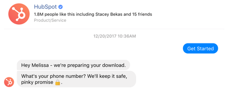
I've often signed up for something and received a receipt on Facebook, such as this eBook from HubSpot.
HubSpot also uses their chatbot to ask qualifying questions.
Chatbots are a resource to ensure every conversion point is smooth.
8. Use Tripwires
A tripwire is a smaller offer designed to get users to spend a little money, with the intent of getting them to purchase a big ticket core offer later. The idea is that because you've already opened your wallet, you will open it again.
Often, leads feel compelled to convert before they miss out on an opportunity to get so much value in exchange for so little. For instance, you sell an eBook, workshop or webinar that's worth $300 is sold for $19. You lose a small profit, but you gain your customer's trust while qualifying them.
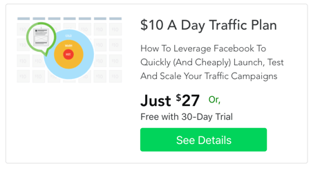
Digital Marketer excels at this. Check out a few tripwires they have on their site.
This $10 A Day Traffic Plan is one of the many offers they have on their site.
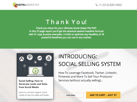
They also use tripwires to upsell customers on thank you pages.
I like this physical book they sell for only $10 (including shipping domestically.)
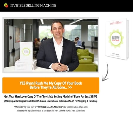
Ryan Deiss, the CEO of Digital Marketer, wrote a great post about the must-have characteristics of tripwires.
He points out that even though you lose margin, business is all about acquiring and retaining customers. It's likely that the customer will also share that offer with peers, so there's a potential bonus there as well.
9. Create An Interruption Funnel
Often, a customer won't download an asset or sign-up for a trial because they do not understand its value. However, when you let them get limited time access to it, they're more likely to convert.
Amazon is known for this, adding on features for a limited time if you sign-up for Prime.

HostGator is also very good at this, with limited time offers that are incredibly cheap.
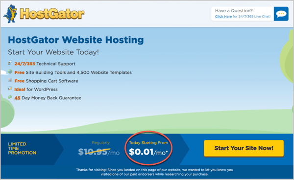 Source: Road To Blogging
Another interruption funnel tactic is to give them something they want for free, but halfway through, make them convert. I often come across prompts unexpectedly when I'm watching marketing videos and such.
Amazon pretty much does this with a "look inside" feature.
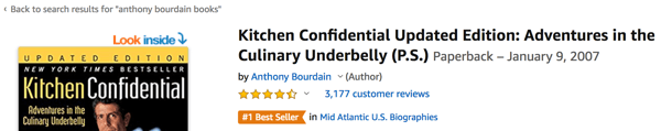
You get to read a few pages of the book for free on your desktop, phone, or Kindle.
The Truth About Website Conversion STRATEGIES
I'm not going to lie to you. You will never finish website conversion optimization. Forms break, and user preferences change. If you want to master UX and conversion optimization, you need to put the time in and make adjustments on an ongoing basis. Over time, it will drastically improve performance. Those little changes add up.
In addition to using conversion tools, you can also overhaul some of your underperforming pages with website strategy documents, such as the page flows from earlier in this article. Our SprocketRocket Strategy Kit includes all of these free templates, and can be used to fine-tune every page on your site.
About Lean Labs
The only outsourced growth team with a track record of 10X growth for SaaS & Tech co's. 🚀
Explore Topics

Discover the Hidden Strategies We Use to 10X Our Clients Growth in 36 Months!
The Growth Playbook is a FREE guide to planning, budgeting and accelerating your company’s growth.


